Standout Features:
- Inclusion of minimalist logo inspired by natural landscapes
- Elegant typography blending tradition and modernity
- Versatile application across print and packaging
Valle de Villaverde, a municipality deeply connected to nature and agriculture, required a fresh identity to elevate its tourism appeal and community presence. Ales Arregi’s design approach captures the essence of this rural enclave through a refined, contemporary visual language that pays homage to its roots.
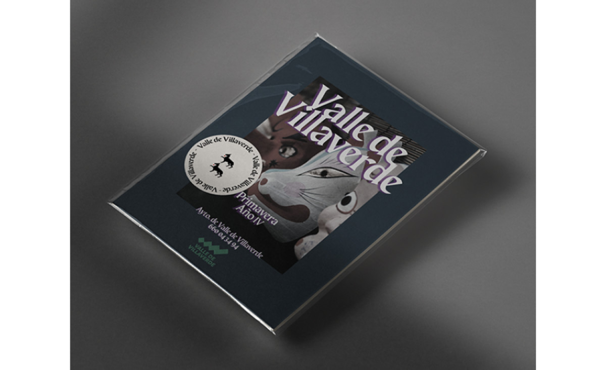
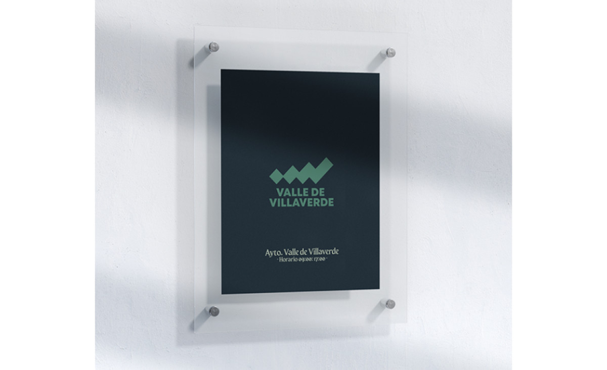
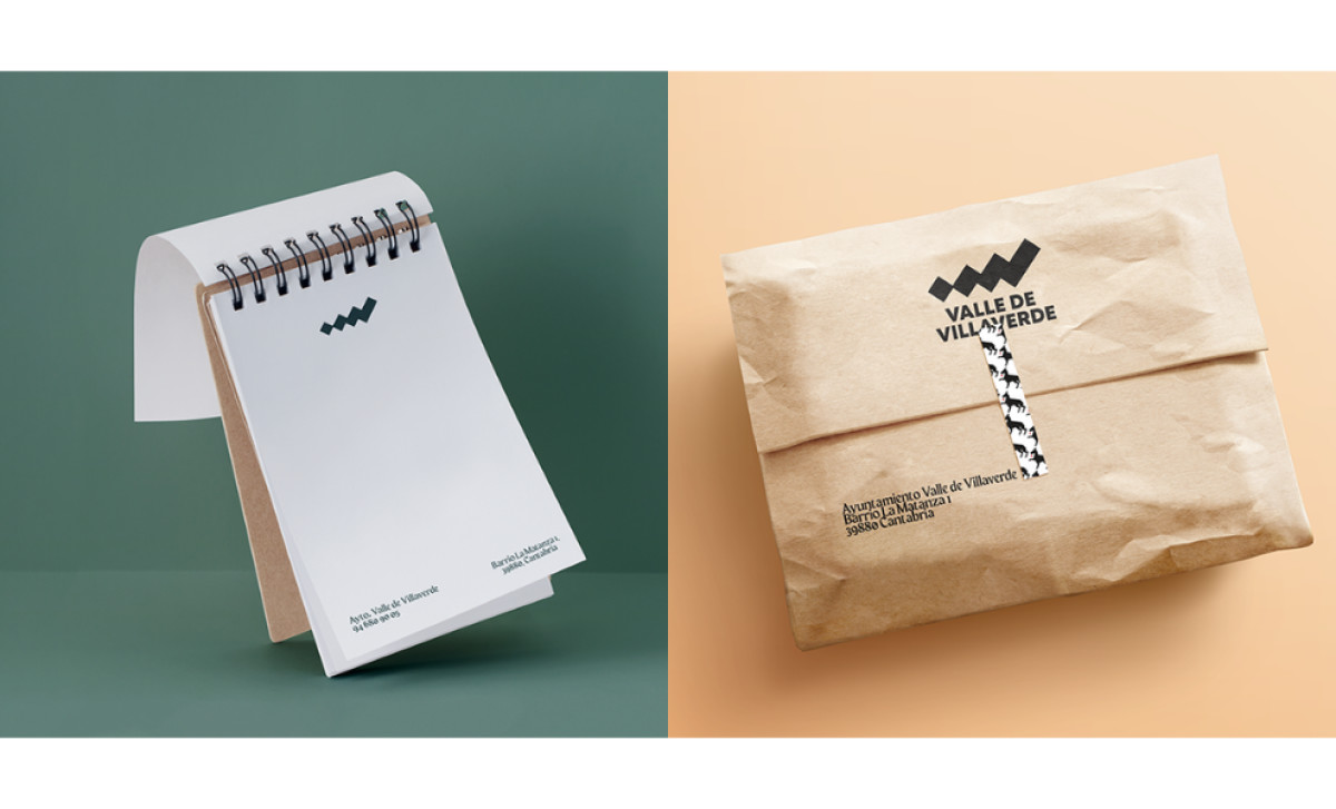
A defining feature of this poster print design is the minimalist logo, a geometric representation of the valley’s rolling hills. The zigzag pattern symbolizes the dynamic local culture and the natural terrain. This simplicity allows the logo to be adaptable across multiple applications, from signage to stationery and packaging.
Typography plays a crucial role in reinforcing the valley’s character. The primary typeface has an elegant curvature reminiscent of traditional calligraphy but with a modern twist. This balance between heritage and contemporary aesthetics ensures that the municipality’s visual identity remains timeless while appealing to a broader audience.
As seen in the stationery and packaging applications, the design maintains clarity and visual appeal without unnecessary complexity. The branding is seamlessly integrated into official documents, promotional materials, and even eco-friendly packaging, reinforcing Villaverde’s commitment to sustainability and tourism.
Ales Arregi’s approach to Valle de Villaverde’s branding successfully elevates the municipality’s visual identity. The design not only strengthens its presence in agriculture and tourism but also provides a timeless, flexible system that can grow alongside the region’s evolving needs.