Standout Features:
- Minimalist and elegant layout
- Strong visual emphasis on projects
- Clear and informative typography
SHA Architecture + Design, known for its expertise in residential and commercial architecture, needed a brochure that would convey its commitment to quality, detail, and client-focused services. Designed by Phoebe Person, this brochure elegantly captures the essence of the firm's approach to architecture.
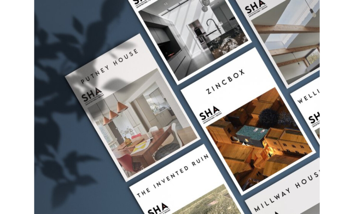
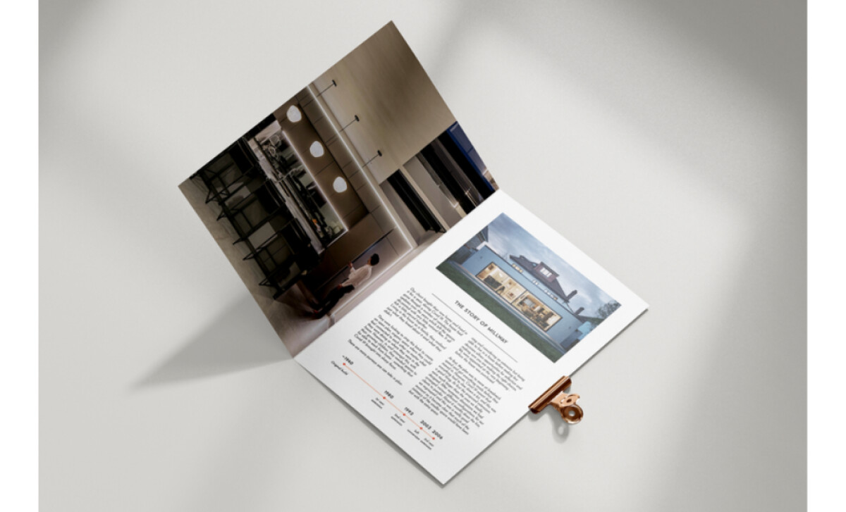
The SHA Architecture + Design brochure embraces a minimalist layout, which allows the content to shine without unnecessary distractions. The white space is used effectively to create a sense of openness and clarity, helping to guide the reader’s eye through each section. This approach ensures that the design is both functional and visually appealing.
One of the most striking features of this brochure is the way it places a strong visual emphasis on the projects SHA has worked on. Large, high-quality images of completed works, such as residential and commercial buildings, help build credibility and allow potential clients to immediately understand the quality of work SHA delivers.
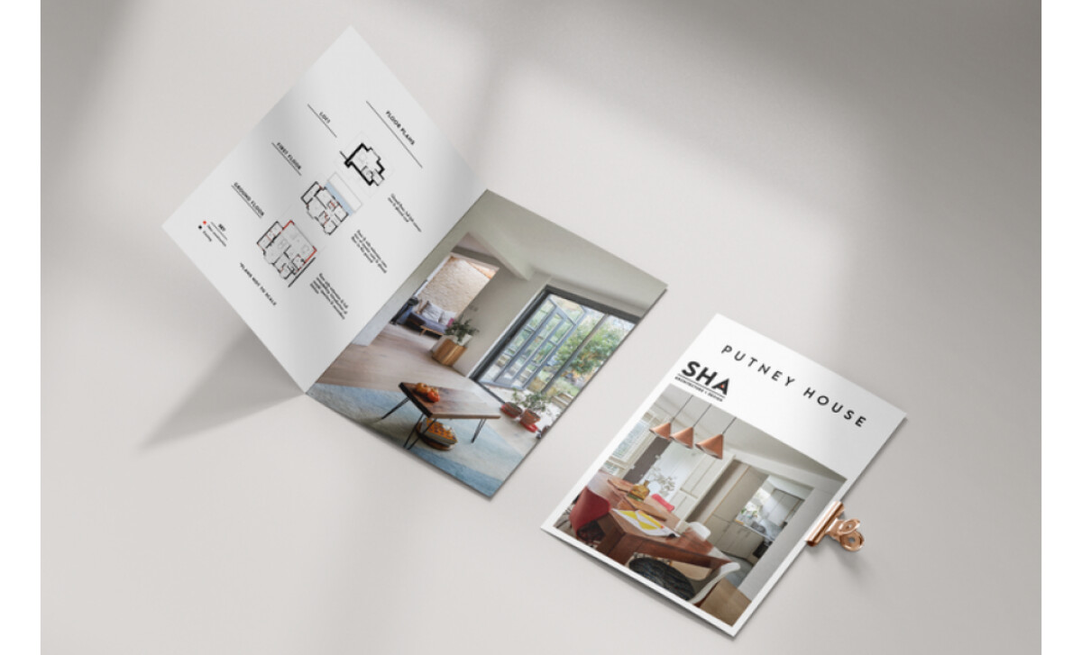
The typography used throughout the brochure is clear, clean, and easy to read. The choice of font, with its modern and professional appeal, ensures that all information is easily accessible. Key details such as services offered, project types, and design philosophies are highlighted in a way that is both informative and concise.
The SHA Architecture + Design brochure is a prime example of how minimalism and elegance can be used to create a compelling print design. For those in need of the best brochure print design that aligns with a sophisticated yet functional aesthetic, SHA’s brochure design offers a perfect example.