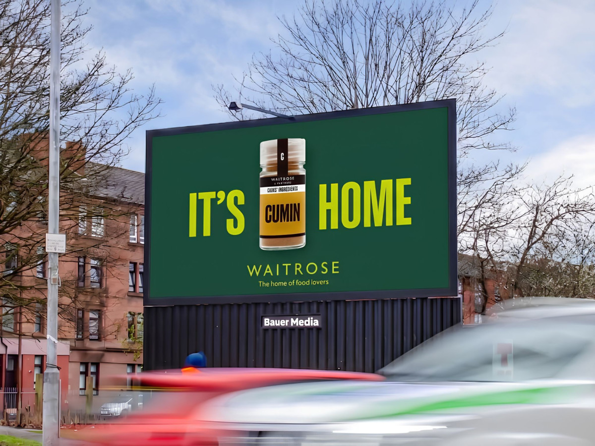
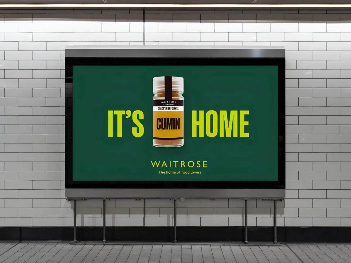
- Agency: Wonderhood Studios
- Client: Waitrose & Partners
- Category: Print Design — Food and Beverage Print
- Location: London, United Kingdom
- Project Brief: Create a playful print campaign that celebrates football culture through witty typography and a memorable visual pun promoting Waitrose's food offering.
Food and beverage print earns its keep when the joke lands in a second. Waitrose swaps a word in England's most famous football chant and gets "It's Cumin Home," with the spice jar standing in for the missing word.
The layout makes the product the punchline. The Cooks' Ingredients cumin jar sits between IT'S and HOME, completing the sentence, and the amber spice reads clearly against the deep green field.
Color and type do the heavy lifting. Chartreuse condensed capitals punch out of the dark green, a high-contrast pairing built for a three-second glance from a platform or a passing car.
The type scale enforces the read order. The two words dwarf everything else, the jar interrupts them at the same height, and the small "home of food lovers" sign-off lands the brand claim last.