Standout Features:
- Dynamic magenta swoosh divider
- Strong corporate identity
- Clear layout and event-specific details
Beyond just looking good and representing the brand, an event brochure like the one designed for Wates at the 2012 BCO Awards absolutely has to work well for attendees who might need information quickly during the event. Galvanize Design prioritized this practical aspect, ensuring the brochure was genuinely functional and simple to use on the spot.
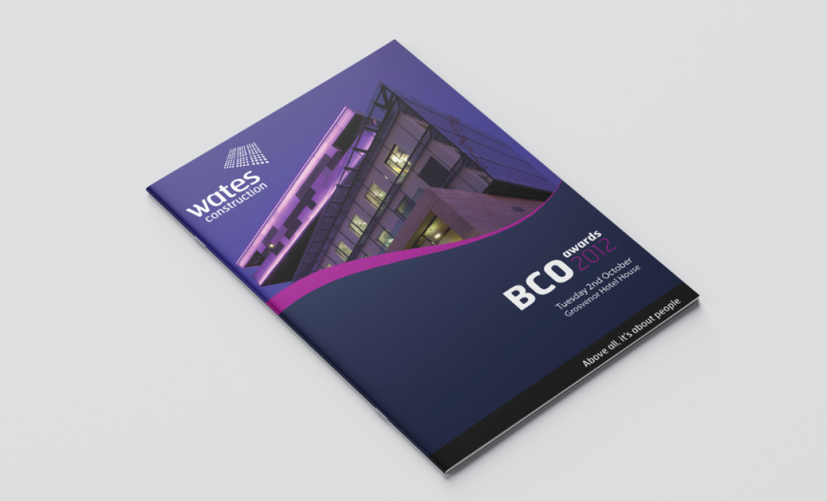
First off, a vibrant magenta swoosh across the page adds a lot of energy to the print design. It shows up on the cover and continues inside, unifying the design and keeping your eye moving smoothly. It sits nicely alongside and even accentuates the usual Wates branding – logos, the blue, magenta, and white palette, sans-serif font.
On the other hand, the widespread use of a deep corporate blue can help associate the company with experience – fitting the brand’s background well. The designer also keeps text clear and modern with a clean sans-serif font everywhere. Plus, high-quality architectural shots also underscore the company’s construction expertise
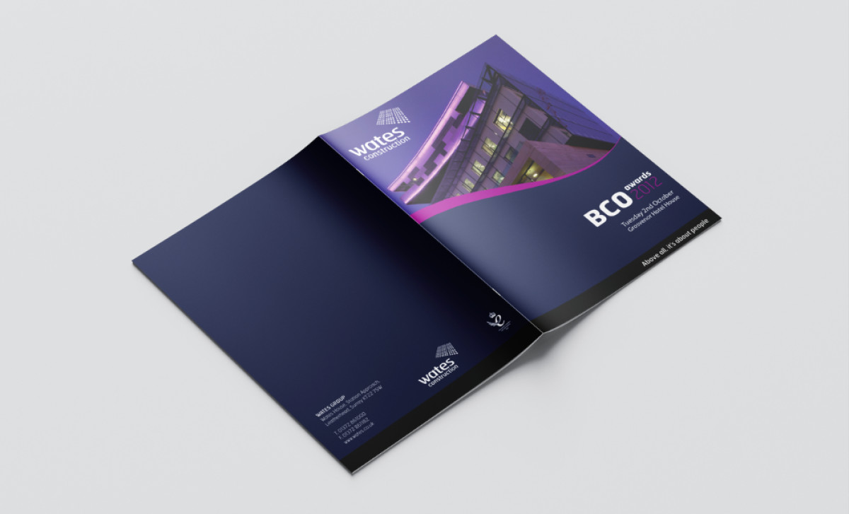
On top of the strong branding, the brochure is great at showing the actual event info. The cover prominently displays the event title, date, and venue with good textual hierarchy. Inside, pages use structured layouts with unambiguous headings (like "Table plan") and lists to keep practical details organized logically for attendees needing quick info.
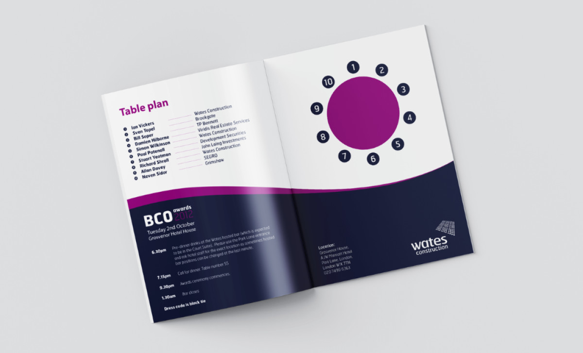
In short, prioritizing really clear, straightforward information in brochure designs — things like easy-to-find schedules, unambiguous table plans, clear headings — massively benefits the event attendees and, in turn, reflects very positively on the host company.