Standout Features:
- Elegant, geometric floral logo
- Strong, modern sans-serif typography
- Dynamic use of circular design elements
Bloom is all about transforming spaces with minimalist, functional, and beautiful designs. For this up-and-coming furniture and interior design startup, LogoFarmer's Studio’s goal was a modern, versatile look for all their materials, especially print, that would clearly show you what Bloom stands for: sophistication and innovation.
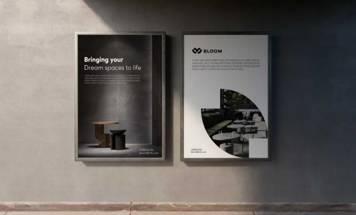
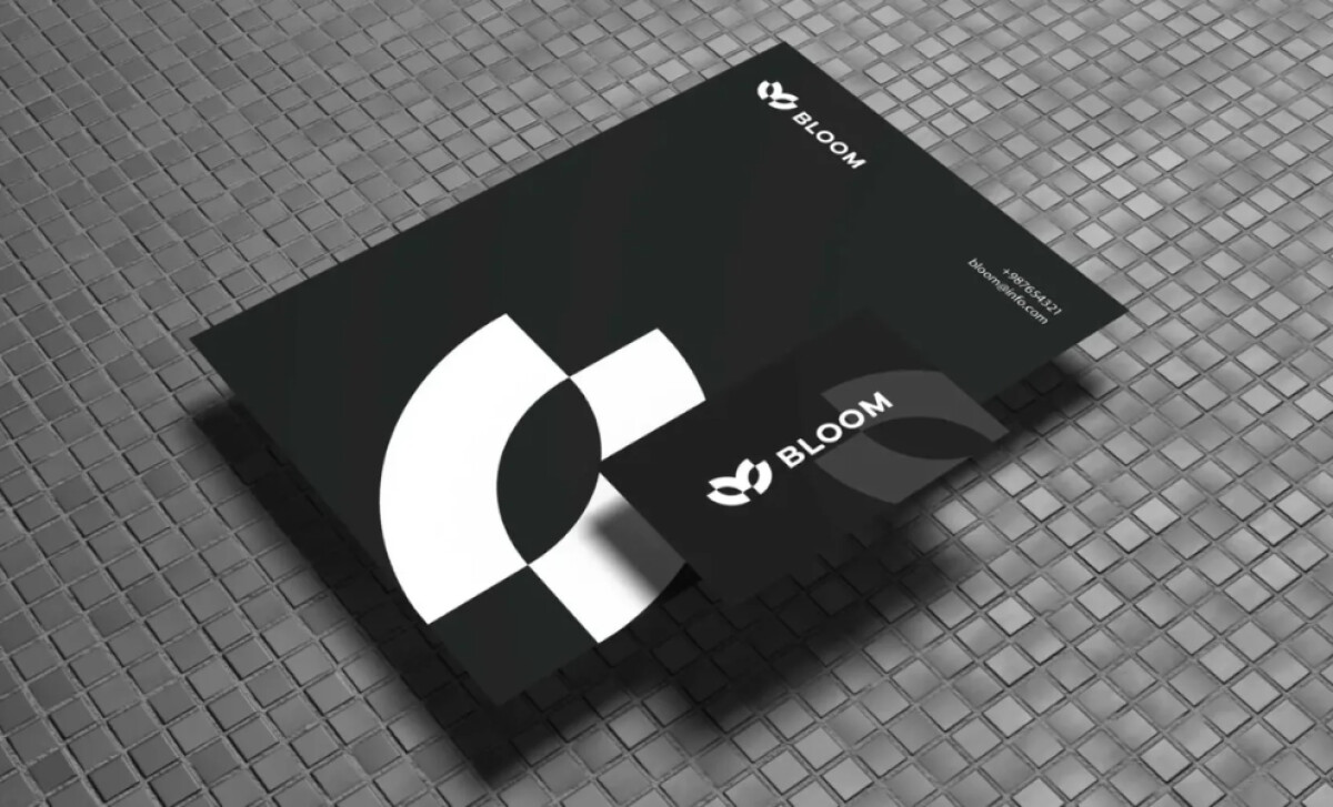
At the heart of Bloom's visual identity is its smart, geometric logo. It’s made of two curved shapes in a calming green that suggests both a flower and a circle. This design is simple yet feels dynamic. You can see how it communicates Bloom's modern, minimalist approach while hinting at natural growth and potential.

For the Bloom name, the designers chose a modern, sans-serif font. It's got a good, solid presence but still feels light and minimalist. This style helps make the brand look professional and sophisticated. You'll find this kind of clear typography makes their manufacturing print materials very approachable.
Circular shapes pop up often in Bloom's brand materials, like on their brochures or business cards. These elements connect back to the logo's design. Using circles can give a feeling of completeness and unity, which perfectly suits Bloom’s goal of creating cohesive and comfortable interiors.
To sum it up, the brand identity for Bloom is a great example of minimalist elegance. The thoughtful logo, modern lettering, and consistent circular motifs work together beautifully in print. This ensures that when you encounter Bloom, you get a clear sense of their commitment to sophisticated, functional design.