Standout Features:
- Powerful, evocative visuals
- Strong typographic hierarchy
- Thoughtful color strategy
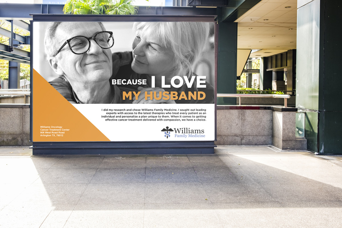
Scot Forbes, a branding expert in strategic storytelling, collaborated with Williams Family Medicine to communicate their compassionate cancer treatment approach through a print advertisement.
The design centers on a poignant black-and-white photo of an elderly couple, symbolizing love and the emotional bond that drives healthcare decisions. This design adds a human touch to the brand and enhances the ad's relatability and impact.
Typography also plays a crucial role in print advertisement, with a focus on the bold statement, "Because I Love My Husband," emphasizing the impact of their care. By varying the text’s size and color, the designer has created a visual hierarchy that guides the viewer through the ad. It ensures that the most crucial information is seen first and remembered.
Lastly, warm orange accents complement the grayscale imagery and highlight key elements. They evoke warmth and optimism — qualities central to Williams Family Medicine's approach.