Standout Features:
- Cross as a central element
- Powerful, emotional imagery
- Customized and well-balanced iconography
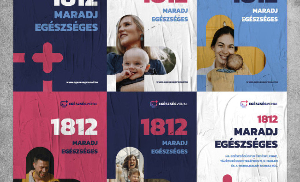
Health Line is a 24-hour information portal that provides updates and information on public health topics. Design agency DAAN created an informative healthcare design focusing on the usual symbols in the industry.
The agency decided to focus on the cross (from the brand’s logo) as a central element, which is also used in different assets and as a mainstay element throughout the poster series. The large cross is always positioned in the bottom left corner, often with powerful real-life photos of parents embracing their children.
Posters are colored in red, blue, and white - colors associated with healthcare. However, the designer picked softer, more modern hues rather than the alarming bright red or deep blue. The rounded shapes of the crosses also reflect friendliness over seriousness.


