Standout Features:
- Bold, approachable color palette
- Strong typographic structure
- Seamless brand application across materials
Wilton @ Work’s business card, designed by Buro Grafilizz, redefines professional networking. Through bold color choices, clean composition, and strong brand language, it transforms a simple print piece into a memorable experience. It proves that small-format design, when done thoughtfully, can make a big impact.
The card’s color palette immediately grabs attention. Deep magenta, green, and blue balance freshness with professionalism, hinting at the brand’s dynamic energy. Diagonal color blocking on the back adds movement and reinforces a sense of forward momentum.
Typography is handled with care, supporting the brand’s approachable yet serious tone. The “WILTON @ WORK” logotype feels modern and compact, while the structured information layout keeps everything clean, simple, and easy for recipients to absorb.
The design’s strength lies in its versatility across formats. From the bold "W" on the back to the clean lock-up on the front, every element feels intentional. This consistency strengthens brand recognition and trust, critical for first impressions.
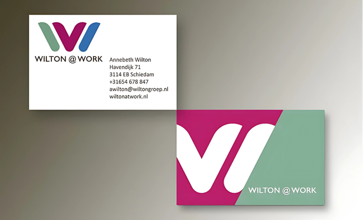
Wilton @ Work’s business card shows how small details can tell a big brand story. With careful use of color, typography, and structure, Buro Grafilizz proves that even the best print design starts with a clear, energetic identity.

-preview.jpg)