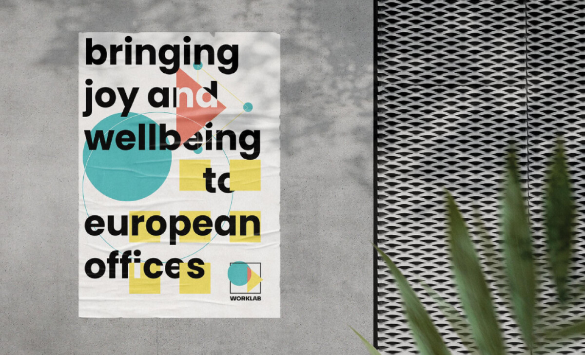
Standout features:
- Playful geometric composition with overlapping shapes
- Bold sans-serif typography with an asymmetrical flow
- Colors that signal optimism and energy
The promotional poster for WORKLAB, a specialist in holistic workspace solutions for large corporations, was designed by ProBranding. Using typographic drive and modern aesthetics, the design distills the company's brand into an engaging layout.
A key element is the playful geometric composition. Large turquoise circles, red triangles, and yellow squares overlap and engage with the text. This Bauhaus-like arrangement blends structure with an organic feel. The resulting visual energy makes the poster memorable and reflects an upbeat approach to workspace design.
Headlines are set in a bold, black, rounded sans-serif. The text is arranged in an unconventional, asymmetrically stacked column aligned to the left, with line breaks that allow it to flow around the geometric forms. This dynamic typographic treatment reinforces the brand's modern and adaptable design spirit.
The color palette features robin’s egg blue, sunshine yellow, coral red, and charcoal black on an off-white background. Applied in flat, solid fills without gradients, these tones are intentionally uplifting. Each hue has psychological resonance — blue for calm, yellow for energy, red for drive — creating a sleek, contemporary aesthetic.
This intentional leveraging of color to guide emotional responses is well-supported by research (Pan et al., 2023), which underscores how different colors and well-designed palettes in graphic design can significantly influence viewers' emotions and states of mind.
The design for WORKLAB’s poster highlights how certain color palettes can significantly influence brand perception. The use of blues for calm productivity and yellows/reds for energy and drive shows how color can actively communicate the emotional intention and benefits of a service.


