Print Design for Nammed Medical Aid Fund Campaign Leverages Out-Of-Home Advertising
A minor health inconvenience as simple as a headache could be the symptom of a serious medical condition without you even knowing it.
This is where Nammed Medical Aid Fund comes in. The company helps Namibians prepare for such instances by providing affordable and suitable medical aid options. This way, people can cover the hefty medical expenses when worse comes to worst.
As evidenced by the current times, healthcare is always a top priority!
To communicate such a value proposition to the general public, Ogilvy Namibia designed a visually-arresting and captivating outdoor campaign for Nammed that highlights the importance of getting a medical fund.
Massive key advertising messages paired with close-up shots in the background stop people in their tracks, a powerful brand statement that excellent branding agencies commend.
With larger-than-life texts and beautifully-shot intriguing images, the designers accomplished the ultimate goal of out-of-home advertising: to be an absolute attention-grabber.
Nammed Print Design’s Vibrant Visuals are Instant Street Attraction
With outdoor print designs, it’s always a battle of who gets the first look or who can sustain that attention. Ogilvy Namibia leveraged the benefits of a well-conceived color story to win the people's attention.
Instead of playing with various color combinations and gradients, they used a more straightforward approach.
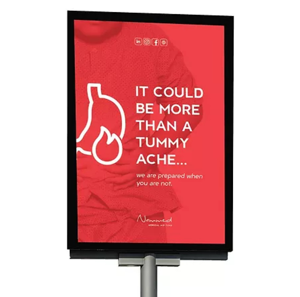
They took the company’s official brand color, red, and made it brighter and more vibrant – almost like a neon shade. This single block of color served as the main canvas for all the printed collaterals like billboards and road displays. In a sea of other colors, this one shines the brightest.
But it doesn’t end there. The designers also lessened the color’s opacity, but apart from that, they used it to reveal a striking image in the background.
Each printed material features a different image that’s part of a central theme: recognizing common sicknesses as potentially serious medical conditions. These images, painted in bright red, are compelling portrayals of how important it is to get a healthcare plan.
Nammed’s Print Design’s Creative Copy Sparks Curiosity
One of the best things to come out of this campaign is the powerful messaging.
As mentioned, the colors and images are interesting enough to spark curiosity from passersby.
And the advertising headline does this with flying colors.
The copy, “It could be more than a back pain…” is a simple yet effective way to make people think about their health conditions. Under this kicker is the immediate solution: “we are prepared when you are not.”
In just two lines, the designers communicated the sole purpose of Nammed Medical Fund Aid.
What made it even better is that these texts are written in a single sans serif font for maximum legibility. The white text against the vibrant red background made the message even easier to read and balanced out the flashiness of the color choice.

Outlined Illustrations Complement the Visuals in Nammed Medical Aid Fund’s Print Design
Rounding up the layout, the designers included outlines of body organs like a spine, kidney, and head to follow through with the medical theme.
One key detail we didn’t miss is that these illustrations are strategically placed to match the picture in the background. This made it even easier for people to understand what the images portray, even if they are slightly overshadowed by the color and text overlays.
They also didn’t forget to highlight the brand name, Nameed. It takes the form of a soft and thin handwritten text to stay consistent with the simple yet ostentatious aesthetic.
Several outlined social media icons also sit at the bottom of the layout to let people know they can easily find Nammed Medical Aid Fund online.
And the best part? All these graphical elements are painted white, making the design clean, crisp and streamlined.
You may look into other graphic designers who focus on creating simple yet impactful print designs like this.