- Agency: Idyllic
- Client: WorkWhy?
- Category: Print Design — Professional
- Location: New Plymouth, New Zealand
- Project Brief: Produce print materials that communicate brand purpose through clear messaging and a cohesive visual identity.
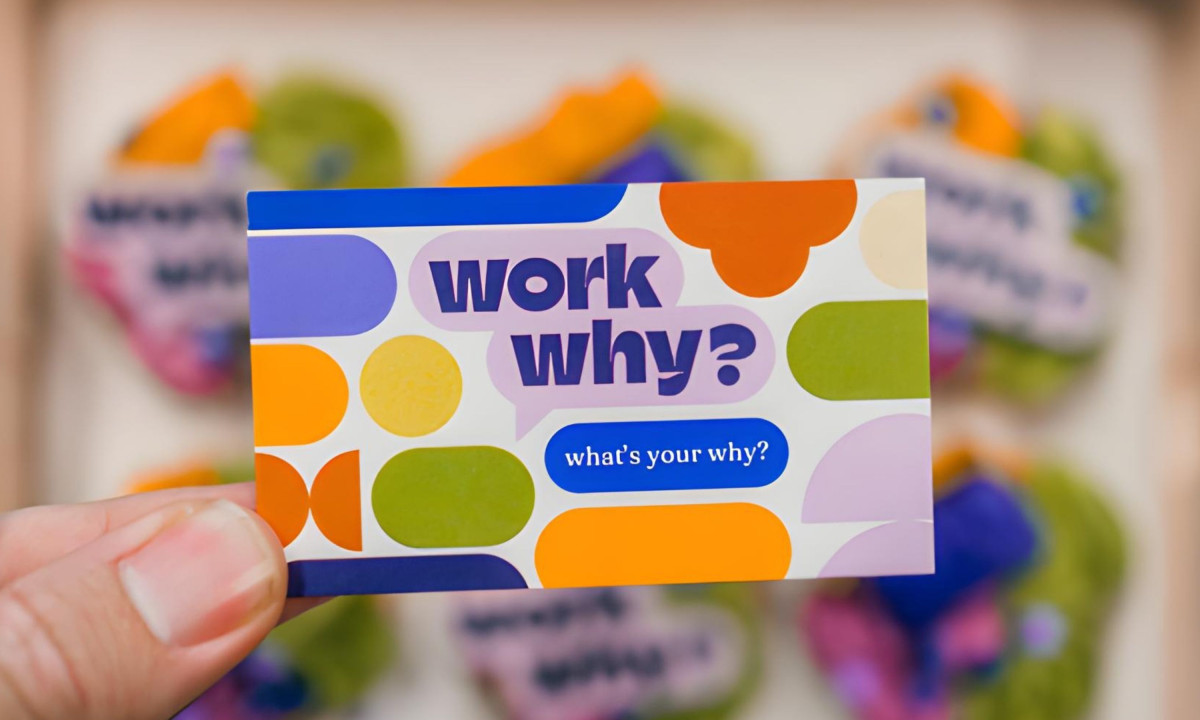
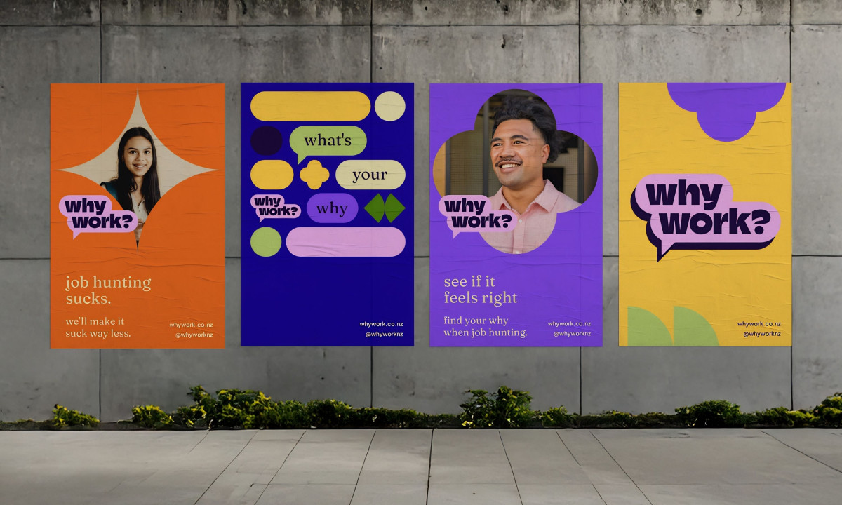
A professional services brand loses its audience the moment it starts looking like every other corporate deck. Idyllic's print system for WorkWhy? leads with candid portraiture and copy written the way people actually talk, because a younger workforce has already developed a fast and reliable instinct for anything that isn't.
Deep purples and oranges land with enough confidence that the brand doesn't need a tagline to signal its intentions. Rounded geometric shapes stop the layouts from calcifying into the kind of rigid grid that makes a career service feel like a government office.
Speech bubble motifs and bold typography show up on posters and business cards with the same energy, and that consistency builds something over time. By the third or fourth touchpoint, the brand stops reading as a set of design choices and starts reading as a personality.
WorkWhy? makes the job search look like a process someone designed with actual people in mind. The print system backs that up with choices specific enough to be trusted.