Standout Features:
- Dominant sans-serif fonts
- Lack of colorful background
- Simple video design
When making announcements about conventions, one must think of ways to ensure as many people will see them as possible.
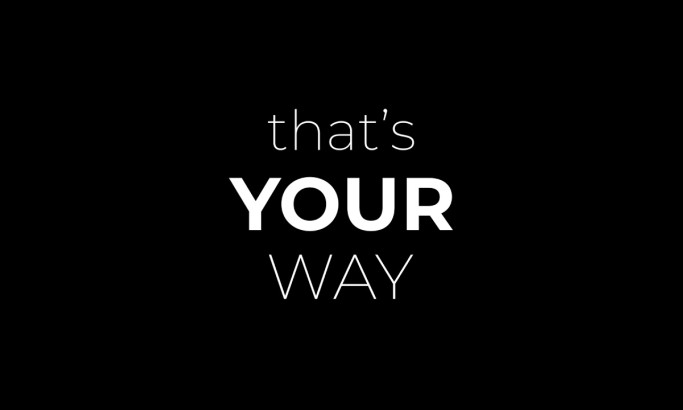
Promo Design Academy nailed this concept in its work for the International Livioon Convention. The agency employed dominant sans-serif fonts and minimal colorful backgrounds, making the typography stand out without distracting viewers.
The font styles were also modern and clean, making the video even more appealing. This video showed how powerful typography can be when used correctly.
Sans-serif fonts are often used for their professional appearance, and this is one way the convention tells their attendees and the people around them that they mean business.
Get a chance to become the next Design Award winner.
SUBMIT YOUR DESIGN