Standout Features:
- Cohesive visual brand identity with geometric shapes
- Visual metaphors that convey complex concepts
- Timeless design that ages gracefully
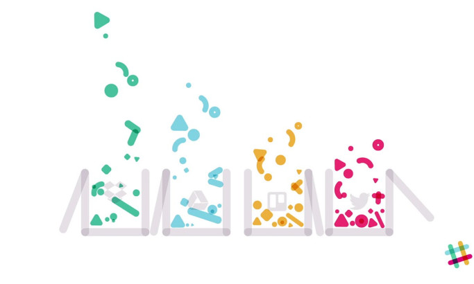
Slack’s animated explainer video is anything but your typical corporate spiel — it’s a high-energy visual journey that takes viewers through the chaos of workplace communication and transforms it into something simple, organized, and downright fun.
The video integrates brand elements — like its bold, primary color palette and simple geometric forms — throughout the animation, ensuring it feels distinctly Slack. The consistency in design, from the color scheme to the fluid motion, ensures that the visual identity remains strong and recognizable.
The fluid transitions are key to this design’s success. The motion flows seamlessly from chaos to order, illustrating Slack’s power to bring structure to a cluttered workplace. Viewers are engaged by the quick, smooth shifts, which simplify the complex concept of how Slack unifies communication and collaboration.
Despite its 2015 release, the video’s design feels as fresh and modern as ever. The bold colors, geometric simplicity, and seamless animation make it look timeless. It’s a visual language that hasn’t aged, proving that strong design principles can create lasting appeal.
In short, Slack’s explainer video is a perfect example of how motion graphics can simplify complex ideas while maintaining energy and impact. Its consistent visual identity and timeless design make it a standout example of the best animated motion graphics principles in action.


