Standout Features:
- Sleek, minimalistic design
- Clear product focus
- User-friendly interface with seamless navigation
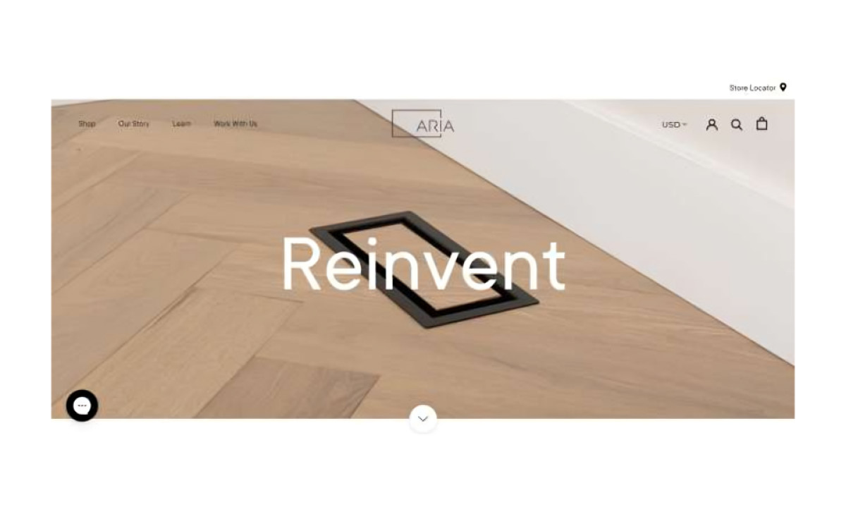
The Aria Vent website by pb+j is a striking example of how less can be more. With its minimal approach, the design effectively puts the spotlight on the product while offering a simple and efficient user experience.
The clean, uncluttered layout keeps the focus entirely on the brand's offerings, showcasing their innovative air vent solutions in an elegant and simple way. This approach helps create a premium feel while keeping the user experience streamlined and efficient. The design places the product front and center. High-quality images of the air vents are displayed clearly, allowing users to immediately understand what the brand is offering. With minimal text and large visuals, it’s easy for visitors to connect with the product without any distractions. This design strategy not only showcases the product but does so in a way that’s both approachable and professional.
Navigation is kept simple, ensuring users can find what they need without hassle. The top navigation bar is unobtrusive, offering quick access to key sections like product details and contact information. This smooth, straightforward user journey ensures that visitors never feel lost or overwhelmed, making the website both effective and easy to use.
In short, the Aria Vent website is a fine example of how a product catalog website design can combine visual appeal with functional simplicity. The design is direct, intuitive, and visually appealing without overcomplicating things, making it a great reference point for anyone looking to create an aesthetically pleasing and user-centric platform.