Standout Features:
- Dynamic typography
- Striking color palette with orange accents
- Imagery focused on real-world applications
Armour Side offers a revelation in steel cladding — a durable, low-maintenance, and eco-friendly alternative for any building style. Its website, developed by Reform Creative, balances engaging elements with clear information to showcase its quality protection and aesthetic appeal.
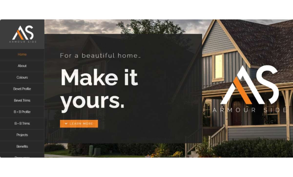
The site features modern sans-serifs rendered in the brand’s orange for prominent headings like "About Us" and "Projects." Varying font weights for the subheadings also create clear visual hierarchies. The typeface for calls-to-action is subtle, but the button colors help guide users. Plus, the orange sets a memorable tone.
You'll notice a striking color palette of predominantly neutral cool tones like dark grays and blues complemented by those bright orange highlights. It's the sparing use of orange for CTA buttons and key headings that makes them pop against the muted background. This contrast maintains focus and adds excitement through color.
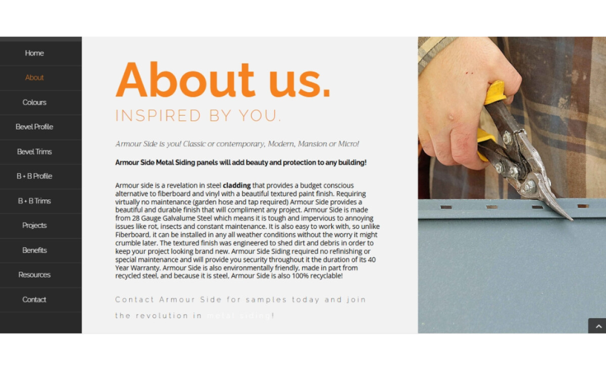
The website also uses imagery focused on real-world applications, showcasing Armour Side’s steel cladding on diverse residential and commercial buildings. This use of high-quality photos of completed projects is crucial in construction, allowing potential customers to visualize the product’s look and application.
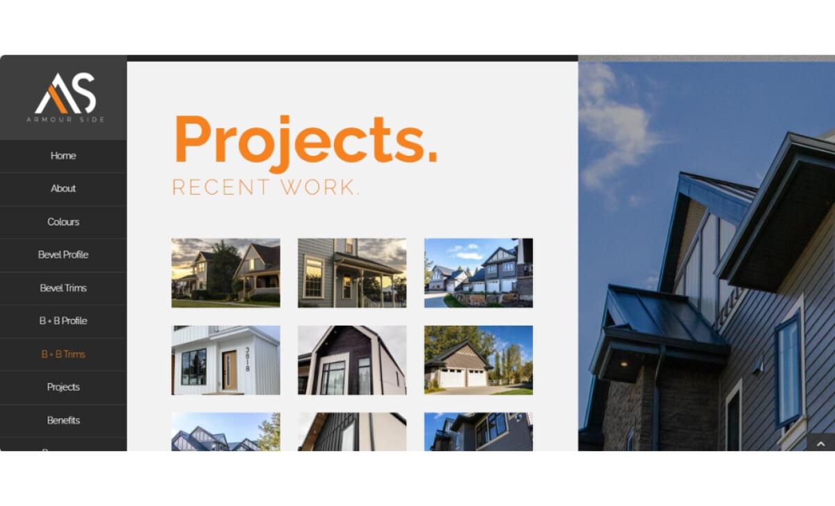
Reform Creative’s emphasis on real-world application imagery is a prime example of "show, don't just tell." For brands providing similar professional services, showing tangible proof of product performance is far more persuasive than text alone since high-quality project photos build trust and help clients visualize your offerings.