Team Behind the Design
Web Design Analysis
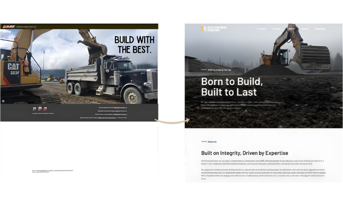
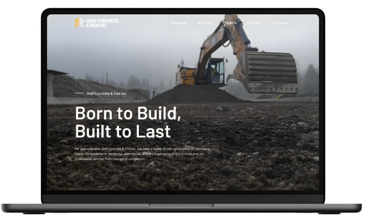
What impressed me first about Graf Concrete & Iron’s new website is how naturally it communicates strength and trust. Construction websites often look either too corporate or too rugged, but this one finds a balance that feels both grounded and refined.
Adventure Tide Media built a design that mirrors the company’s craftsmanship while making every detail feel intentional and approachable.
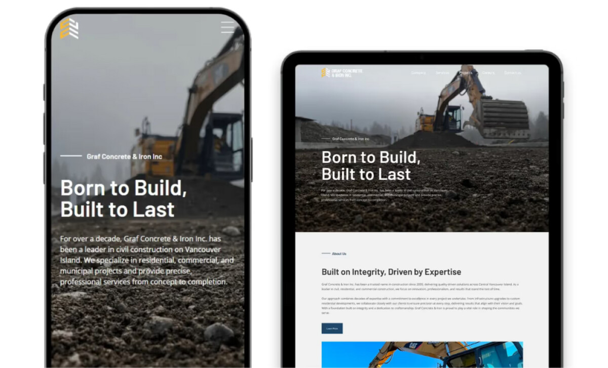
- UX Design and Navigation: The homepage headline, “Born to Build, Built to Last,” sets the tone immediately. Navigation is clean, with clear sections for Services, Projects, and Careers. The structure directs attention where it matters most and supports easy exploration for both clients and job seekers.
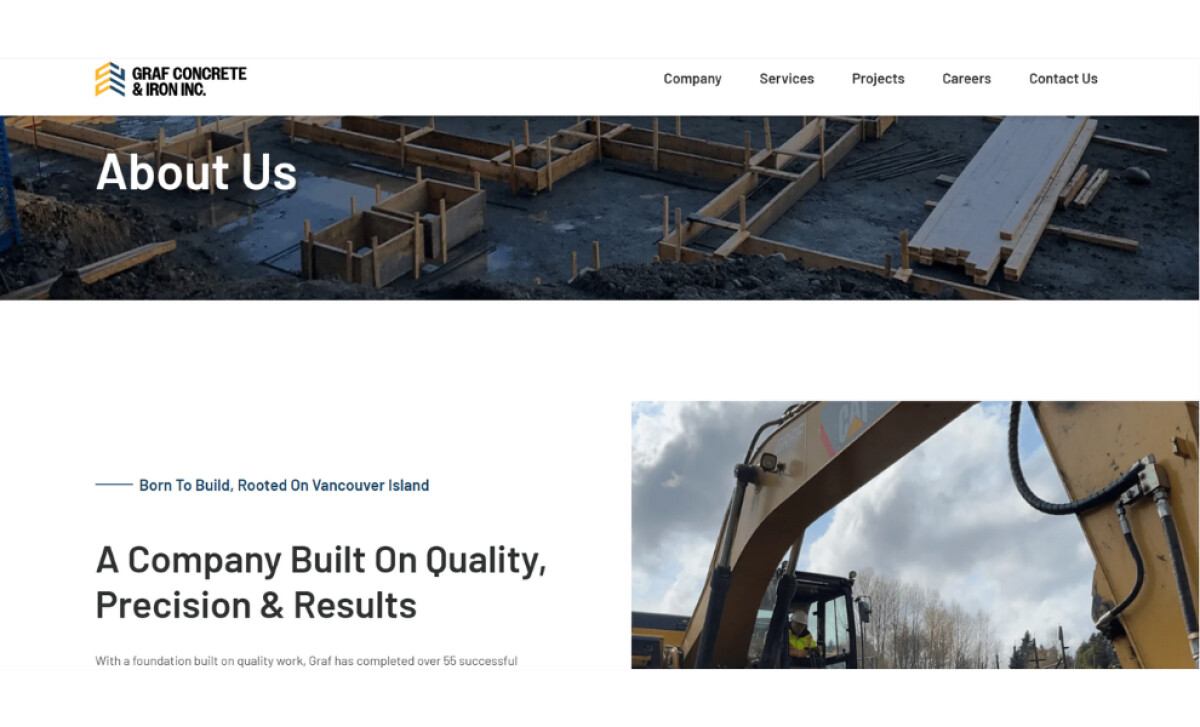
- Visual Direction and Tone: The hero photography, showing machinery in motion against a misty job site, brings authenticity to the experience. Neutral grays and whites keep the focus on imagery and text, while yellow accents echo the logo and highlight calls to action. The site feels serious but not cold, inviting without losing its professional edge.
- Typography and Content System: The choice of bold sans-serif type gives the brand a sense of confidence. Body text stays light and legible, supported by consistent spacing that prevents visual fatigue. Each project and service section follows a clear visual rhythm, making information easy to read and expand over time.
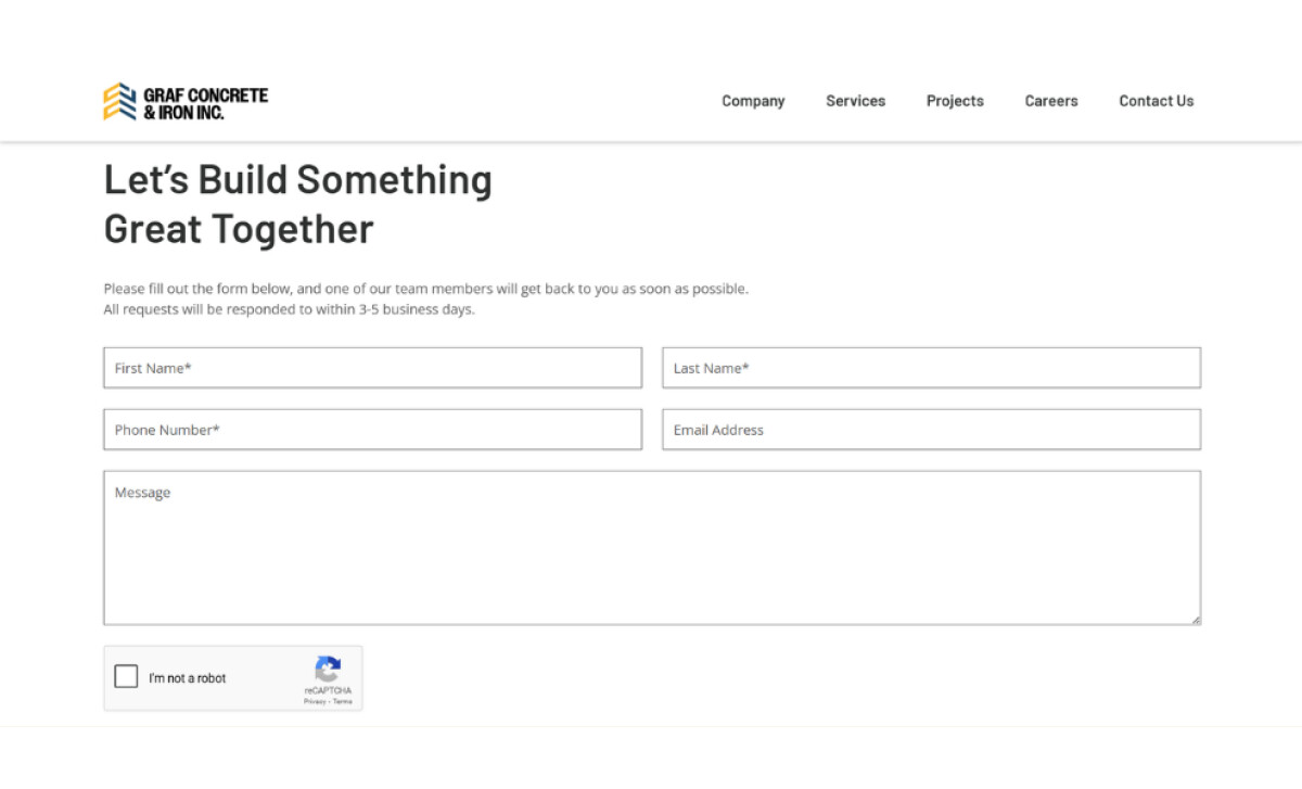
- Scalability and Credibility: The design is built for growth. New projects can fit into the layout without breaking consistency, and the responsive framework performs smoothly on every device. The contact page closes the journey with a strong call to action, reinforcing Graf’s collaborative, client-focused ethos.
What Brands & Agencies Can Learn from Graf Concrete & Iron
Graf Concrete & Iron’s new website proves that design for the construction industry can feel strong without being heavy. Adventure Tide Media demonstrates how thoughtful structure and clear communication can bring craftsmanship to the digital space.
1. Lead with Authentic Imagery
Use photography that reflects real work and real people. Genuine visuals build trust faster than stock images and give a brand its own texture and credibility.
2. Build Structure That Feels Solid
Clear hierarchy and restrained typography help complex information read easily. When content is laid out with precision, users associate the same care with the company’s workmanship.
3. Keep Growth in Mind from the Start
Design templates that can expand as projects and services evolve. Scalability ensures the site can grow alongside the business without losing clarity or consistency.
About DesignRush Featured Designs
At DesignRush, we review hundreds of agency projects each month. The featured designs stand out for creativity, relevance, and execution.
Many go on to be recognized as winners of our Monthly Design Awards.
Explore more here:
- Best Website Designs
- Best App Designs
- Best Logo Designs
- Best Print Designs
- Best Packaging Designs
- Best Video Designs
For a full list of design agencies and related services, see our Agency Directory.