Standout Features:
- Customer testimonials in marquee animation
- Longer scroll experience on the homepage
- Monochromatic approach
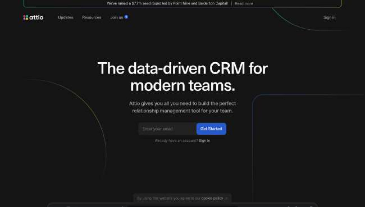
The Attio website design by Ana Moreno is simple, sleek, and neat.
The agency leaned on the monochromatic approach with the design. Black, white, and gray shades dominate the website, with occasional pops of color on the inner pages.
What sets this apart from other startup websites is the slim horizontal call-to-action (CTA) that almost stretches through the screen size. This displays Attio’s latest announcement with a “Read More” button that leads to the whole article.
Just below the hero copy is a preview of the dashboard in dark mode which turns to light mode upon scrolling.
The agency added customer testimonials and media features in a Twitter-like layout with marquee animation. This is another unique element that’s especially beneficial for startup companies like Attio. Each block is linked to either a tweet, published writeup, or client review.
All in all, the client’s website design is comprehensive and informative. The agency managed to squeeze in all the details about the product without overwhelming the visitors.
This Client Relationship Management (CRM) platform is presented in detail under the “How it Works” section on the homepage. It’s divided into three different parts: Sync, Build and Collaborate.
Signup CTAs are creatively scattered on the pages too. With a distinct blue color, site visitors surely won’t miss it!


