Standout Features:
- Clean and minimalist design
- High-resolution images
- Embedded Instagram grid
Mysa Skincare radiates in this website design by Shape.
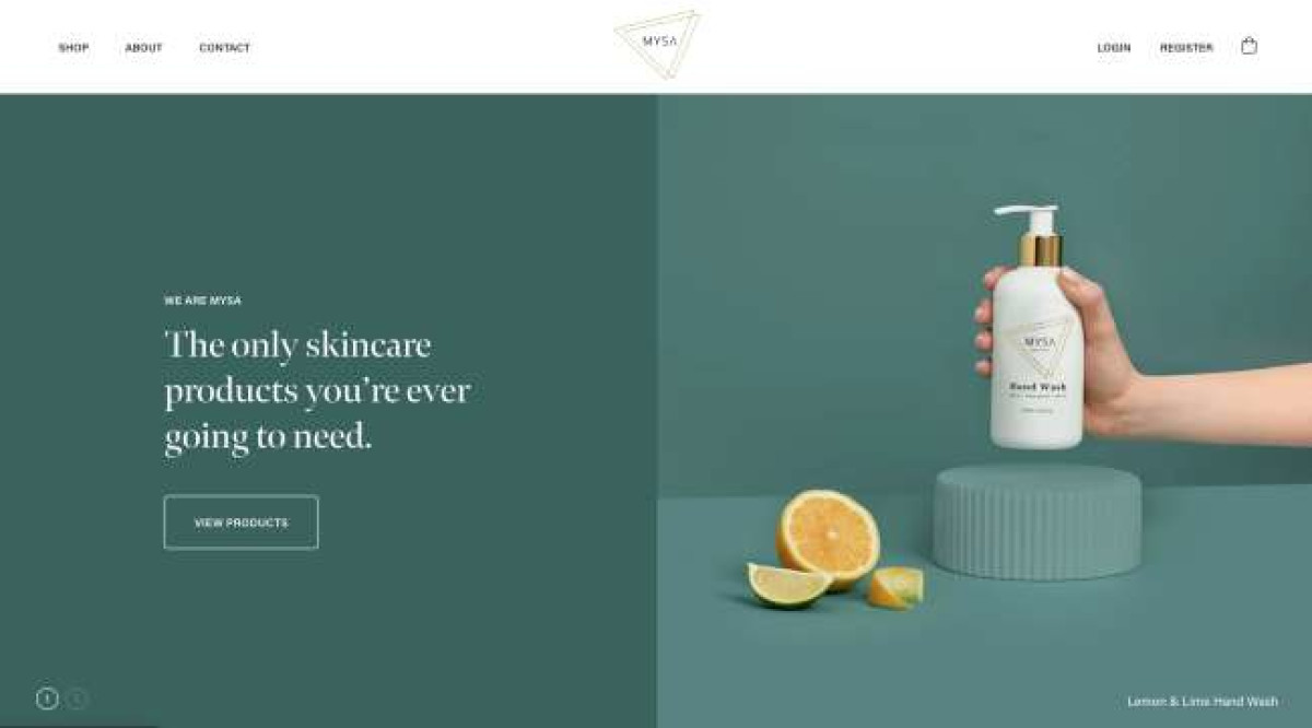
The design leaves no room for guessing because it’s clear and concise. Right from the get-go, visitors know what kind of products are sold, starting with the split header design in teal. On the left is the copy that says, “The only skincare products you’re ever going to need.” It is parallel to a creative product shot of their Hand Wash product.
This header alternates two versions: one in teal and another in off-white. The second version features the Lip Oil with the copy, “Enriched with amazing natural ingredients,” plus a “View Products” CTA button.
Since this startup website is an eCommerce platform, product images and lifestyle shots populate the site.
There’s a product section on the homepage that displays some of the client’s items, prices, and brief introduction copy. Four products are showcased horizontally and browsed by dragging your mouse from left to right. This is signaled by a circular cursor with the word “DRAG” in it.
To introduce natural oil-based skincare products to the market, the agency capitalized on high-resolution images, informative copy, and testimonials.
Before reaching the footer section, there’s a horizontal grid of images sourced from the client’s Instagram account. These photos add more human elements and candidness to the website. Even with just a few images displayed, it’s already enough to balance the overly curated product shots on the site.


