Standout Features
- Highlights brand-related keywords
- Clean, minimal design
- Smooth transitions
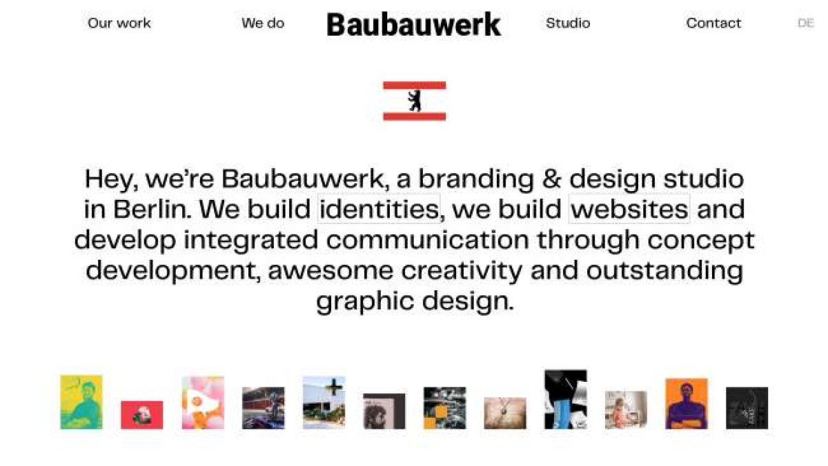
Baubauwerk, a branding and design studio from Berlin, did an excellent job designing its official site. Aside from its captivating colors, one of the first things visitors will notice are the highlighted keywords on the site’s landing page. Hovering over them reveals the blocks of photographs that change depending on the highlighted term.
Clicking on the accentuated texts leads users to another page that contains the company’s portfolio. Each featured material sports on-point tags and high-quality pictures.
While fairly clean and simplistic, the website leverages its minimal approach, modular design and smooth transitions that when combined, create an illusion of effortless movement, adding to the overall appeal effortlessly.
The website design agency didn't skimp on the quality of their photos, which speaks volumes about the studio's consistency and attention to detail.
Users might find this site simple, but it's a concept that fits Baubauwerk well – conveying its message and approach through engaging visuals. The website doesn't focus on over-the-top aesthetics and cluttered design, but on streamlined navigation and clarity, making it easier for users to understand the agency's offering.