
Boardwalk Website Design Showcases Efficiency And Reliability
Boardwalk Insurance is a Canadian, purpose-built insurance brokerage company for small to medium-sized businesses. Their website is a creation of Design Rooster, a marketing & advertising agency from Kleinburg, Ontario.
As a B2B company offering insurance and liability services, the Boardwalk Insurance corporate web design steers clear of flashy animations and colorful graphics. Rather, it takes on a more professional and restrained look that is fully in service of delivering the right message.
The website is modern-looking, clean and easy on the eyes. It features a clever use of brand colors and a simplistic visual hierarchy that presents the company’s services and solutions.
Although it opts for a fairly uniform look, it is a far cry from your typical corporate website. What makes it stand out in the sea of similarly crafted pages is the visual emphasis on the brand’s mission – catering to small and medium-sized businesses.
Just like the company’s logo, the website presents an open door for business owners that seek reliability and understanding of their unique position.

Boardwalk's Sticky Navigation Provides A Smooth User Journey On The Website
The user journey on Boardwalk Insurance’s website is as simple and effective as the overall design.
The menu stays on top of the page when the user scrolls down. This is a web design best practice that ensures page visitors can easily jump from section to section. It mitigates potential misdirection and offers no distractions that can draw attention away from the message.
The navigation menu perfectly fits into the website's aesthetics and enhances the user experience.
This website design opts for a menu that’s easy to skim and contains only the absolutely necessary options. The company’s philosophy is that “actions speak louder than words," so they circumvented the standard “About Us” section.
The order of the links is also intuitive and logical: "Home," "Difference," "Policies" and "Claims," followed by the lead-generating CTA, “Get Started.”
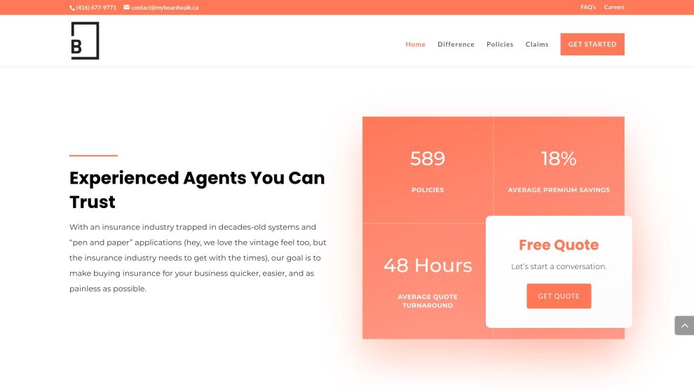
Boardwalk's On-Brand Colors Prove To Command Attention Where It Truly Matters
Ample negative space drives attention to the key elements and conversion points.
Web designers leverage this technique to make the site’s content more legible. It also lets visitors familiarize themselves with the website while simultaneously keeping them interested and incentivizing them to take action.
This allows content to be more legible and lets visitors familiarize with the website, while simultaneously keeping them interested and incentivizing them to take action.
The only color that disrupts the prevalent whiteness of Boardwalk website design is the on-brand orange. It is used for highlighting some bits of copy blocks, CTAs and background illustration details to direct attention and guide users down the conversion funnel.
When it comes to design in general, orange commands attention without being as overpowering as red. It is also considered to be more friendly and inviting, more than its warmer counterpart. The exact hexadecimal shade of this orange hue is #FF7854.
When it comes to typography, the Boardwalk website design utilizes the standard bold font to underline its distinct blend of direct, concise and personable messaging.

Playful Doodle Characters Support's Boardwalk's Personal Approach To Web Design
Although counterintuitive at first glance, Boardwalk website design avoids using stock photos that have evidently become a favored method for companies to quickly (and inexpensively) populate their websites with professional-looking visuals.
A heavily edited, high-quality photo of a fake meeting, or a “carelessly” positioned coffee cup may seem more appealing at first. But the fact is, these methods come across as artificial, even to the inexperienced/uninitiated audience.
However clean and minimal it may be, the Boardwalk website breeds life into every single page with sincere and inspiring illustrations. These doodles depict small businesses (like the bakery and a flower shop) which represent the embodiment of the company’s care for these types of clients.
Static as they may seem, these illustrations imply movement that both brings design to life, as well as their daily goings.
It also reflects how branding professionals use hand-drawn illustrations with soft compositions to create a memorable and impactful user experience. These drawings are crafted to encapsulate what the company is all about, combining its core messaging, values, and approach. These drawings are crafted to encapsulate what the company is all about, combining its core messaging, values and approach.

Boardwalk Website Design Is An Embodiment Of Creativity And Reliability
Even though the initial impression the Boardwalk website design gives off is minimalism and simplicity, Design Rooster went to great lengths to present the company and its services with more value and personal touch.
The agency’s major contribution to the website’s distinct personality is the addition of subtle visual cues that communicate reliability and validity.
Without explicitly pointing to the company’s logo and brand, they serve as consistent and almost intangible branding elements that improve the UX and the company’s likability.
Boardwalk website design gave a rare example of successfully combining professional minimalism and artful UX to improve user engagement.
The resulting website feels timeless and current even when design trends change in the years to come. No wonder it won our Best Design Award!


