-account-photo_listing.jpg)


Our Jury has worked with Prada, Nike, Chanel, Google, and Apple.
Best Motion Effects Website Designs of 2026
View the Top Motion Effects Website Designs Below
Best Motion Effects Website Designs of 2026
4,200+ Submitted Designs
- Advertising
- Aerospace
- Agriculture
- AI
- Architecture
- Arts & Recreation
- Automotive
- Banking & Finance
- Community
- Construction Company
- Content & News
- Digital Agencies
- Distribution
- E-Commerce & Retail
- Education
- Engineering
- Entertainment
- Fashion & Beauty
- Film Production Company
- Food & Beverage
- Games and Entertainment
- Government
- Health & Wellness
- Hobby
- Hospitality
- Jewelry
- Legal & Insurance
- Luxury
- Manufacturing
- Medical & Pharmacy
- Museum
- Music
- News Magazine
- Non-Profit
- Professional Services
- Real Estate
- Restaurant
- Roofing
- Sports & Leisure
- Startup Business
- Tech Startup
- Technology
- Travel
- Wedding Planning
- Zoo
- 3D
- 404
- About Page
- Artisan
- Artistic
- Black and White
- Blog
- Bold Color
- Bold Font
- Book App
- Check Out Page
- Chinese
- Clean / Minimal
- Colorful
- Contact Page
- Corporate
- Custom
- Experimental
- Flat
- Footer
- Form
- Fullscreen
- Futuristic
- Green
- Horizontal Layout
- HTML5
- Illustrated
- Images / Gallery
- Innovative
- Inspiring
- Interactive
- Landing Page
- Menu
- Microinteractions
- Mobile Websites
- Motion Effects
- One-Page
- Parallax Effects
- Personal
- Pet Store
- Photographer
- Playful
- Podcast
- Pop Ups
- Portfolio
- Pregnancy
- Pro-loaders
- Product Listing Page
- Purple
- Retro
- Services Page
- Simple
- Slider / Module
- Small Business
- Soft Colors
- Sound / Music
- Storytelling
- Tech Online Store
- Typography
- Unusual Layout
- Use of Infographics
- User-Friendly
- UX Designs
- Virtual Reality
- Visible Borders
- Visually Striking
- Webflow
- Welcome Page
- WordPress
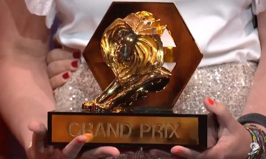
★9.38/10
 AO 9.00
-account-photo_listing.jpg) IS 10.00
IS 10.00 LS 9.00
 BD 9.50
View Design
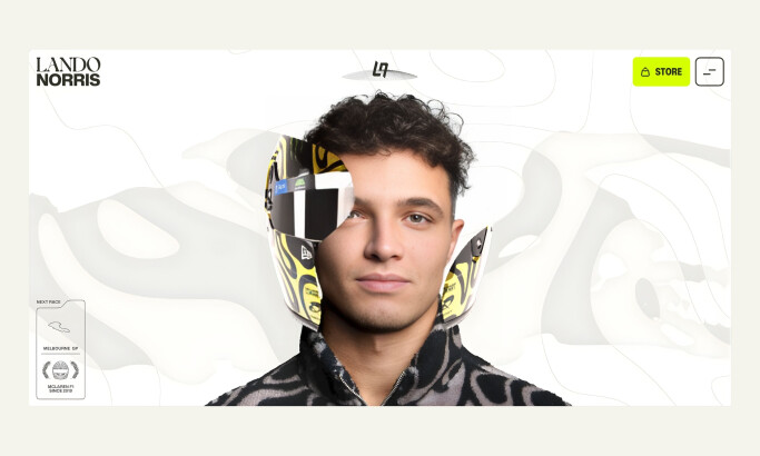
Lando Norris
View Design
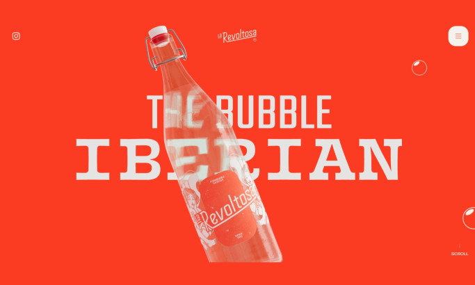
La Revoltosa Website Design
byWaka
View Design
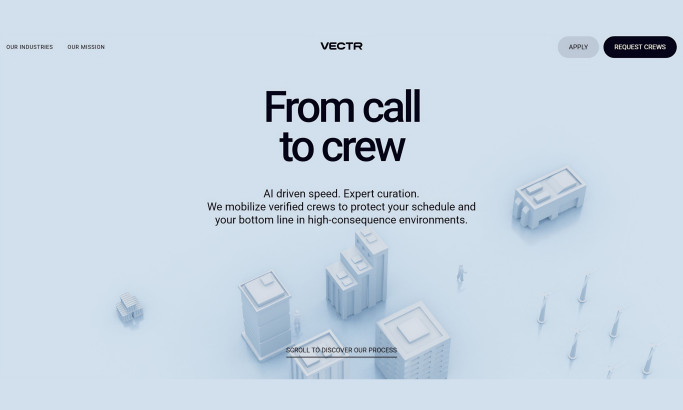
Vectr Website Design
byUtsubo
View Design
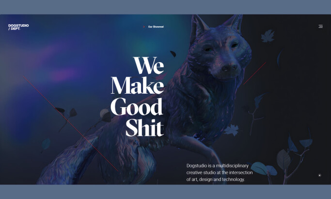
Dogstudio
byDept
View Design
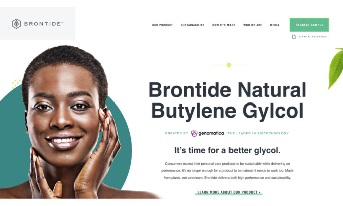
Brontide
View Design
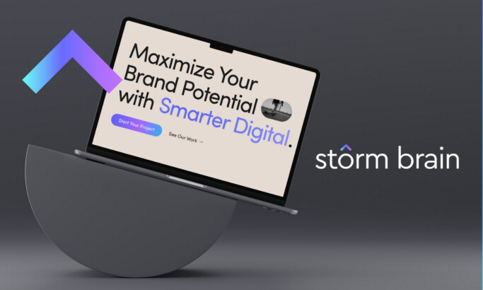
Storm Brain
View Design
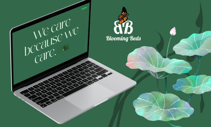
Blooming Beds
View Design
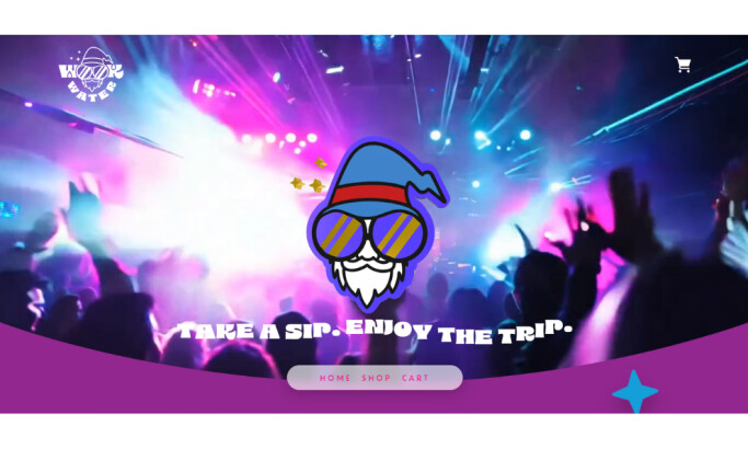
Wook Water
byByer Co

View Design
ELEVATE
Get Connected
With The Right Agency Partner
& Receive Proposals For FREE

View Design
Habitas

View Design
Portion Engaging

View Design
Royal Caribbean

View Design
Nooflow

View Design
Desires Tram

View Design
Nike React Build Your Own Product

View Design
Max Chocolatier

View Design
Jackie

View Design
Shopskin
Ready to elevate your designs?