DANZAN Website Design by JIEJOE
DANZAN is an interactive street culture project by JIEJOE that blends samurai imagery with rebellious visual storytelling. Built around the idea of “slicing” through fake and conventional design rules, the project uses destruction as a symbolic act to reveal authenticity, individuality, and raw creative expression through a dark, layered artistic world.
Beige webpage features a black samurai silhouette and text
Interactive silhouette centers stark minimalist layout and instructional typography
Vivid banner displays a samurai silhouette against a sun.
Vibrant vector composition contrasts bold typography against striking hues
This website uses a colour palette of 4 colours
  • #E00000
  • #FFD300
  • #2C5559
  • #1F1F1F
Technologies & Tools
Description
Team Behind the Design
  • Agency: JIEJOE
  • Category: Website Design
  • Location: China
  • Project Brief: Design an arts website that transforms samurai-inspired storytelling and experimental visuals into an immersive interactive digital experience.

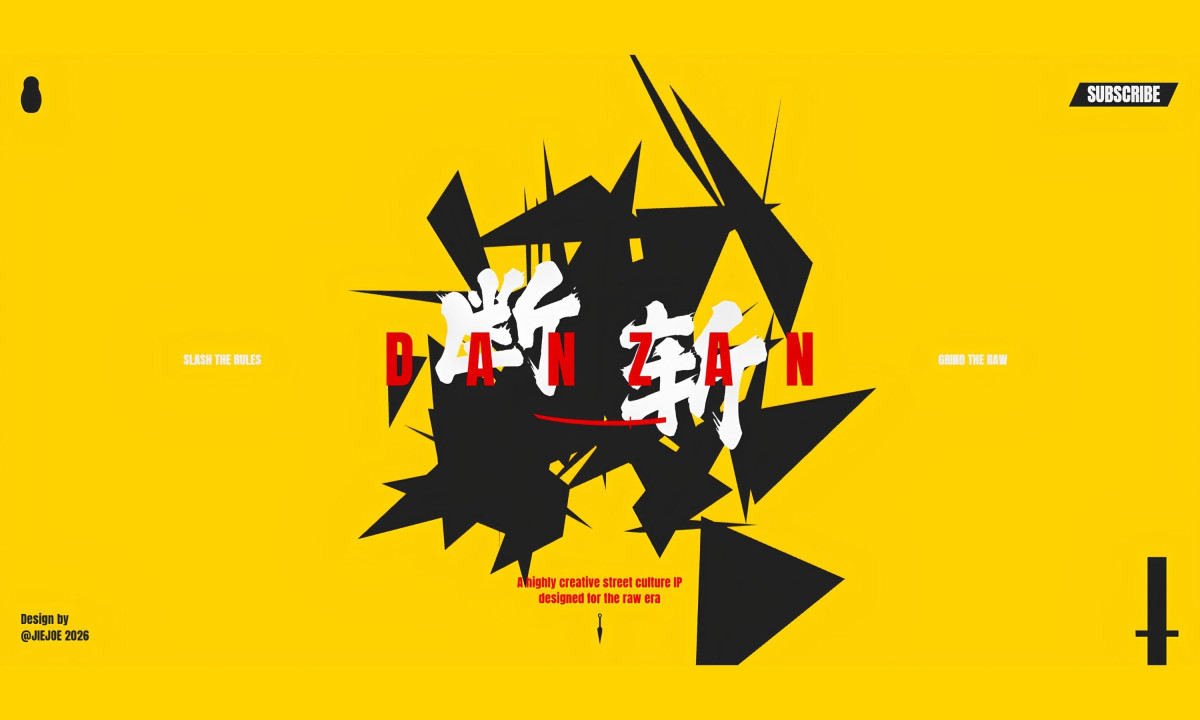
A street culture website lands hardest when the interaction itself carries the brand's attitude. DANZAN, designed by JIEJOe, opens on electric yellow with a fractured black mass at its center, Chinese characters and bold red Latin type colliding mid-explosion.

The yellow alone is a statement: it's the same confrontational shade that runs through Kill Bill, and it sets the same expectation of controlled, stylized violence before a single word is read.

The site scrolls vertically through distinct visual worlds, each section functioning like a scene change rather than a page. Moving through DANZAN feels like cutting through something, which is exactly what the IP is built around: violence aesthetics used not to glorify gore but to brutally dismantle fake design conventions and expose what's underneath.

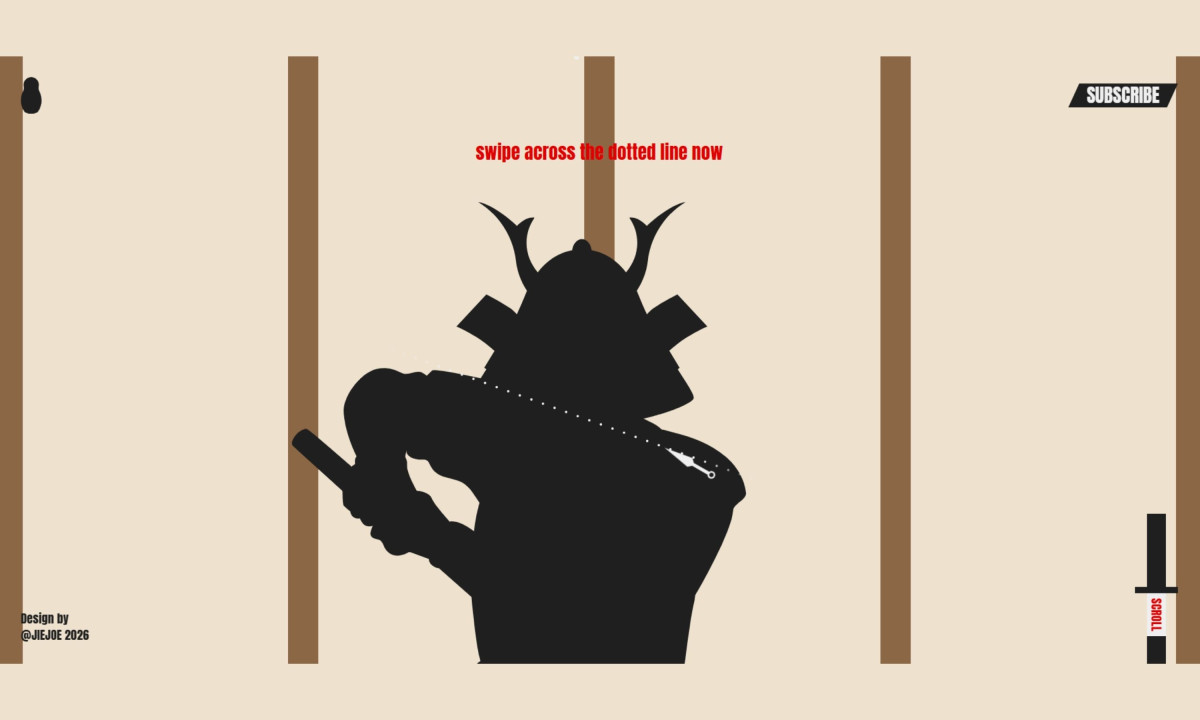
A samurai silhouette with a dotted katana blade and the prompt "swipe across the dotted line now" turns a gesture into a slicing action. The interaction isn't decorative: it makes the user complicit in the philosophy. Sections shift between electric yellow, raw parchment and deep teal, each palette change landing like a scene cut.

The deepest layer of the site, Layer 4, exposes the brand's core values through anatomical imagery: brain, lungs and heart rendered raw. JIEJOe uses the matryoshka as the central metaphor, shattering the outer shell to reveal what's inside. The site performs that same logic structurally, moving the visitor deeper with every scroll.

Vote for the best design in this year's Design Awards and help decide which projects deserve top recognition. Every vote contributes to celebrating creativity and craftsmanship across categories like web, branding, product, and digital design.
Podium Website Design by San Rita

Podium

Designed bySan Rita
DANZAN Website Design by JIEJOE

DANZAN

Designed byJIEJOE
The Find Atelier Website Design by Purvish Prajapati

The Find - Atelier

Luke Drummond-Dupuis Website Design

Luke Drummond-Dupuis

Found Brand Agency Website Design

Found Brand Agency

Qodeca Website Design

Qodeca

Designed byQodeca
SkyHighGrowth Website Design by Jungle Creatives

SkyHighGrowth

Designed byJungle Creatives
Taco Culture

Taco Culture

Designed byBig Red Jelly
NAI NorCal Mitchell Warren Team Website Design

NAI NorCal Mitchell Warren Team

Designed byCalico Marketing
View All BestWebsite Designs

Ready to elevate your designs?