- Agency: Tiny Coast Digital
- Client: Emily Durham
- Category: Website Design — Portfolio
- Location: Vancouver, Canada
- Project Brief: Redesign Emily Durham’s website to deliver a cohesive personal brand experience through clear structure and engaging visuals.
Emily Durham has 3 million followers, a podcast, a book, and a coaching business. The website's job is to make all of that feel like one person, not four separate products. Tiny Coast Digital solved it by building the site around Durham's personality rather than her resume.
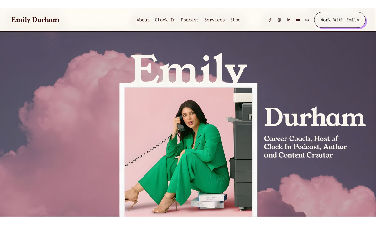
The hero makes the tone obvious. Durham in a green power suit, crouching by a filing cabinet, holding a corded phone, shot against pink clouds on a purple-to-pink gradient. The typography splits her name across the photo, using a large, high-contrast serif with visible stroke weight. It reads editorial, not corporate. That's the design decision that sets the whole portfolio website apart from the standard career-coach template.
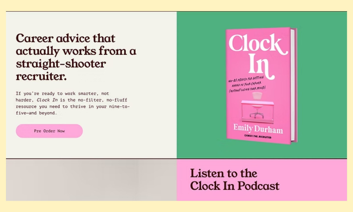
The color system runs bold. Pink, green, purple, lavender, and butter yellow rotate across sections, each one matched to a different content vertical: the book gets pink and green, the podcast gets pink, the media section gets lavender with pink accents.
The palette is louder than most personal brand sites because Durham's content voice is louder than most personal brands. The design matches the energy instead of taming it.
The site organizes five revenue streams (coaching, podcast, book, speaking, content) across a flat nav with five labels: About, Clock In, Podcast, Services, Blog. A "Work With Emily" CTA in a purple-outlined button sits at the top right of every page. The structure stays simple because the content volume is high. Users arriving from a TikTok or Instagram reel need to find the relevant product in one tap, not three.
The book section pairs "Clock In" with a pre-order CTA on a split green-and-cream layout. The media credibility bar runs a scrolling marquee above embedded social content. Durham's 3M+ follower count sits in a purple flower-shaped badge. The site treats social proof as a design element, not a footnote.
Tiny Coast Digital built a personal brand site that actually sounds like the person behind it. The design is confident, specific, and unapologetically colorful. For a recruiter who built her audience on directness, anything less would have been dishonest.