Team Behind the Design
Website Design Analysis
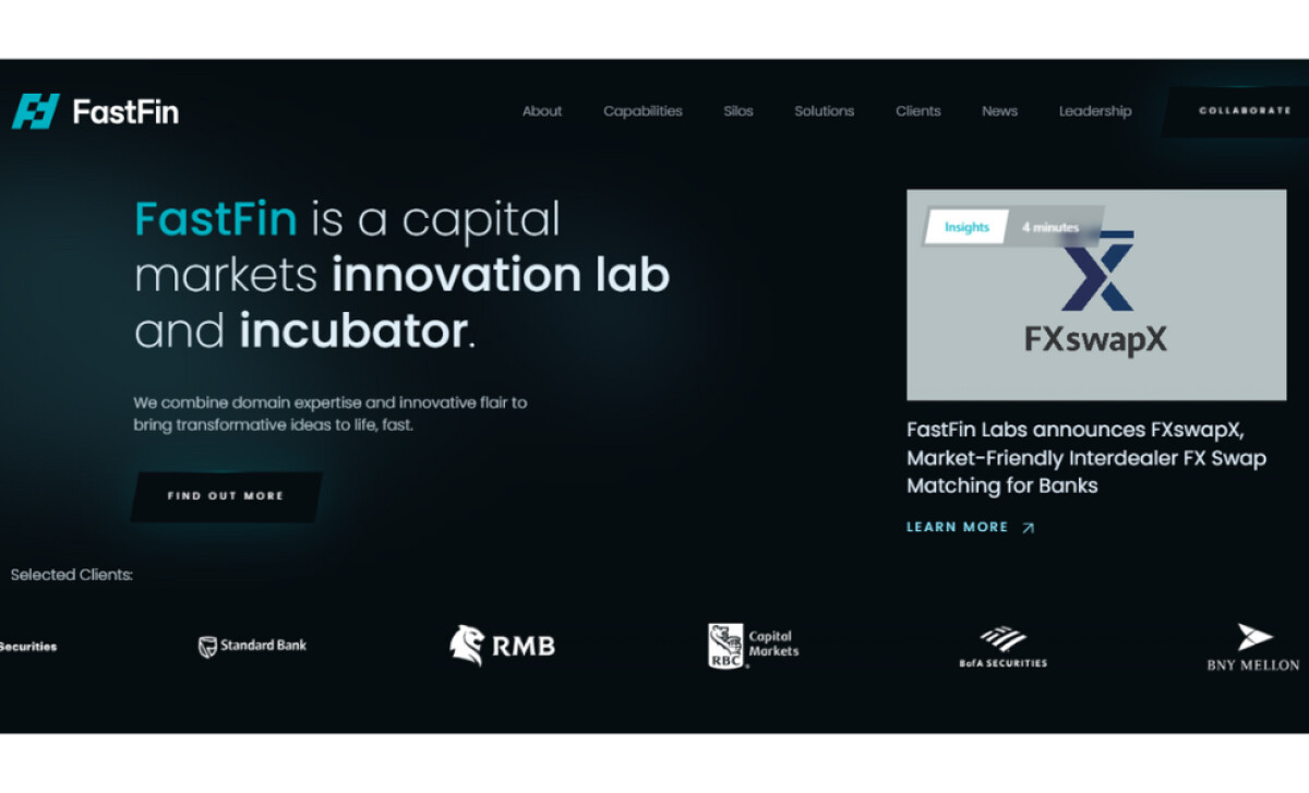
For fintech sites, I often look at how visual systems communicate trust, intelligence, and innovation.
FastFin’s website achieves this through a tightly controlled blend of light, geometry, and high-tech iconography.
- Gradient System: The teal-to-aqua gradient becomes a clear brand signature. I like how it creates focal points across modules while reinforcing the sense of acceleration and precision that defines FastFin’s work.
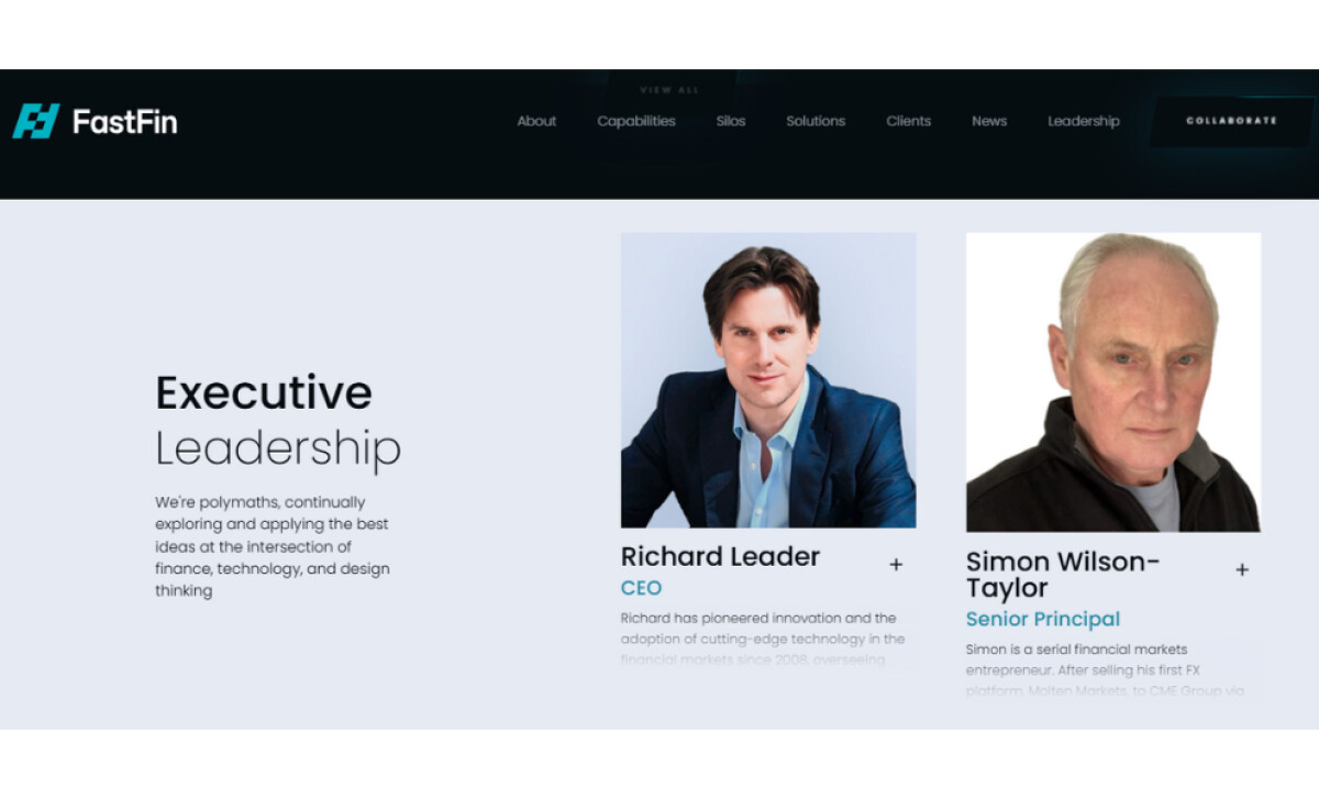
- Typography: The geometric sans-serif typeface delivers modernity and approachability. Its wide counters and clean hierarchy make dense financial concepts easier to navigate.
- Dark-Mode Atmosphere & Cinematic Depth: The charcoal-to-black interface feels premium. The soft vignette lighting is particularly effective in adding dimension without clutter — something I value in complex fintech UX.
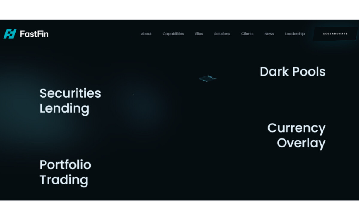
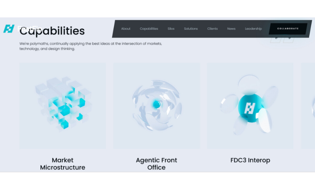
- 3D Icons: The translucent, refractive icons serve as conceptual metaphors for intricate market systems. Their material quality elevates the brand and helps explain abstract topics visually.
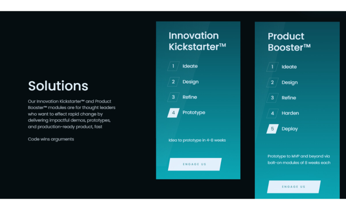
- Process Cards & Structural Transparency: The step-based modules communicate how FastFin accelerates innovation. I appreciate how the gradient panels and beveled CTAs make the process feel approachable and well-defined.
What Brands & Agencies Can Learn from FastFin
Here are a few lessons from how this website approaches fintech design:
1. Use Gradient Light to Signal Innovation Without Noise
Controlled luminance can guide attention and create a proprietary visual signature. It’s a powerful alternative to overly bright accent colors common in fintech.
2. Elevate Complex Concepts With High-Quality Technical Iconography
3D metaphors help users understand abstract financial systems. When executed with precision, they reinforce credibility and clarity.
3. Let Negative Space Create a Premium, Institutional Tone
Spacious layouts reduce cognitive load and communicate confidence. For fintech brands, this balance of restraint and sophistication is invaluable.
About DesignRush Featured Designs
At DesignRush, we review hundreds of digital projects each month, spotlighting work that merges creativity with technical precision. The featured designs stand out for concept strength, usability, and execution quality.
Only the most compelling projects advance to become Monthly Design Awards winners, recognized across global creative industries.
See more creative projects across categories:
- Best Website Designs
- Best App Designs
- Best Logo Designs
- Best Print Designs
- Best Packaging Designs
- Best Video Designs
For a full list of design agencies and related services, see our Agency Directory.


