Standout Features:
- Hero image with purpose-driven overlay
- Organized publication section
- Clear call-to-action hierarchy
Made In 13 anchors IIMS’s authority with a website that blends maritime grit and institutional polish. Designed for surveyors, members, and learners alike, the site strikes a balance between formality and function — with clarity taking the lead at every turn.
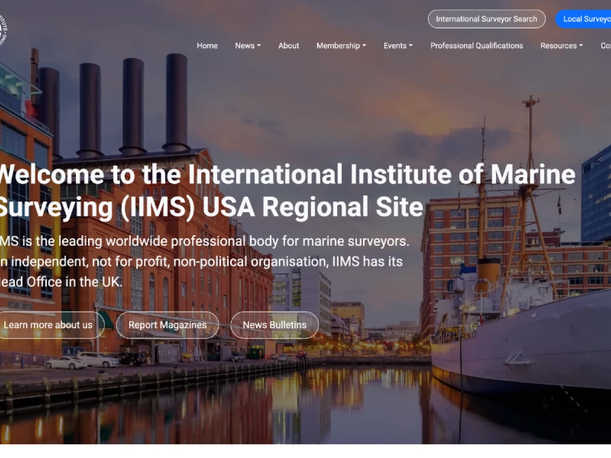
The homepage opens with a high-resolution photo of a docked ship flanked by city buildings, immediately situating the user in a professional maritime context. Overlaid is a bold welcoming headline and concise mission copy that builds trust within seconds.
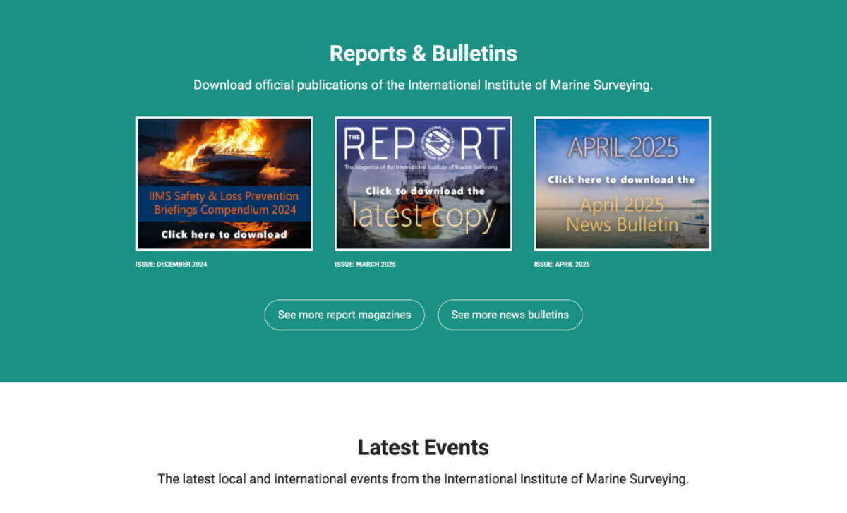
Further down, the Reports & Bulletins section offers a visual, card-style layout for downloadable publications. Each issue cover is custom-designed, turning what could be dry content into a compelling visual archive. The teal background helps this section stand apart without clashing with the site’s clean palette.
Navigation is clear and functional. Dropdowns organize dense information under clean headers like “Membership,” “Events,” and “Professional Qualifications.” Every click feels intentional, reducing friction for a specialized audience that often visits with a task in mind.
Made In 13 has engineered a platform that reflects the professionalism of IIMS while enhancing its usability for a global audience. It’s a site that understands its users — and stays mission-focused from the hero banner to the footer.