Three, two, one…blast off! Prepare to be transported to a whole new dimension with this highly interactive 3D art project, dedicated to the history of space exploration.
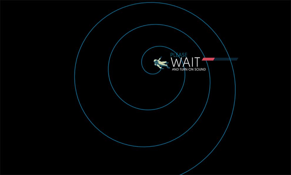
The site’s loading page sets the scene for the transient narrative that’s to come. The muted color palette, sleek typography, and retro graphics all work together to create a vintage-inspired theme. By reducing the size of the astronaut graphic and using animation, the site immediately invokes a sense of floating through space. Then the audio begins—a transient, and somewhat eerie loop offset by radio transmission sounds—adding depth to the total user experience.
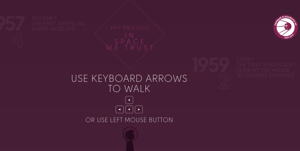
From here, the header’s background color fades to a twilight-like shade of purple. The UI elements are made explicitly clear: a shadowed figure appears bottom-center, layered with minimalistic typography and simple arrow graphics. These keyboard graphics, paired with the shadowed figure, transmit the retro vibes of an old-school video game.
The white text and geometric graphics provide a sharp contrast and immediately draw the user’s eye to the center focal point. The remaining text is set in varying shades of purple, reducing readability and giving the user just a hint of what this experience is about. Minimal navigation elements eliminate distraction and clutter. The user has little choice but to start walking.
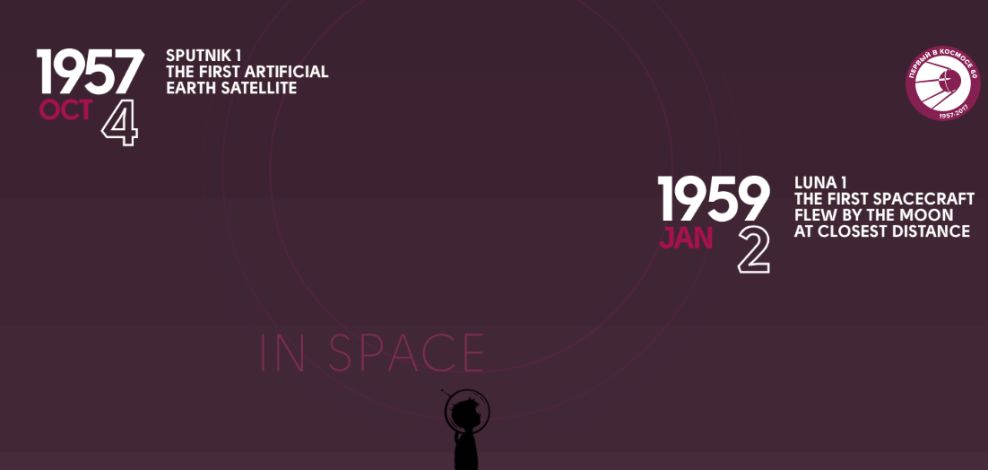
And so, an interactive timeline begins. The transient audio loop continues to play, while typography slides and animated images add more layers of depth to the total user experience. No more than four colors are introduced on the screen at a time, keeping the clean, minimalistic aesthetic alive.
Important dates and snippets of information are consistently highlighted in stark white. Apart from the user’s arrow keys, the only other navigation element is the sticky button placed at the top right of the screen—the project’s company logo, which doubles as a homepage button.
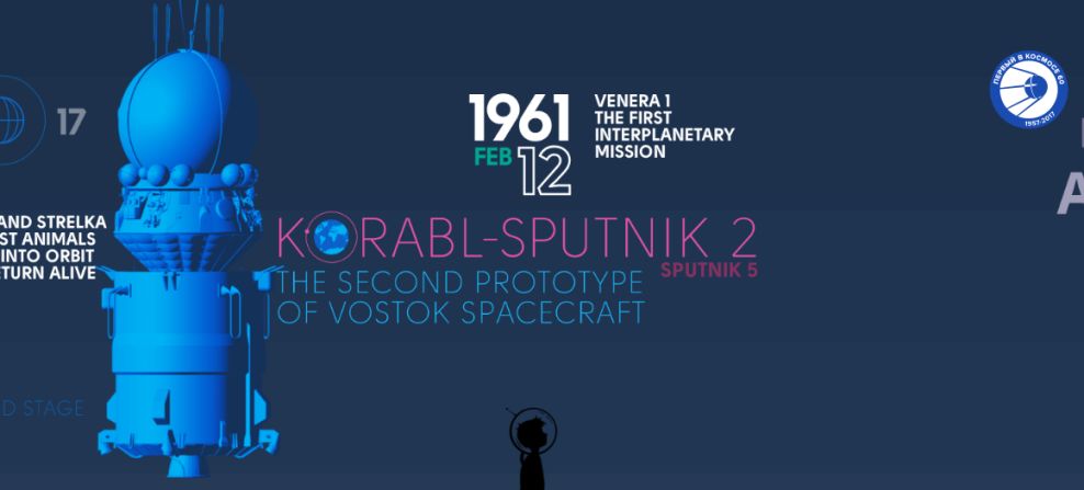
As the interactive journey through space continues, the background color gently shifts to various twilight-inspired shades of blue, purple, and orange. Visuals, including animations, graphics, and typography, seamlessly shift together and are always kept in the same color family as the background. Coupled with the transient audio, these elements truly invoke a sense of floating through space.
The sticky navigation button remains at the top right corner and acts as the user’s only escape route. Minimizing distraction and options, the user is gently forced to keep moving forward in their exploration.
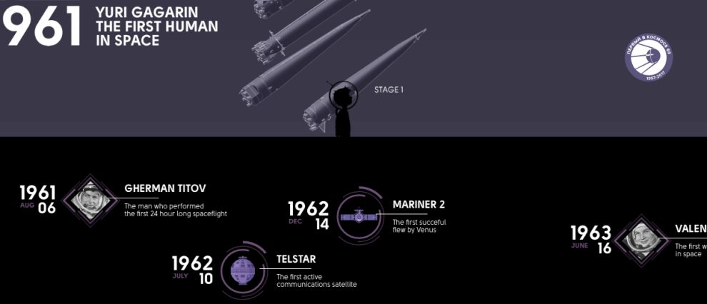
If the user happens to scroll down, a horizontal split occurs. The shadowed figure now becomes the center focal point. The bottom half of the screen goes black and is layered with clean graphics and typography, continuing the previous elements from the header.
The top half of the screen is now solely devoted to moving images and graphics—no text or type. This contrast keeps the aesthetic clean, while creating a dynamic tension that propels the user forward in their exploration of space. This site proves that knowing how to layer animations, audio, and typography, while also minimizing navigation elements and clutter can create a deeply (and literally) moving interactive experience.
In Space We Trust is an awesome website design in the Aerospace industry.