Team Behind the Design
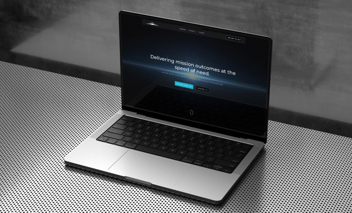
Sentinel Horizon delivers fast, mission-critical outcomes, bridging the gap between government and private sectors. Whiskey and Red’s redesign creates an identity that conveys precision, clarity, and capability through a sleek, minimalist website.
The result is a dynamic online presence that reflects the brand’s commitment to high performance, operational excellence, and agility.
Website Design Analysis
In evaluating aerospace website designs, I focus on how effectively the design communicates expertise, authority, and usability.
Sentinel Horizon’s website succeeds by combining sophisticated color choices, sleek typography, and interactive elements that embody speed and precision without overwhelming the user.
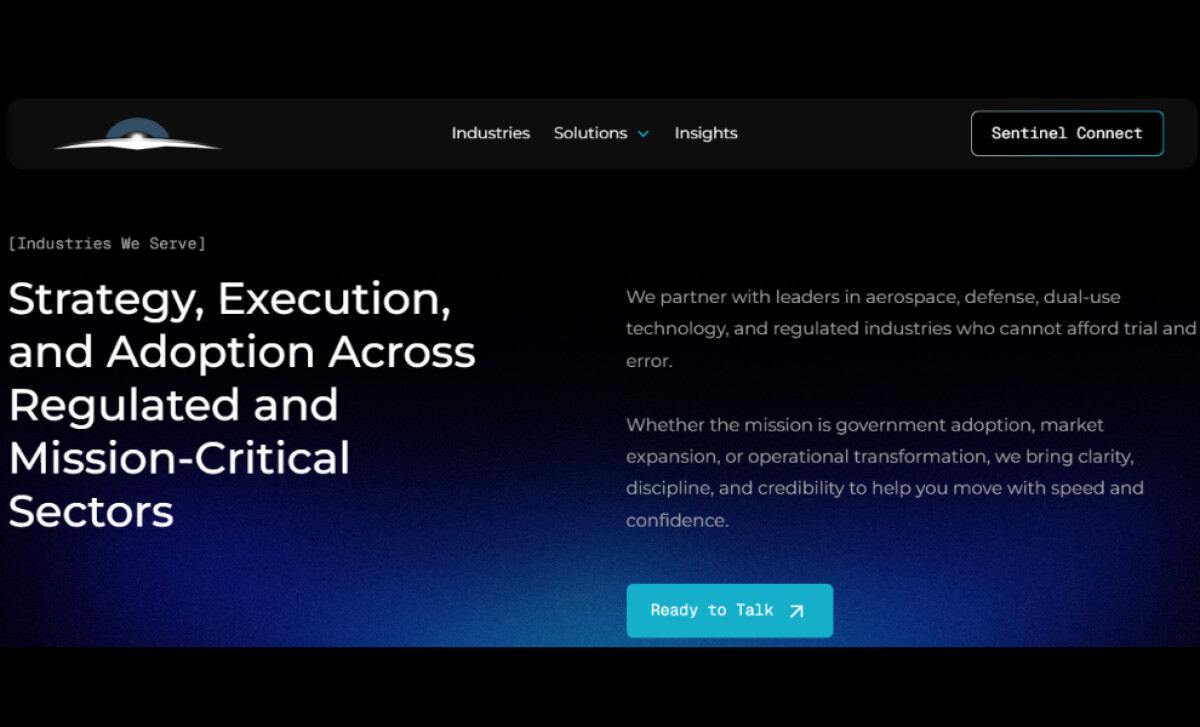
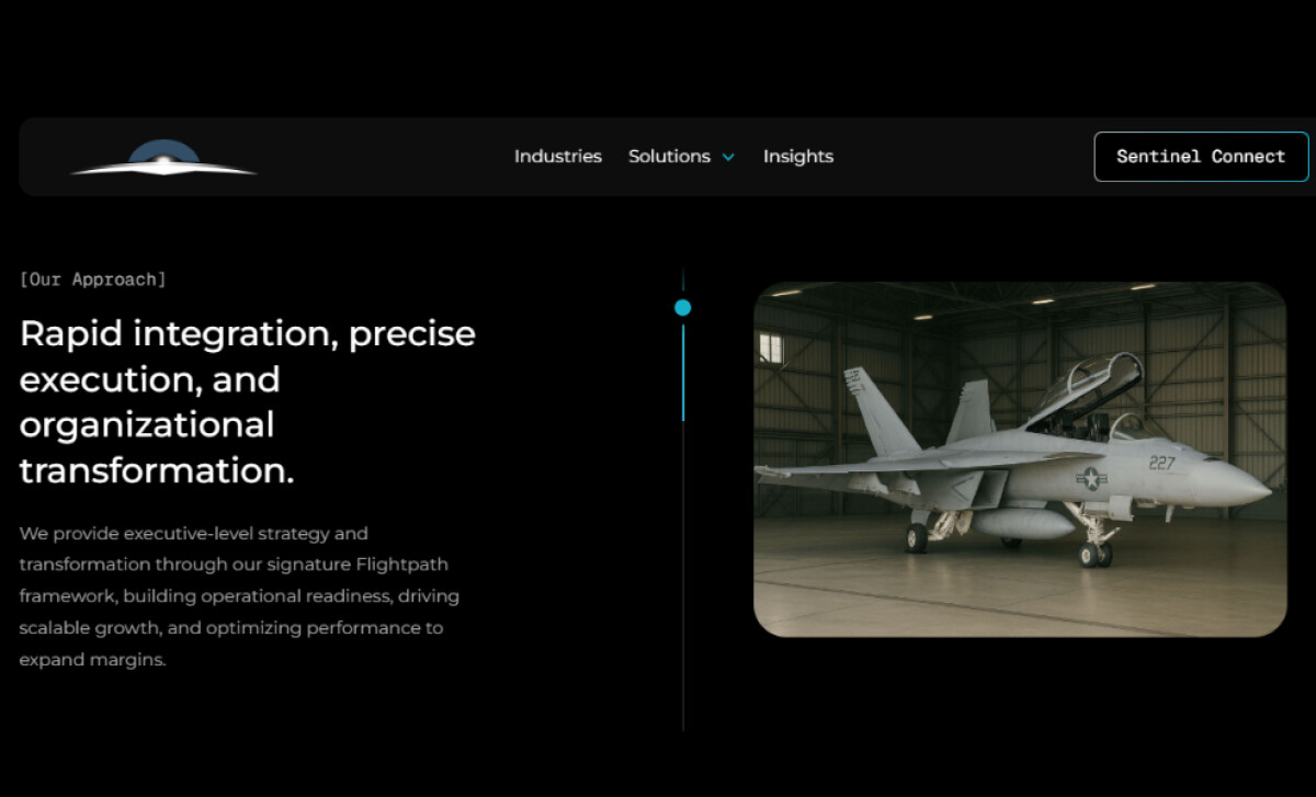
- Futuristic Color Palette and Gradients: The website features a gradient-heavy palette, with deep blues transitioning to lighter, electric blues, paired with subtle background animations. I love how the gradient not only conveys technological sophistication but also mirrors the brand’s focus on clarity and forward-thinking capabilities.
- Minimalist Layout with Strong Typography: Whitespace is plentiful, allowing typography to shine. Large, bold headings in modern, geometric sans-serif fonts give a sense of stability and professionalism. I appreciate how the clean lines and bold typography create a clear hierarchy, making complex information more digestible and easier to navigate.
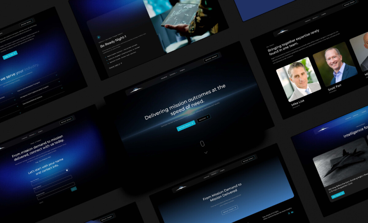
- Dynamic Micro-Animations on Scroll: Subtle animations, like text fading in and images sliding into place, bring extra movement to the website. I like how these animations are used with restraint, keeping the focus on the content while enhancing the user experience. The transitions' pace matches the company’s dynamic nature.
- Strong Visual Storytelling Through Imagery: Images of military personnel, aircraft, and high-tech equipment tell a story of operational precision and readiness. These visuals feel authentic and powerful, aligning with the brand’s mission to provide mission-critical solutions while emotionally connecting with the target audience and reinforcing trust.
What Brands & Agencies Can Learn from Sentinel Horizon
Here’s what brands and agencies can take away from this project to elevate their own digital presence:
1. Use Futuristic Colors to Signal Precision and Modernity
By employing deep blues and gradient transitions, Sentinel Horizon conveys technology, trust, and forward momentum. Agencies can adopt similar palettes to communicate cutting-edge innovation and professionalism in industries like defense, tech, or consulting.
2. Minimalist Design Creates Clarity and Focus
When working with complex, high-stakes content, minimalism allows the key message to shine through without distractions. Whiskey and Red’s design proves that a clean, spacious layout paired with strong typography can simplify even the most intricate topics.
3. Micro-Animations Add Life Without Clutter
Subtle animations enhance the experience without stealing the spotlight. This technique can make any website feel modern, interactive, and engaging, enhancing user retention and overall brand perception.
About DesignRush Featured Designs
At DesignRush, we review hundreds of digital projects each month, spotlighting work that merges creativity with technical precision. The featured designs stand out for concept strength, usability, and execution quality.
Only the most compelling projects advance to become Monthly Design Awards winners, recognized across global creative industries.
See more creative projects across categories:
- Best Website Designs
- Best App Designs
- Best Logo Designs
- Best Print Designs
- Best Packaging Designs
- Best Video Designs
For a full list of design agencies and related services, see our Agency Directory.