Standout Features:
- Clean and clear typography
- Smooth scroll and subtle animations
- Microinteractions that build user confidence
Kuna Capital’s website, designed by Polonio Agency, sets a fresh standard for financial platforms in Mexico. Clean visuals, seamless navigation, and subtle animations work together to build trust at every scroll. Every element — from typography to microinteractions — feels intuitive and credible.
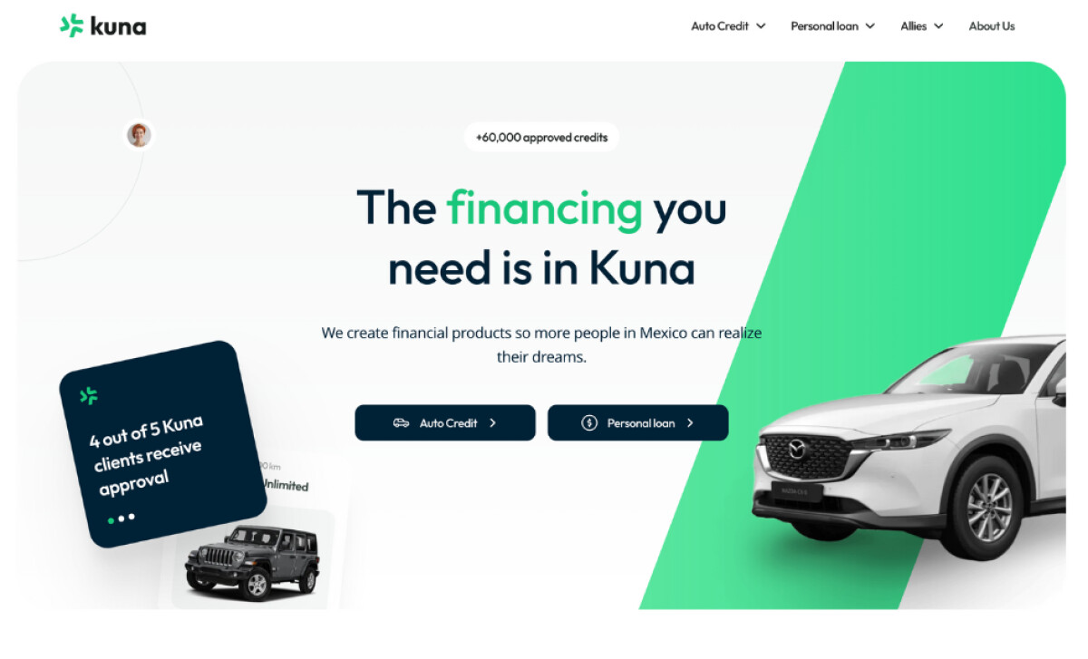
Typography plays a crucial role in making financial topics feel accessible. Modern, rounded typefaces create a friendly tone, while strong visual hierarchy keeps users focused. Bold headlines draw the eye to key points, helping Kuna establish a clear, no-nonsense voice that feels current and trustworthy.

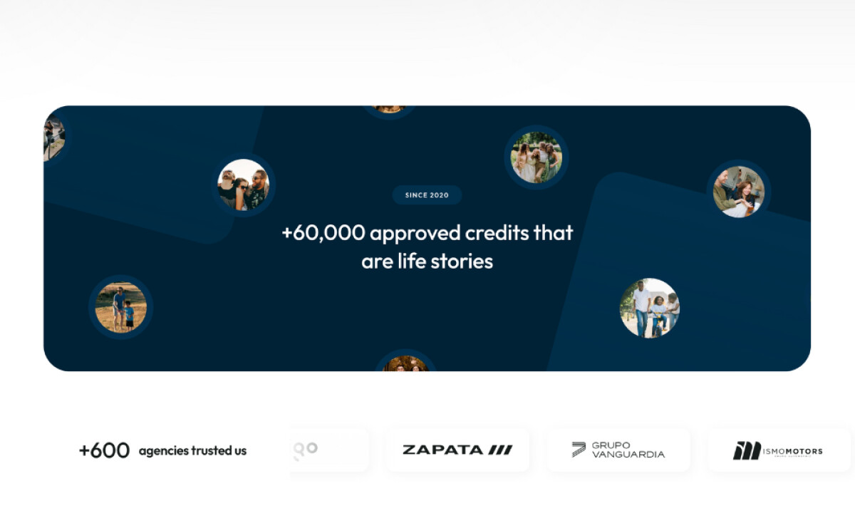
Movement on the site feels light and purposeful. Smooth scroll animations bring key numbers to life, while a quiet ticker tape reinforces brand credibility through trusted partner logos. These touches guide users naturally without distracting them from the main content or goals. Additionally, microinteractions bring a responsive, human feel to the site. Hover effects and instant feedback on buttons like "I want my credit" make the platform feel alive. Built fully on Webflow, the site also gave Kuna the agility to expand faster, with results like a 46-second rise in session time and a tripled campaign launch speed.
Kuna Capital’s website proves that design, branding, and smart tech can drive real business impact. By creating a confident identity and removing operational friction, Kuna moves faster and builds deeper trust. It's a strong reminder of what the best website design can truly achieve when built around clear goals.
-preview.jpg)
-preview.jpg)

-preview.jpg)