- Agency: White Coat Web
- Client: Magnolia Dermatology
- Category: Website Design — Health & Wellness
- Location: Sugar Land, Texas, United States
- Project Brief: Redesign Magnolia Dermatology’s website to create a more patient-friendly digital experience that reflects the practice’s personalized and family-oriented care.
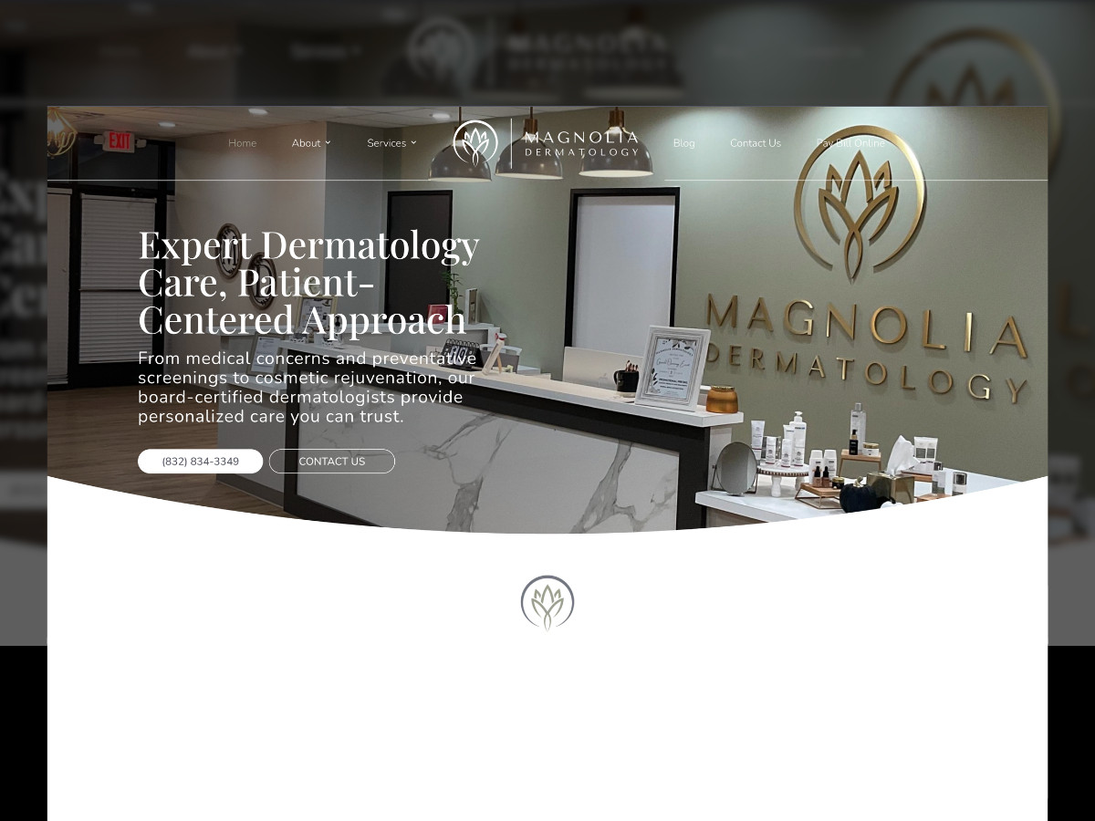
A dermatology website lives or dies on whether the practice looks like somewhere you'd let near your skin. Magnolia Dermatology's site by White Coat Web swaps the old template build for real photography of the Sugar Land office and team, shot in the same sage tones as the lobby walls behind the front desk, which sets the visual tone before a single service is named.
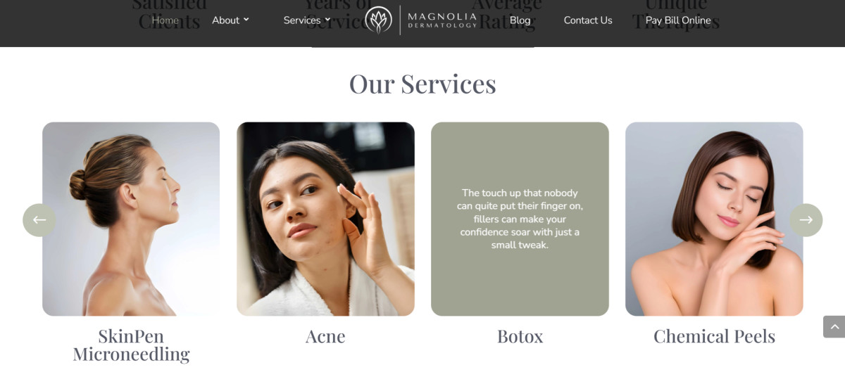
That tonal groundwork carries into how services are presented. Each one lives inside a hover-flip card that turns over to reveal a muted green tile with a line of copy where the photo was, so the directory becomes something patients explore rather than scan past.
Typography reinforces the same balance, with section headers in a tall serif and the rest of the UI kept rounded. The pairing gives the health and wellness website an editorial register without the institutional stiffness most dermatology sites carry by default.
The same warmth extends to how the practice introduces itself. The team page renders as one group portrait with a marker over each provider that opens their bio, and patient reviews land as quote cards instead of stacking into a wall of testimonials.
Navigation closes the loop on patient convenience. Three contact paths run in parallel, with the phone number in the header, a contact button next to it, and online scheduling further down the page, so patients pick whichever channel they already prefer instead of being routed through a single form.