Standout features:
- Concise messaging
- Symmetrical, user-friendly layout
- Google Maps integration
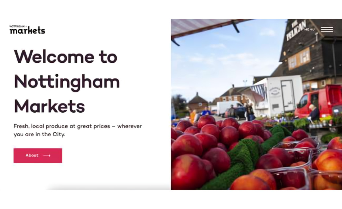
The website for Markets of Nottingham, designed and developed by Framework Design agency, is remarkably simple in its layout and usability. Large, prominent fonts and symmetrical grids align all elements.
The super-menu opens full-screen navigation that contains links to the website’s pages on the right and illustrated links to the market’s various locations on the left. Above the fold, an image from the market and a simple message with a CTA greet the visitor.
Scrolling down, the user discovers more about each market and reads the latest news and sellers’ impressions. An integrated Google map of the market’s location provides a more convenient user experience, while the mostly white design with a select array of accent colors keeps everything well-grounded.
-preview.jpg)