- Agency: Mushy Media Group Ltd
- Client: Metroflex
- Category: Website Design — Health & Wellness
- Location: Bicester, United Kingdom
- Project Brief: Design and build a high-conversion website for a private personal training gym that clearly communicates services, builds trust, and removes friction between discovery and booking a consultation.
In the wellness sector, digital experiences often lean on soft, aspirational aesthetics.
Metroflex succeeds by deconstructing the gym experience into bold typographic experiments that prioritize urgent calls-to-action and direct user engagement.
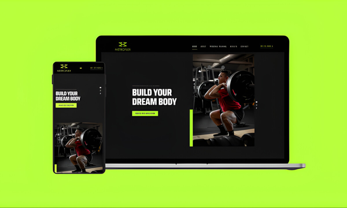
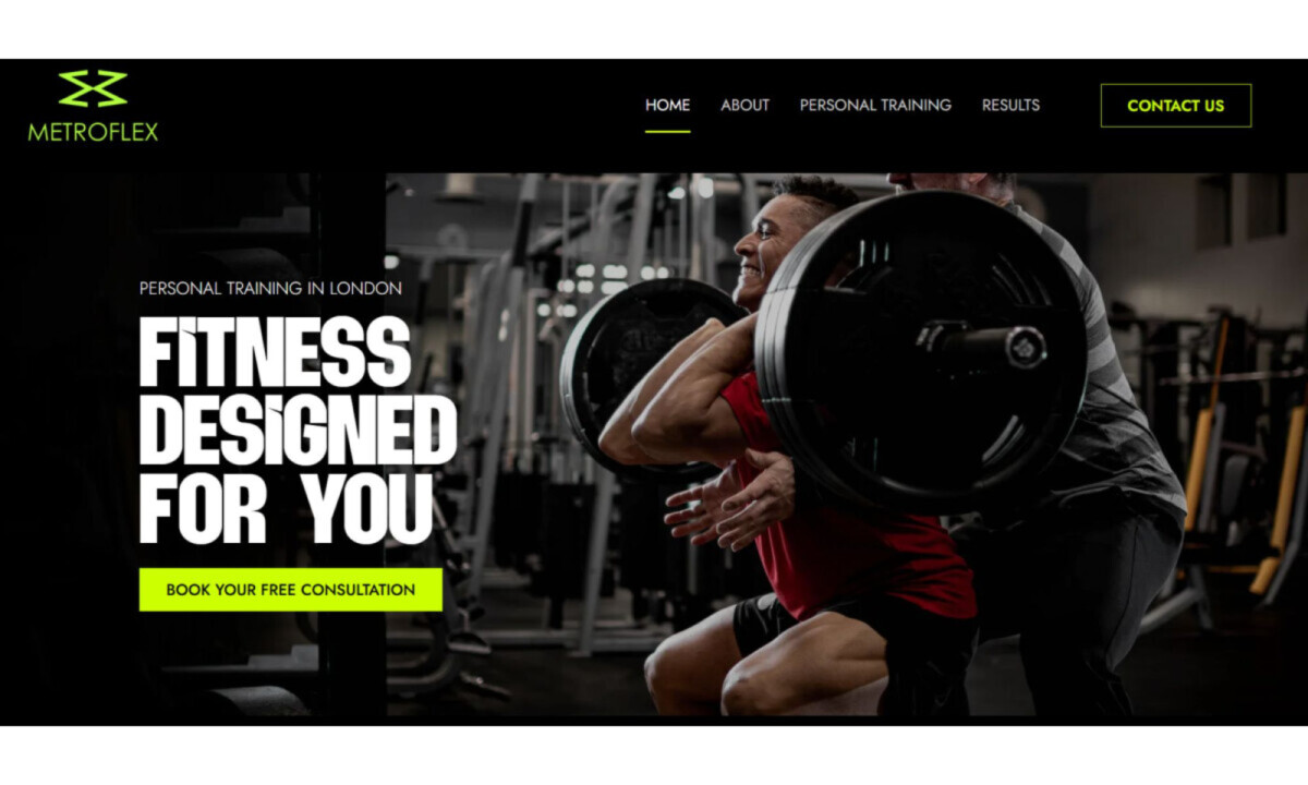
- Conversion-First User Flow: The site structure prioritizes immediate clarity with strong hero statements and minimal navigation depth. I believe this effectively funnels users toward booking a consultation without overwhelming them with unnecessary choices.
- Typography & Visual Hierarchy: Large, condensed headlines and stark contrast establish a sense of authority and urgency. I find this approach ensures that key programs and outcomes are impossible to miss, mirroring the intensity of a serious training environment.
- Imagery & Brand Intensity: High-contrast photography of real training moments reinforces credibility by showcasing genuine discipline. I think the use of authentic visuals over stock photography positions the brand as hands-on and results-oriented.
- Interface Design & Usability: A dark UI paired with neon accents creates a high-energy experience that remains usable across all devices. I appreciate how the simplified forms and short content blocks reduce hesitation at the critical point of conversion.
What Brands & Designers Can Learn from Metroflex
1. Design the User Flow Around Immediate Action
Strong hero messaging and shallow navigation funnel users directly toward booking. Reducing choice at the top of the experience increases conversion confidence.
2. Use Typography to Convey Intensity and Authority
Large, condensed headlines and high-contrast layouts mirror the seriousness of the training environment. Typography can set expectations before any copy is read.
3. Reinforce Credibility Through Authentic Imagery
Real training photography builds trust and positions the brand as hands-on and outcome-driven. Authentic visuals outperform polished stock when results matter most.