Standout Features:
- Utility-first icon system for navigation
- Split-tone blue UI for service differentiation
- Scannable microcopy and list formatting
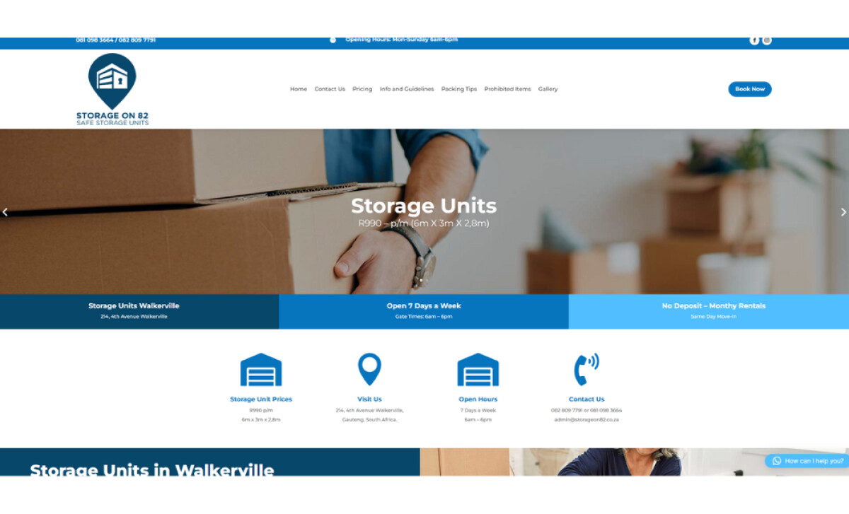
The website for Storage on 82, designed by Web Dynamix, is a perfect example of a design that serves its purpose and is built for a service where clarity and accessibility are paramount.
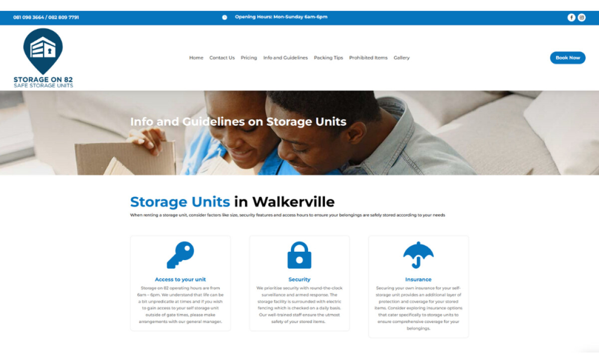
Across the site's key content sections, the design uses bold and simple icons. You'll see a lock, a key, and a location pin, all rendered in a solid blue and set within uniform white cards above their corresponding text.
This iconography gives users immediate cognitive access to the site’s structure. This is especially valuable for a self-storage business, where users are often making practical decisions quickly. The icons help to reduce overwhelm and guide the eye.
A split-tone blue user interface is used to organize information on this professional services website. The hero section and other key areas feature horizontal stripes of navy, royal, and sky blue. This helps to separate different types of content visually.
This is a very smart and effective design choice for this type of service. The color stratification supports accessibility, and the use of blue is strategic for building trust, as 54% of consumers identify it as the most trustworthy brand color. It’s a design that is built for a broad demographic.
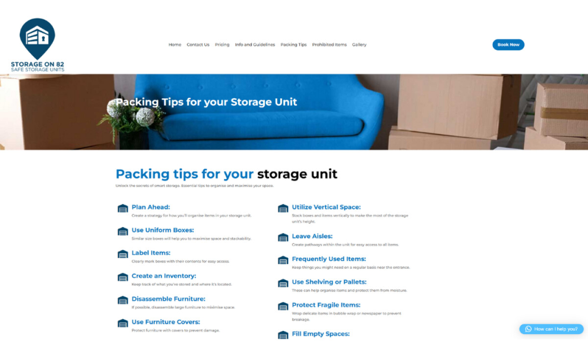
You'll find a very user-friendly "Packing Tips" page that uses a grid of bulleted lists. The tips are broken down into small, digestible chunks with bold subheaders. The language is simple and easy to understand for any reader.
By treating the content formatting as a design task, Web Dynamix empowers the user. The layout allows you to find actionable tips and helps to build trust through transparency.
The Storage on 82 website is a solid example of user-centered design where practicality outranks flash. The key lesson here is that for a service-based business, a clear and functional website is often the most effective marketing tool.
A website for a service business doesn't need to be flashy; its main job is to be clear, functional, and helpful to your customers.
That's why brands turn to expert partners, and our team has ranked the best agencies worldwide to make finding them simple.
Visit our Agency Directory for the Top Web Design Companies, as well as:
Our design experts also recognize the most innovative design projects across the globe. Visit our Awards section to see the best & latest in website design.