Standout Features:
- Bold duotone gradient backgrounds
- Modular information blocks
- Concept-driven visual messaging
This website by Thomas Gress represents Strrom, a company that combines solar and building technology expertise through Renergo and ROM Technik.
The design's goal is to position Strrom as a top provider of photovoltaic and storage systems in Germany. This online presence is paramount, as websites are key touchpoints in the B2B world, where 56% of buyers start their research directly on vendor sites.
It achieves this with bold visuals and a structure that makes complex energy solutions accessible.
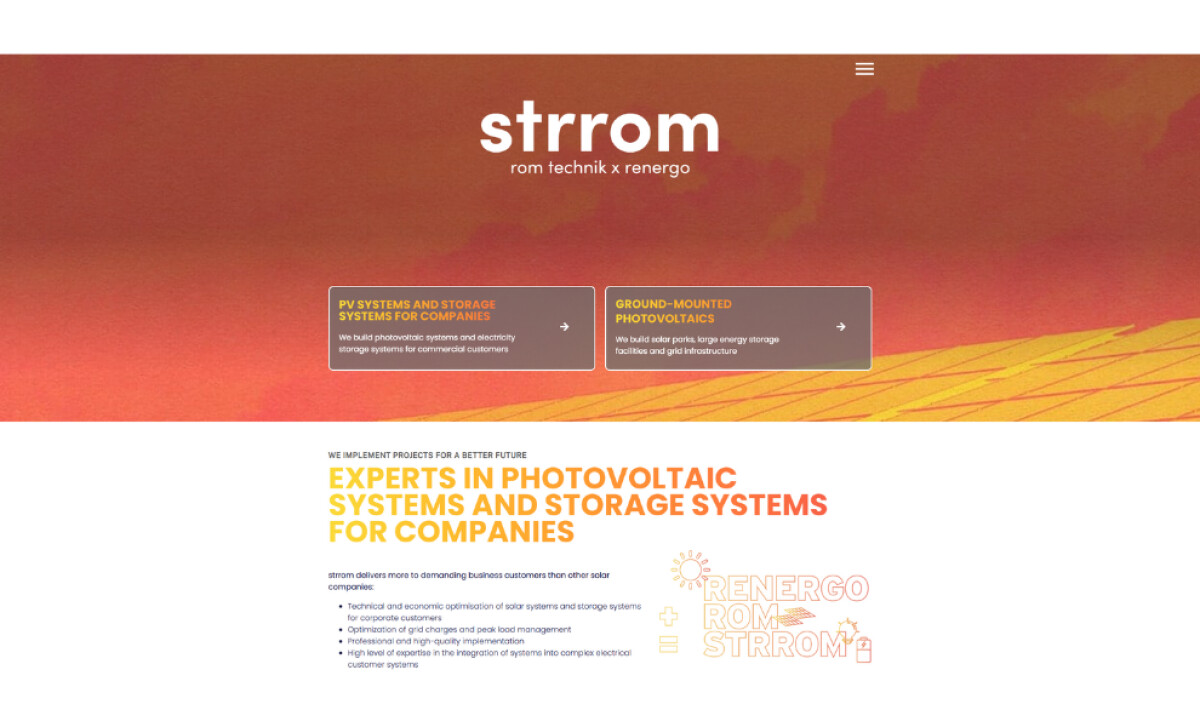
A bold duotone gradient — orange-red with a slight texture — characterizes the hero sections and callouts. This is combined with high-contrast headlines, where main messages use a yellow-to-orange gradient.
This visual strategy strongly communicates solar energy themes and the brand's dynamic purpose.
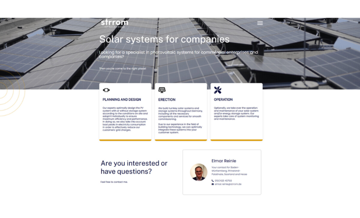
Modular information blocks, designed as cards, represent different service stages such as “Planning and Design.” These cards include icons, consistent padding, and a subtle warm yellow underline, maintaining a clear visual rhythm.
This structured approach makes complex offerings feel simple, methodical, and actionable for users.
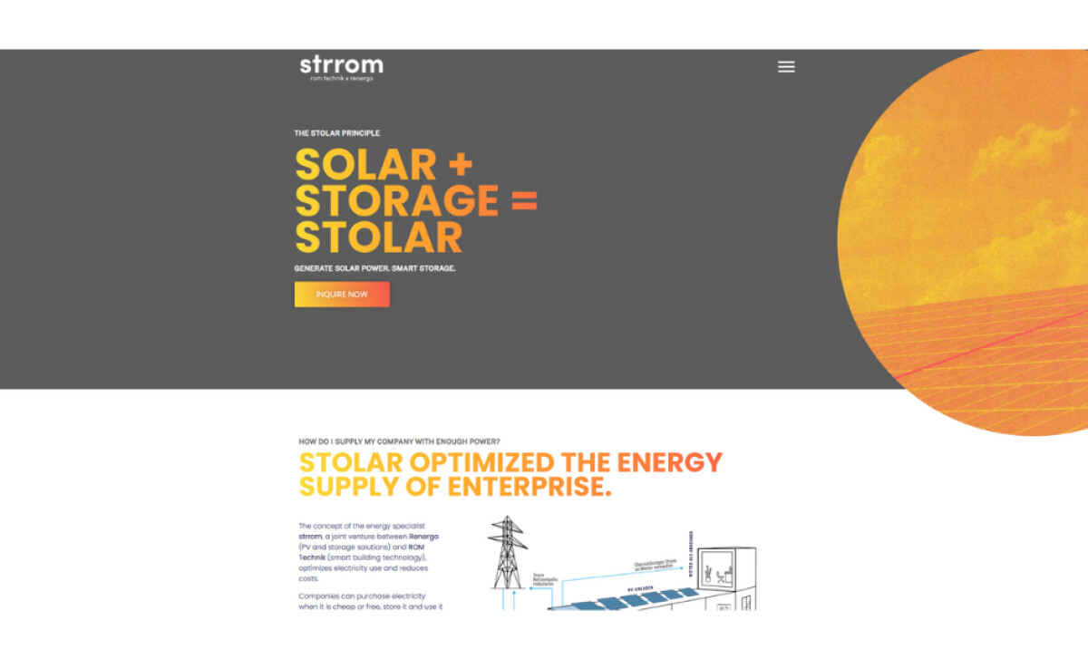
The homepage prominently features a memorable formula-style message in bold typography: “Solar + Storage = STOLAR.” This is paired with a call-to-action and supported by minimalist icon-based diagrams throughout the page.
This creative naming device compresses the company’s core value proposition into a repeatable brand shorthand.
Thomas Gress’s work for Strrom underscores that a successful B2B energy tech website and similar manufacturing website designs can be both functionally sharp and visually expressive.
The cohesive system of bold gradients, clear modularity, and unique conceptual messaging effectively positions Strrom as an approachable yet authoritative leader in a specialized industry.

-preview.jpg)