- Editorial storytelling builds emotional connection without sacrificing conversion.
- Interactive quizzes and warmth filters personalize product discovery.
- Typographic clarity and white space improve user comprehension and confidence.
Industry Insight: 75% of users judge a company’s credibility based on its website design, showing how crucial interface quality is for trust in high-performance product categories.
Editorial Layout Signals Product Confidence
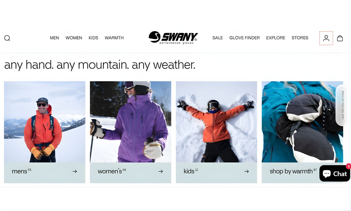
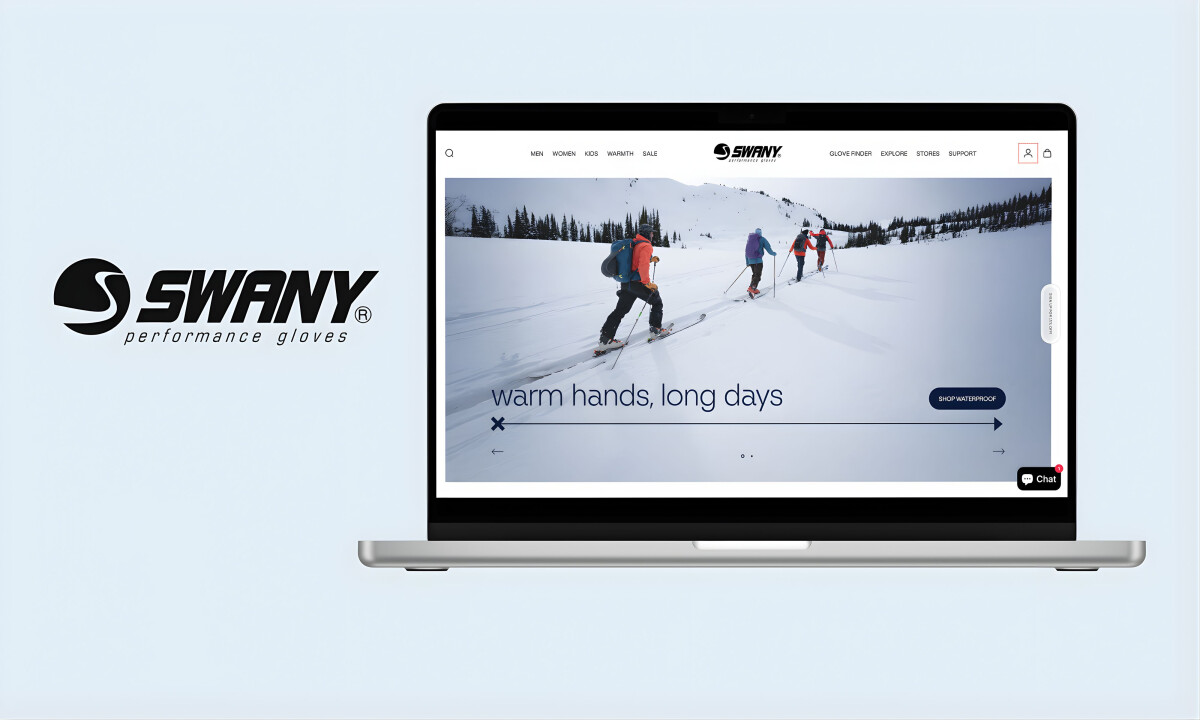
The homepage reads more like a magazine spread than a storefront. Large-format photography and brief lowercase headlines set an approachable tone.
Rather than crowding the space with promotions, this e-commerce website design invites users to slow down and engage emotionally.
This layout supports clarity and trust. Research from Smashing Magazine found that generous use of white space improves content comprehension by almost 20%, helping users process product messaging more effectively.
Andrea Owsinek-Brucker, DesignRush Awards Jury, praised it as:
"This site is exceptionally well designed, engaging, and offers so much more than just another shopping experience."
Intuitive Navigation Reduces Complexity Without Oversimplifying
The mega menu lets users shop by warmth, material, activity, or collection—whichever path makes the most sense. Each route feels clear and manageable, even with a large product catalog behind it.
According to Baymard Institute, 67% of leading ecommerce sites still rate as mediocre or worse in UX, showing how much work remains across the industry.
Swany’s architecture avoids this pitfall with thoughtful information hierarchy and flexible navigation paths.
Interactive Quizzes Personalize the Path to Purchase
Swany introduces a guided glove finder that asks about warmth preferences, usage, and audience. It helps customers make confident decisions without needing technical knowledge of insulation levels or materials.
The value of personalization continues to grow. PwC reports that 86% of buyers are willing to pay more for a better customer experience, reflecting a shift in how people define value online.
Design elements like this transform routine product selection into a more tailored, satisfying experience.
Product Pages Prioritize Clarity and Confidence
The product grid is stripped of distractions. Clean backdrops, consistent image sizing, and visible ratings make it easy to compare options. Color swatches and warmth levels are presented clearly, reducing guesswork.
With U.S. ecommerce projected to exceed $1.2 trillion by 2026, shoppers are overwhelmed with choice. Clear product presentation and frictionless UI can be key differentiators.
Swany keeps the spotlight on the product while maintaining pace and usability across every page.
Check out the top ecommerce development companies to help you build outstanding online stores that prioritize user confidence.
What Brands & Agencies Can Learn from Swany
TMFL Studio’s work for Swany highlights how disciplined e-commerce design can build trust and drive conversion by aligning structure, tone, and messaging with real customer decision-making.
1. Design Around Real Decisions
Swany shows that focusing on how people actually choose products, like warmth, comfort, and use case, leads to clearer UX than feature-heavy layouts.
2. Let Restraint Build Trust
Leading with imagery and tone instead of promotions creates confidence early. That calm approach earns attention before asking for conversion.
3. Use Plain Language to Widen Reach
Clear, human copy makes the experience accessible to both experts and newcomers, expanding the audience without weakening credibility.