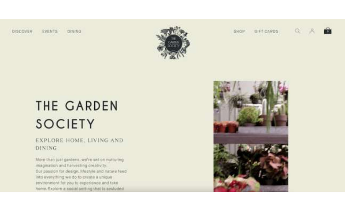
Standout features:
- An understated design above the fold, a bolder approach below
- A complex, intricate logo
- A speedy UI
A unique social setting that reconnects customers with nature in its cultivated and discerning form, The Garden Society website by JDD Agency embraces the utmost simplicity and consistent use of nature’s visual elements.
A very light shade of mint green sets the tone for what is an understated design overall, with the only ornament being the brand’s logo at the top. It separates the main navigation into two distinct halves, with plenty of space in between.
This white space philosophy continues throughout, with images and videos displayed mostly on a narrow, rectangular screen. The colors get somewhat bolder down the line, with olive green and dark red breaking the established order. Large boxes with stylish, modern fonts denote the premise’s main attractions.