Standout Features:
- Bold and approachable color palette
- Iconography that simplifies information
- Community-centered visual storytelling
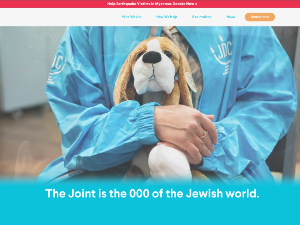
The Joint Australia’s new website, crafted by Creative Haus, invites visitors to become part of its story. Bright colors, clean organization, and action-focused messaging support the non-profit’s mission to inspire aid, build community, and foster involvement with clarity and heart.
Color plays a key role in setting the tone. Bright aquas, oranges, and pinks create a lively atmosphere that feels approachable, not heavy. Pops of color also highlight important actions like donations and service navigation points.
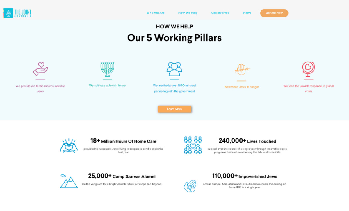
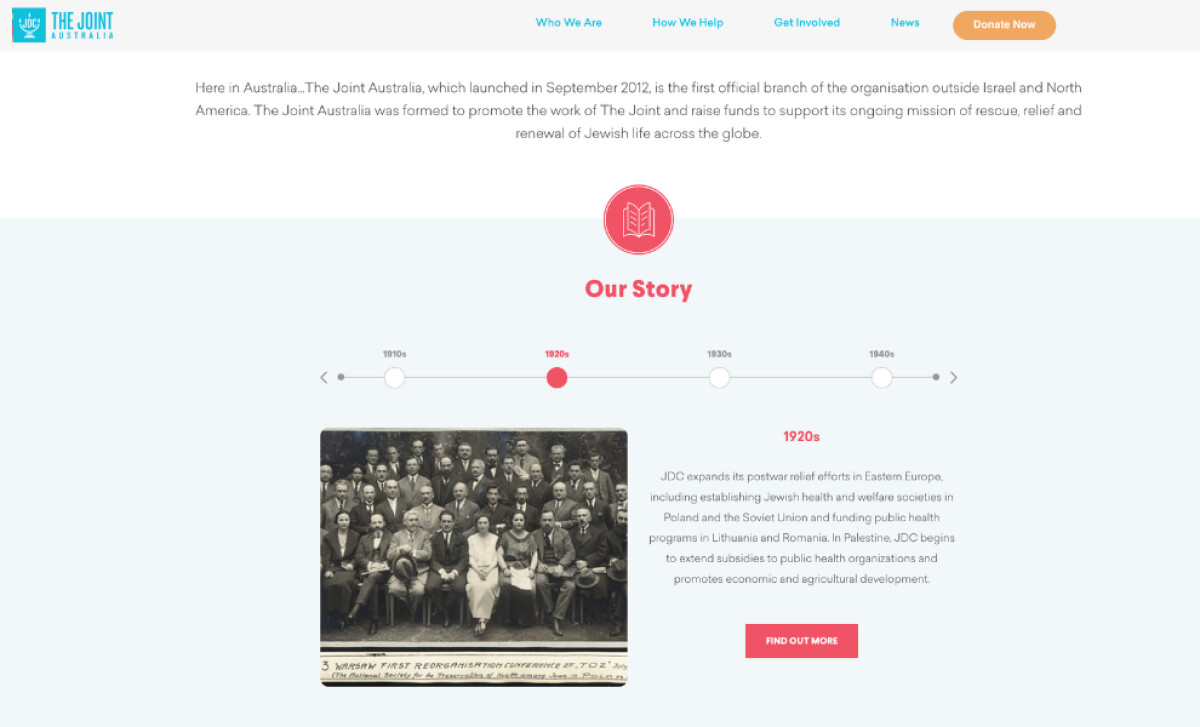
Purpose-driven icons help break down complex services into simple, relatable ideas. Graphics for each pillar—like a heart in a hand—support quick understanding while adding emotional depth. The iconography strengthens the brand’s voice across the site.
Visual storytelling brings authenticity to every page. Real images of community members, events, and archives ground the site in lived experiences. This personal connection reminds visitors their support creates direct, meaningful impact.
Through bold design, accessible visuals, and real storytelling, the Joint Australia website empowers users to act. It’s a strong reminder that the best website design in any sector makes people feel seen, valued, and ready to get involved.
_image1_e3ab75d01028-preview.jpg)