Standout Features:
- User-oriented
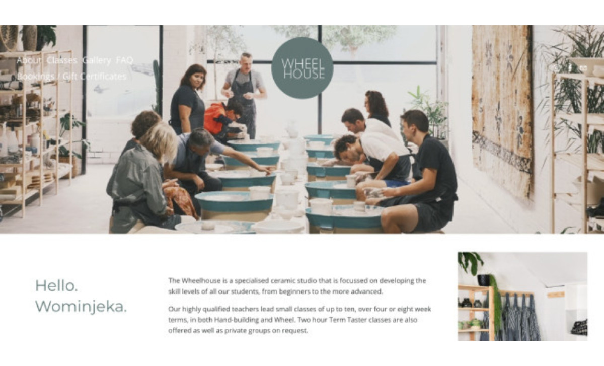
- Students at work imagery
- Subtle and consistent CTAs
As the community around The Wheelhouse Studio grew, the organization was naturally inclined to refresh its online platform. So, Michael Brimelow helped the studio with a website redesign that’s more user-oriented.
The redesign includes an aesthetic update, highlighting the brand colors more, and a technical revamp, switching from WordPress to Squarespace. (If you're keen on developing WordPress-powered websites, these beautiful WordPress website designs are great inspiration!)
With unintrusive font style choices that place readability first, there was more space to showcase the students’ work, so the design features many images of people enjoying honing their clay figure-making skills.
Another aspect of the redesign is the more efficient and less aggressive placement of buttons. The redesign features a more subtle and consistent CTA placement that reinforces the emphasis on the prominent gallery.
-preview.jpg)
-preview.jpg)
-preview.jpg)
-preview.jpg)