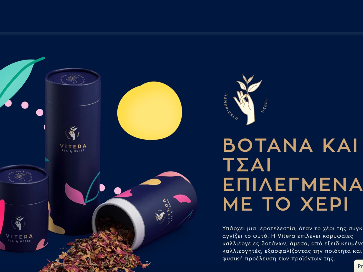
Vitera Website Design Opens With A Bold Unique Value Proposition And An Emotional Appeal
Vitera is a Greek brand that produces and packages remedial herbal teas and whose website is the work of their web design-savvy compatriots, Artware.
As an extension of the brand’s visual identity, the Vitera website design incorporates an eCommerce section that offers teas that correspond to certain moods of the consumer.
The website opens with a stellar hero section, all drenched in the brand’s navy blue color along with some images of the product’s packaging, custom illustrations of leaves in vibrant colors and a benefits-focused text.
Specifically, this particular copy emphasizes how the producer ensures the quality of their product which is by hand-picking the leaves from the best tea harvests.
Just below the fold, the website’s content continues the showcase of Vitera’s benefits by presenting the visitor with a choice of six different moods by asking “How are you feeling today?”. Clicking on either one of these moods takes the visitor to a page with suggested tea flavors that help mend this particular mood, lifting the consumer’s overall well-being.
The “handpicked by nature” UVP keeps popping up in different places, including the brand’s logo (also designed by Artware), depicting a hand holding a tea branch – intentionally reminiscent of the iconic image of a dove carrying an olive branch, another famous Greek export.

The Website’s Sticky Menu Includes A Shopping Cart For A Convenient UX
The main menu is the vital facet of user navigation and, as such, it follows the current best practice: keeping it “sticky” - that is, always present on the webpage, no matter how far the visitor scrolls.
The menu bar blends with the background’s primary color. The menu’s typography is slightly different than the one used in the website’s main textual content. It is a highly legible sans serif font, pale yellow and quite thin, complementing the brand’s logo on the left side of the screen.
To the right are the user-focused functions: the member icon and the shopping cart, which shows the items the visitor currently has in their cart.

The Stark Color Contrast & Custom Fonts Add Flavor To Vitera’s Website Design
Vitera website design breaks away from the onslaught of minimal, white space-heavy websites. Instead, it uses the brand’s colors quite lavishly. Navy blue takes up the majority of the website’s background, except for sections that deliberately stand out with the yellowish tone found in the main menu’s font.
The color palette doesn’t end there, though: the headings are in a “cappuccino” shade of brown, while pre-headings and CTA buttons utilize a vibrant magenta. In the case of the latter, the call-to-action arrow stands out in this color.
Professional and artsy photography of the brand’s products also contributes to the multi-colored feel of the website, as do the custom animated illustrations of moods that follow the brand guidelines used on the packaging design. It’s an excellent display of branding experts’ ability to curate visual elements that align with the brand's guidelines and effectively communicate its value.

The Product Pages Engage To Emphasize The Tea’s Composition & Benefits
The eCommerce section of the website lists the brand’s tea products in a 3-column grid layout. This number of products in a single row is optimal for the users’ visibility: one less, and it would be a waste of space. One more, and it would be too much to process.
The image of a tea is enhanced with some illustration blurbs. Hovering over the photo transitions to the product shot and shows the tea in its packaged form.
Clicking on one product opens a page that showcases this particular blend of tea in greater detail. A set of larger images and a very informative copy depict the product quality and effectiveness to the prospective buyer. The page also suggests what this particular tea is good for: the section “It is ideal when you feel...” shows the same mood icons from the homepage.
Just below are the available package sizes and a very prominent Add to Cart button. In case the visitor needs some more convincing, they will find the properties of each ingredient, ideal ways of preparation and more helpful tips just below.
It shows how web designers carefully consider the placement and presentation of package sizes, Add to Cart buttons, and additional product information to optimize the user experience and facilitate conversions!

Vitera Website Design Shows What Today's Online Shopping Experience Should Be Like
By offering the visitor the kind of tea that would best fit their mood or overall state of health, Vitera’s website design introduces an important functional feature that users today look for and value above all others: personalization.
The ability to find the product that fits your exact needs is a standard user expectation in this day and age. Artware agency recognized this and, in addition to a beautiful design and custom illustrations, delivered a memorable user experience.
The eCommerce pages are integrated with the rest of the website seamlessly: it doesn’t bring down the average website loading speed and it doesn’t make the UX any more complex. It is partly because the eCommerce section only holds a small number of products.
Overall, its custom functionality and on-brand appearance going hand-in-hand are the main reasons why we present Vitera with the Best Website Design award!
_564445b14d1e-preview.jpg)