- Agency: Brand Büro
- Client: ZAHN 13
- Category: Website Design — Health and Wellness
- Location: Austria
- Project Brief: Redesign ZAHN 13’s website to deliver a clear, user-friendly experience that builds trust and encourages appointment bookings through intuitive navigation and structured content.
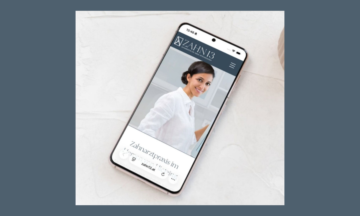
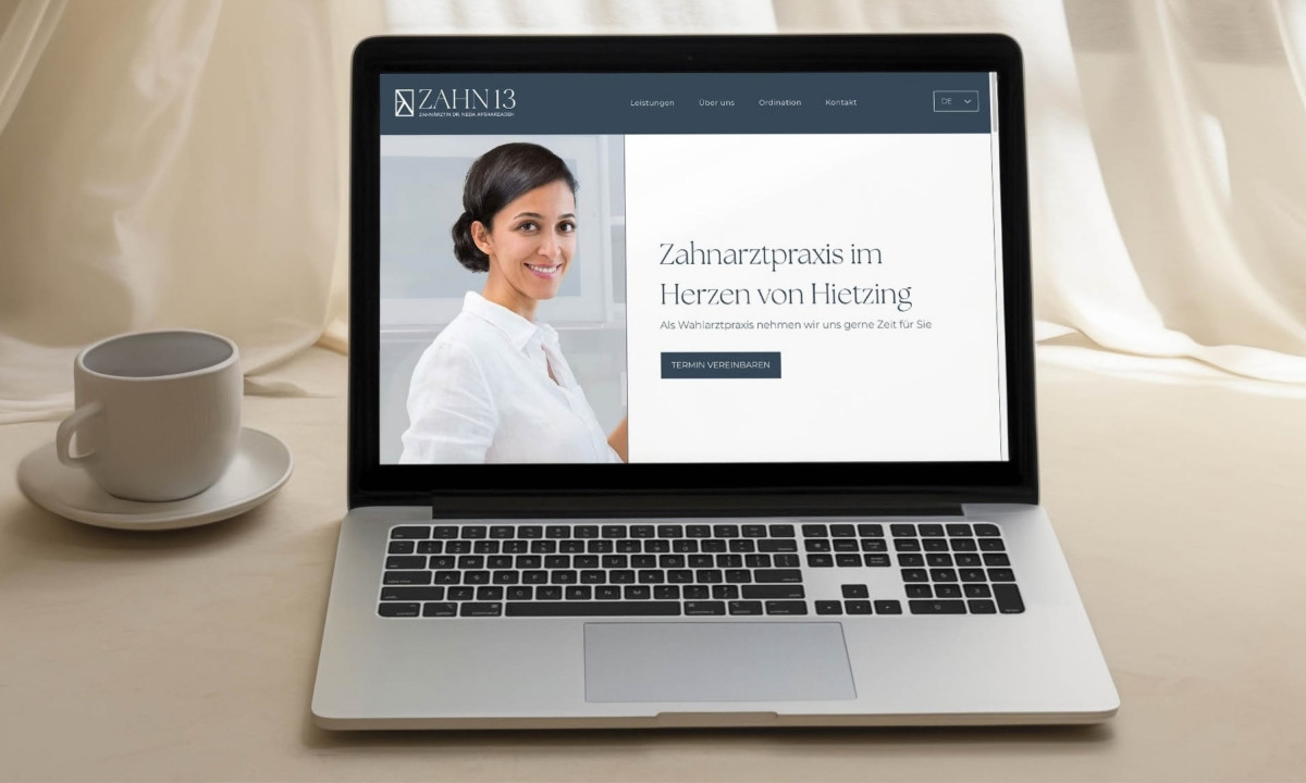
A strong health and wellness website does more than present information. It also makes it easy for patients to find what they need and take action. ZAHN 13 keeps things simple: clean layout, clear navigation, and a calm, professional look that works on any device.
For a dental practice, that simplicity matters. Many patients already feel anxious before their first visit. A website that's easy to use starts building confidence before they ever walk through the door.
Results & Impact
- Patient inquiries and appointment requests increased after launch.
- Visitors arrived better informed about available services, reducing back-and-forth exchanges before booking.
- Clearer structure and direct calls to action made it easier for people to move from browsing to reaching out.
- The practice saw steady growth in new patient acquisition following the redesign.