
In real estate, branding goes beyond logos and color schemes — it’s about building trust, credibility, and lasting relationships with buyers and investors. A strong brand combines strategic messaging, a compelling online presence, and unique selling points to stand out in a competitive market.
Luxury brands like Sotheby’s use heritage and prestige to position themselves as leaders in the high-end market, while disruptors like Compass leverage technology-driven branding to attract modern buyers.
We've rounded up the best real estate branding examples worldwide. These companies, in collaboration with top branding agencies, have created impactful brand identities that resonate with their target audiences.
1. Compro.CASA - Real Estate
-content-large-webp.webp)
Standout Features:
- Striking color story
- Simple yet meaningful logo
- Reliable brand image
Compro.CASA is an Italian real estate agency specializing in flipping and selling properties. Its visual identity, built around a striking color story, evokes the passionate roots of northeastern Italy. This branding successfully captures the company’s local heritage, appealing to buyers seeking authenticity and trustworthiness.
The logo design combines modern artistry with professionalism, featuring a simple illustration of a man in a bowtie alongside the company name. This design conveys a professional yet approachable identity. Paired with the rich color scheme, it reinforces the brand's reliability and credibility, instilling confidence in buyers choosing a newly renovated home in a culturally rich setting.
Beyond its strong visual identity, Compro.CASA also leverages a strategic digital branding approach that helps engage a wider audience. A high-performing real estate website with seamless UX and immersive property showcases allows potential buyers to explore listings with ease.
2. Oakbridge
-content-large-webp.webp)
Standout Features:
- Streamlined logo design
- Rich royal blue color
- Polished and professional
Oakbridge exudes professionalism and luxury with its rich royal blue color palette that conveys stability and trust — key factors in attracting high-end clients. Its streamlined logo and sleek, modern typography enhance the brand’s polished, sophisticated image, positioning it as a credible and reliable choice for buyers seeking luxury properties.
The brand’s visual identity reinforces its luxury branding while maintaining approachability. This consistent and professional look assures clients they are working with a trusted partner in a competitive market, especially those seeking seamless, high-end real estate experience.
3. Homely
-content-large-webp.webp)
Standout Features:
- Witty logo design
- Friendly approach
- Sensible catchphrases
Homely embraces a friendly, approachable branding strategy to make homebuyers — especially first-timers — feel at ease. Its witty logo, featuring a small house with a smile and rounded typography, evokes warmth and comfort. This branding effectively communicates that Homely isn’t just selling properties — it’s offering a space to call home.
The inviting typography and catchy tagline further enhance the brand’s welcoming identity, easing buyer apprehension and helping them envision a home that feels right.
On social media, Homely effectively uses Instagram to showcase properties through visually engaging posts, while Instagram Reels offer quick, dynamic property tours that captivate viewers.
View this post on Instagram
On Facebook, the company shares detailed property information, success stories, and helpful home-buying tips, further engaging their audience and encouraging interaction.
4. Sotheby’s International Realty
-content-large-webp.webp)
Standout Features:
- Timeless elegance
- Luxurious color palette
- Refined, classic typography
Sotheby’s International Realty embodies sophistication and prestige, making it the top choice for luxury homebuyers. Its branding reinforces this high-end positioning with a timeless logo, classic serif typography, and a refined color palette of rich golds, deep blacks, and crisp whites—symbols of heritage, trust, and exclusivity.
View this post on Instagram
Sotheby’s extends its sophisticated branding seamlessly across its website and social media platforms. The website’s sleek, luxurious design showcases properties through high-quality visuals and immersive property tours, while Instagram, Facebook, and LinkedIn highlight visually stunning properties, lifestyle content, and exclusive listings. Through video content and virtual tours, Sotheby’s reinforces its reputation for luxury and exclusivity.
5. Shelest
-(1)-content-large-webp.webp)
Standout Features:
- Leaf-designed logo
- Thin typography
- Minimalist design approach
Shelest embraces a minimalist branding approach that reflects simplicity and modernity. Its leaf-inspired logo symbolizes life — perfectly aligning with the real estate industry, where new beginnings and growth take place.
Rather than a full leaf image, the outlined design suggests that life serves as a framework within each home, creating a sense of calm and natural beauty. The thin typography complements the logo, reinforcing the brand’s clean aesthetic and focus on modern, functional living spaces.
Learn more about the different branding elements here.
6. Ile de Vue
-content-large-webp.webp)
Standout Features:
- Chill luxury vibes
- Sleek typography
- Overall sophisticated feel
Ile de Vue blends sophistication with an approachable luxury. Its sleek typography and metallic, earthy color scheme exude elegance, making the property feel both exclusive and welcoming. A polished logo ties these elements together, reinforcing a modern, high-end brand identity.
This refined branding resonates with discerning buyers, positioning Ile de Vue as a premium choice in the competitive luxury real estate market.
-content-large-webp.webp)
The brand’s minimalistic website design enhances its sophisticated image. Its clean layout creates a calm, elegant browsing experience, allowing the properties to take center stage. Moreover, interactive features, like an interactive map of the property location, offer visitors the ability to explore the area and its amenities.
7. FLEX
-content-large-webp.webp)
Standout Features:
- Creative logo design
- Neutral color story
- Polished aura
FLEX, a Russian real estate company, adopts a sleek, professional branding strategy that emphasizes simplicity and trustworthiness. Its neutral color story conveys calm professionalism, positioning FLEX as a reliable, no-frills real estate partner. The creative logo, paired with strong typography, reinforces this polished and memorable identity.
This clean, efficient branding appeals to clients seeking a straightforward, distraction-free experience. By prioritizing simplicity, FLEX creates a sense of confidence and reliability, ensuring the focus remains on its properties and services rather than flashy aesthetics.
-content-large-webp.webp)
FLEX’s digital branding extends this sleek, professional aesthetic across its website and social media. The website delivers a seamless user experience, while social media maintains a cohesive, high-quality visual identity through striking images and videos.
8. Compass Real Estate
Standout Features:
- Modern, tech-focused branding
- Bold, clean typography
- Vibrant color accents
Compass Real Estate sets itself apart by focusing on modern technology and a forward-thinking approach to real estate. Its clean and bold logo and typography reflect the brand’s commitment to being cutting-edge and innovative.
Beyond helping buyers find homes, Compass empowers agents with AI-powered tools for a seamless experience. This forward-thinking branding positions the company as a leader in the digital real estate space.
Compass thrives online, where it blends modern technology with dynamic social media strategies. Its interactive website features intuitive property search tools, AI-driven insights, and immersive visuals.
Additionally, the brand’s social media strategy leverages Instagram Reels, YouTube walkthroughs, and Facebook posts to showcase properties in engaging, digestible formats. Through targeted content marketing and video storytelling, Compass connects with both buyers and sellers, emphasizing its innovative approach to real estate.
9. ALHUDA
-content-large-webp.webp)
Standout Features:
- Professional and luxurious feel
- Creative design concept
- On-brand design approach
ALHUDA successfully establishes a premium and respected identity in the competitive Middle Eastern real estate market. Its luxurious branding is crafted through innovative design elements that convey trust and sophistication.
The logo design, featuring a clean white font and sleek silhouette, symbolizes reliability and forward-thinking vision. This simple yet striking logo fits seamlessly into any digital or print material, offering versatility while maintaining a strong, professional image. The overall branding strategy positions ALHUDA as a prestigious and trustworthy choice for buyers and investors.
View this post on Instagram
Beyond its visual identity, ALHUDA branding excels in its digital presence, creating engaging and captivating video materials to showcase the luxurious spirit of its real estate offerings. Their video content highlights the elegance and exclusivity of the properties, helping to evoke an emotional connection with its target audience.
Check out some of the best real estate website designs here.
10. RAHAF&AZAL GROUP
-content-large-webp.webp)
Standout features:
- Robust and minimal design
- Logo symbol as seal of quality
- Luxurious palette
RAHAF&AZAL GROUP excels with a streamlined, minimal design that communicates strength and sophistication. The logo symbol serves as a seal of quality, representing the brand’s commitment to luxury and trustworthiness.
The use of client partners' initials in the logo effectively symbolizes the fusion of professionalism and modernity, making the brand instantly recognizable and reinforcing its high-end image.
The choice of a gradient gold color palette further elevates the brand, enveloping it with an aura of exclusivity and luxury. Gold is often associated with wealth and prestige, making it the perfect choice for a real estate group focused on premium properties.
11. Keller Williams Realty
-content-large-webp.webp)
Standout Features:
- Friendly, approachable branding
- Warm, welcoming color scheme
- Strong focus on agent-driven success
Keller Williams Realty takes a people-first approach to real estate branding. Its clean, approachable logo and straightforward brand typography reinforce trust and reliability, making it a top choice for buyers and sellers.
The warm color palette evokes comfort and friendliness, reinforcing the brand's mission of connecting clients with caring, dedicated agents. Keller Williams emphasizes agent empowerment, ensuring that their agents are at the forefront of the brand’s identity.
Keller Williams also utilizes social media to connect with clients on a personal level, using Facebook, Instagram, and LinkedIn to highlight the success stories of its agents and community involvement.
-content-large-webp.webp)
Its user-friendly website offers engaging content that keeps clients and agents informed. Through strategic email marketing and insightful blog content, the brand fosters trust, transparency, and a strong sense of community across all platforms.
12. Diehlgasse 47
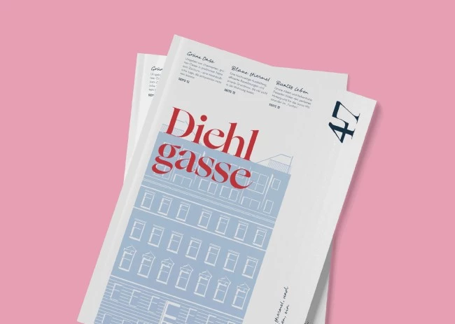
Standout Features:
- Contemporary visuals and icons
- A friendly and edgy color palette
- Humorous messaging
Diehlgasse 47 effectively targets the creative and contemporary urbanite market by embracing a bold, unique branding strategy. The logo is simple yet stylish, featuring a contemporary typeface that is both memorable and easy to read. This clean, modern design aligns perfectly with the brand’s mission of catering to a dynamic, forward-thinking audience.
The color palette blends warm, edgy tones, adding a playful touch to the brand, while eye-catching illustrations creatively highlight the properties. Subtle humor and wit further distinguish the brand from traditional real estate identities, making it more memorable and approachable.
The use of white space also creates a sense of openness and elegance, making the text even more legible. Plus, the visuals are site-bending! That means they can adjust to different platforms, making them versatile and adaptable.
Personal Branding Examples: How Real Estate Agents Build Trust
Real estate agents are increasingly using personal branding to build trust and stand out in a competitive market. Below are a few notable examples of how agents are making a name for themselves and attracting new clients.
Ryan Serhant (Serhant)
Ryan Serhant has built a powerful personal brand through reality TV exposure, social media dominance, and a consistent content strategy. His presence on Instagram and YouTube allows him to connect with a broad audience while showcasing his expertise and personality.
Ryan’s branding focuses on transparency, offering followers a behind-the-scenes look at his real estate ventures and showcasing properties in a unique, engaging way.
Barbara Corcoran
View this post on Instagram
Barbara Corcoran has turned her personal brand into a household name by combining storytelling with media appearances. She uses Instagram and Twitter to share personal stories, real estate tips, and insights into the market, helping her maintain a strong presence and build trust. Her branding emphasizes her credibility, making her a trusted voice in the industry.
Instagram-Focused Agents
Many real estate agents are finding success by focusing on Instagram to build their personal brands. Instagram offers a platform to engage directly with potential buyers by showcasing properties, sharing market tips, and offering a glimpse into their personal lives.
Here are a few notable Instagram realtors:
- Loida Velasquez: Known as the "Wonder Woman of Real Estate," Loida combines property showcases with motivational content, offering a blend of professional and personal posts.View this post on Instagram
- Bryan Casella: Leader of Team BC Real Estate, Bryan shares industry tips, motivational content, and glimpses into his personal life, engaging a broad audience.View this post on Instagram
- Jade Mills: A leading luxury realtor in Beverly Hills, Jade showcases stunning property listings and offers insights into the luxury market.View this post on Instagram
These agents create authentic connections with their audience, positioning themselves as approachable and knowledgeable experts in the field.
Real Estate Branding Examples: The Bottom Line
In today’s competitive real estate market, effective branding is crucial for standing out and connecting with the right audience. Companies like Sotheby’s International Realty, Compass Real Estate, and Keller Williams Realty have mastered branding by understanding their target market and positioning themselves uniquely.
A strong digital presence amplifies this branding, with websites and social media channels acting as key touchpoints that reinforce the brand’s values, showcase properties, and engage customers. Whether it’s through immersive virtual tours, engaging Instagram Reels, or informative email marketing campaigns, the integration of digital strategies into real estate branding has become essential.
Ultimately, successful real estate branding is all about creating an experience that aligns with customer expectations and fosters trust.
![]()
Our team ranks agencies worldwide to help you find a qualified partner to implement the latest AI solutions. Visit our Agency Directory for the Top Branding Agencies, as well as:
- Top Real Estate Branding Agencies
- Top Real Estate Marketing Companies
- Top Real Estate SEO Services
- Top Small Business Branding Agencies
- Top Cincinnati Branding Agencies
And don’t miss our Awards section, where we showcase the top agencies recognized for exceptional creativity and impact.


-preview-webp.webp)