Much like the properties they showcase, real estate website designs must be crafted to build trust and safety and, ultimately, emanate visual appeal. Considering that buying a house and/or an office building is one of the most essential purchases, real estate websites must fully exploit their possibilities.
So, whether you seek a new family home, business space, upkeeping, or management of your existing properties, see how the 17 best real estate website designs of 2026 employ different design strategies to attract customers and drive conversions.
1. SAA interiors + architecture by Quixta
Standout features:
- Project-focused navigation
- Minimalist interface
- Clean modern typography
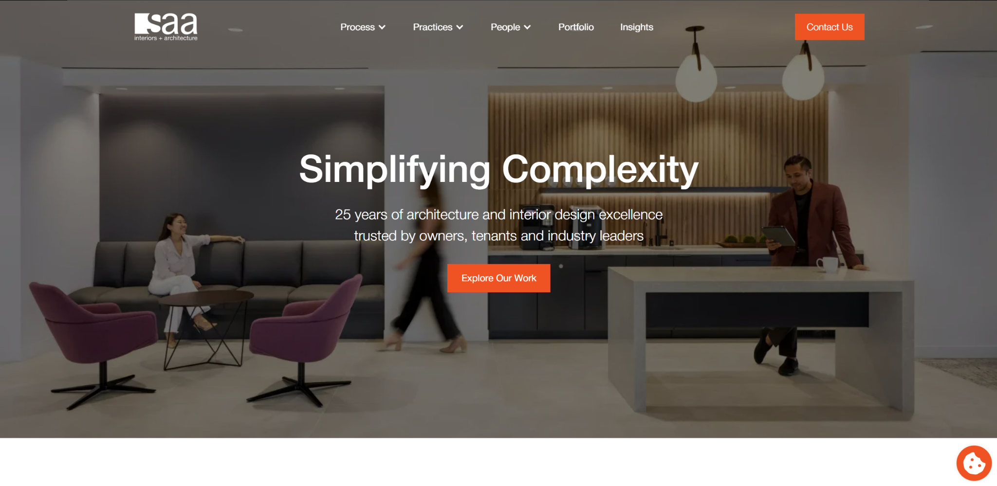
SAA Interiors + Architecture is a U.S.-based design firm specializing in commercial architecture, workplace interiors, and real estate advisory services. Designed and developed by Quixta, the SAA website reflects the firm’s central philosophy of simplifying complexity through thoughtful design, innovation, and technical precision.
Large architectural imagery and curated portfolio highlights showcase SAA’s experience across office interiors, healthcare environments, and real estate analytics. The layout uses generous spacing and restrained color palettes to keep the focus on the firm’s projects and design thinking, reinforcing a sense of clarity and professionalism throughout the browsing experience.
The interface emphasizes process and performance. Sections such as “Our Process Innovation” and “Core Practices” guide users through the firm’s approach to architecture and interior design, presenting complex services in an organized and digestible format. This structure helps convey SAA’s ability to manage intricate projects while delivering measurable value to clients and stakeholders.
Subtle motion effects and smooth scrolling transitions maintain visual engagement without distracting from the content. Combined with a clean sans-serif typography and consistent visual hierarchy, the website delivers a polished and contemporary user experience.
2. Soflo Home Realty by S3 Marketing Solutions
[Source: Soflo Home Realty]
Standout features:
- Captivating, hero section carousel
- Clear, minimalistic layout
- Calming blue hues
One of the best website designs for real estate is SOFLO Home Realty, an agency based in South Florida that specializes in luxury properties and new construction homes. With more than a decade of experience, SOFLO aims to help people accomplish their dreams of owning high-end homes.
Reflecting the nature of properties the brand offers or deals with, S3 Marketing Solutions built a high-end website that guides future homeowners, sellers, and real estate brokers and ensures transactions go as smoothly as possible.
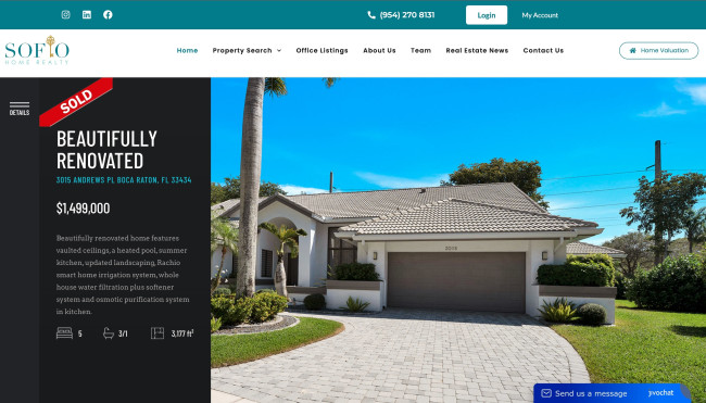
The website makes a powerful first impression with a hero section carousel that showcases magnificent property pictures and 3-D models. On the left side, helpful information complements the visuals, while a prominent call-to-action button encourages users to take the next step, making the homepage beautiful and functional.
The site’s layout is clear, minimalistic, and meticulously organized to enhance user experience. Moreover, each section and property overview are visually consistent and fast-loading, ensuring a seamless journey from browsing to closing a deal.
The designer adorned the website with calming blue hues to reflect the tranquility and luxury of South Florida's high-end properties. Top website designers often use this color to instill a sense of trust and professionalism. It subtly reinforces the brand's commitment to smooth and pleasant real estate transactions.
3. This Is Neat Cleaning by Michael Ngo

[Source: This Is Neat Cleaning]
Standout features:
- Easy, intuitive navigation
- Approachable, contemporary illustrations
- Legible, sans-serif typography
This Is Neat is a bond cleaning service that “keeps tenants, real estate agents, and property managers happy all across Sydney and Melbourne." They offer a variety of services, such as End-of-Lease Cleaning, Vacate Cleaning, and Moving Cleaning.
Its website is the work of the multifaceted web designer Michael Ngo, who fully adopted the “less is more” design philosophy and put a “clean” design into the cleaning service.
Right from the get-go, the visitors are welcomed with friendly SaaS design trends, soothing blue hue, and smart copy. Although the specific cartoony style overstays its welcome page, This Is Neat real estate web design uses it to evoke familiarity and personality and generally feels like a genuine embodiment of its service and brand message.
The website’s navigation is designed to be easy and intuitive, ensuring users can effortlessly find the services they need. A well-structured menu and clear pathways guide visitors through the various offerings, enhancing the overall user experience.
Legibility is a key focus in This Is Neat’s website design, achieved with clean, sans-serif typography. The typography contributes to a cohesive and visually appealing interface that aligns with the brand’s professional yet approachable image.
4. Castell Management by Atelier Design
[Source: Castell Management]
Standout features:
- Accessible layout with ample negative spaces
- Highly legible sans-serif typeface
- Energetic yet subtle transitions and movements
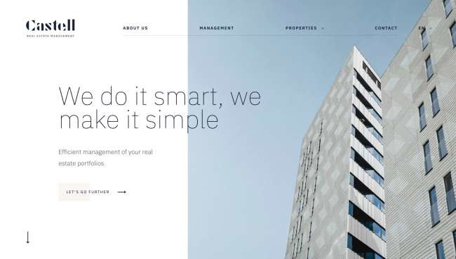
Castell Real Estate Management is a Brussels-based agency specializing in a wide array of services including management, brokerage, and short-term rental of real estate in the Belgian capital. Created by Atelier Design digital and branding agency, Castell’s real estate website design is messaging-oriented, dynamic, and simple, conveying its mission and objectives in a clear and professional manner.
Custom visuals, property showcases, and ample negative space accentuate the way written content is delivered. The copywriting and chosen visual style express the brand’s know-how in a simple and appealing way, avoiding barriers with their audience.
The subtle transitions and movements bring an energetic and contemporary feel to the user experience. It’s a great example of motion graphics websites that use animation to enhance engagement without overwhelming the design. Although the tone and overall design exude executive mastery, Castell's real estate management website smartly avoids the trap of feeling too white-collar and/or detached.
Scrolling down, dark blue blocks that highlight the brand’s mission break the monotony of a generally low-key color scheme. The typography is a highly legible sans-serif, Ida Thin typeface that helps with message delivery and retention.
5. Agate Luxury Residence by Yehuda Bruck
Standout features:
- High-quality apartment photography
- Convenient apartment browsing options
- Engaging, subtle, dynamic elements
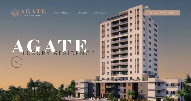
The Agate Luxury Residence website design embodies a high-class, elegant lifestyle in the urban area of NYC. Yehuda Bruck designed the website in a way that elaborates on the client's purpose: to ensure your comfort at all times. The interface looks clean, delicate, and minimalist despite the extensive information.
The website opens with a stunning full-screen image of the residence building, immediately captivating visitors. The "Gallery" page showcases a moving gallery of high-quality photos, highlighting interiors and exteriors. Additionally, it includes pictures of the surrounding area, providing a comprehensive view.
Like the best website designers, Yehuda Bruck simplified the browsing experience by implementing two distinct apartment browsing options on the "Apartments" page: Layout and List. The Layout option features an interactive image of the building with clickable floors, while the List view offers filtering options and detailed blueprints.
To create an engaging and interactive experience, the designer employed subtle parallax scrolling, animations, and hover effects. These dynamic elements infuse movement and depth into this luxurious real estate website design.
6. Belyi Ostrov House by Bquadro
Standout features:
- Engaging, parallax effects
- Luxurious color palette
- Minimalist hamburger menu
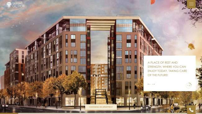
Belyi Ostrov House is a palatial residential complex located on Beloostrovskaya Ulitsa (White Island Street), a deluxe location in Saint Petersburg with highly developed transport, social, retail, and entertainment infrastructures.
Belyi Ostrov House is secluded but not isolated. It is a copious space of safety, leisure, and comfort in a newly developing city area. The White Island website, masterfully crafted by Bquadro, perfectly encapsulates the district’s appeal through a subtle yet innovative parallax effect.
The concept is not a simple flexing of opulence but a cozy, high-tech, and environmentally friendly place. The website combines each of these aspects with a user-friendly approach that boosts brand awareness among the target audience.
Bquadro opted for pseudo-3D effects, motion graphics, interactive maps, and parallax homepage scrolling — a non-standard solution that commands attention. The unconventional scrolling and ample gold hues make users feel like they’re leafing through a swank magazine, “leaning back in a chair, in a business class aircraft.”
The entire website seems saturated with dynamic yet calm animation. This supports the website's “magazine” vibe while emphasizing the ergonomics of the residential complex. One of the more interesting solutions in addition to the main page is the sticky Burger menu, which, when pressed, collapses into a minimalistic side window that offers everything prospective buyers might look for in one convenient place.
7. Avantgarde Properties by Digitalwerk
[Source: Avantgarde Properties]
Standout features:
- Prominent awards showcase
- Engaging real estate imagery
- Expanded, sticky menu
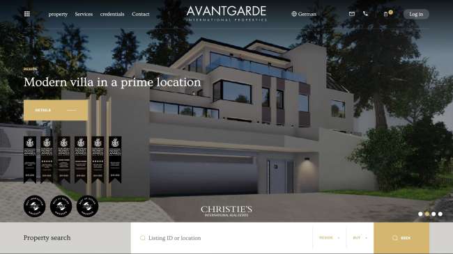
Avantgarde International Properties is a Vienna-based real estate agency founded in 2011. Over the past decade, the company has overseen numerous high-end transactions and established a strong history of accomplishments in the high-end and real estate market. The company’s successful mileage and market position, as well as its name, values, and approach, were ideal foundations for the website that Digitalwerk created.
The Avantgarde Properties website is a textbook example of a simple, elegant, and modern design that demonstrates maximum efficiency in searching for the right luxury property. Besides the engaging carousel, it also showcases a unique portfolio with rich imagery that presents the most sought-after properties in Vienna and the surrounding area.
While more and more real estate website designs sport the tested tri-color combination of white, black, and gold, Avantgarde Properties’ website shines with luxurious hues and the assortment of awards prominently showcased on the homepage.
One of the more interesting features on the website is the variation of sticky menu navigation that morphs into a convenient properties search bar as users scroll down while retaining its primary function.
8. K11 ARTUS by Unlimited (ULTD)

[Source: K11 ARTUS]
Standout features:
- Interactive, “Clock” hero section
- Tranquil, piano background music
- Intuitive, hamburger mega menu
K11 ARTUS is a luxury Hong Kong residence with a 5-star hotel rating in the heart of Tsim Sha Tsui’s busiest commercial and shopping hubs. It is part of the K11, a mall-museum hybrid concept conceived in China.
The name of K11 stems from the Eastern philosophy of “the co-existence of nothingness and substance,” and it is intrinsically neutral. It is rich in meaning and stimulates numerous interpretations. The agency Unlimited (ULTD) opted for the “artistic experience” aspect of the said philosophy.
Experience interweaves in every element of the K11 ARTUS website and it starts before you set foot on the premises. Website visitors are welcomed with a full-screen video and an interactive “clock” showcasing the prospects of an ideal day at the property.
A seamless user journey continues, showcasing the company’s values, offerings, inspiration, and benefits with plenty of motion effects and interactive galleries. Furthermore, tranquil piano background music enhances the navigation, becoming an intrinsic part of the scrolling process.
Finally, the mega menu that opens when a top-right hamburger icon is clicked provides an intuitive browsing experience. The full-screen panel contrasts the rich visuals with simplicity and subtle gold highlights when a visitor hovers over different categories.
9. Forty Ninth Living by Khula Design Studio
Standout features:
- Minimalistic layout and intuitive navigation
- User-friendly “Find Your Unit” page
- Classy, opaque color palette
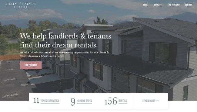
Forty Ninth Living is a rental real estate business in Chilliwack, BC. Its website is the work of Khula Design Studio, a branding design studio from Canada. The web design agency faced the challenge of creating a unified online presence for all of the company’s properties. The company also needed to craft a professional brand identity that resonated with Forty Ninth Living’s target audience and accurately reflected the business.
Searching for a real estate property can be daunting, but Khula Studio tackled this by simplifying the website's navigation with a sticky main menu and scattered call-to-actions, guiding visitors through the conversion funnel. The design also uses succinct copy, brief paragraphs, and bullet points to highlight key selling points.
To help users effortlessly browse for accommodations, the design agency employs the "Find Your Unit" with various filters to list apartments, suites, townhomes, and family homes. On the left, users can filter properties by housing type, bedrooms, bathrooms, and price range. On the right, properties are displayed in a three-column layout. Clicking a photo leads to a detailed page with high-res images, floorplans, and essential information.
Lastly, the website’s color palette includes shades from light to dark grey with blue undertones, accented by salmon pink for CTAs. This contrasting color scheme ensures key interactive elements stand out, promoting user engagement while lending a modern and exclusive feel to the brand.
10. Sanderson Weatherall (SW) by Show + Tell
_521607c39a07-desktop-content.jpg)
Standout features:
- Sleek and minimalist layout
- Gallery-style visual presentation
- User-friendly navigation
The Sanderson Weatherall (SW) website is a masterclass in digital professionalism and trust-building. This UI design by Show + Tell prioritizes clarity and ease of navigation, allowing users to find the information they seek effortlessly.
User-friendly navigation is at the core of SW’s website design, ensuring visitors can effortlessly explore the site. Clear labels and a logical hierarchy help in quick information retrieval, which is crucial for maintaining user engagement and ensuring that visitors find exactly what they need with minimal clicks.

Professional images of consultants in action serve as a dynamic backdrop for text. Each content block adds authenticity and credibility to the website. Moreover, its gallery-style presentation enriches the site and makes it easier for users to navigate through services and information.
The agency crafts a sleek and minimalist site layout to enhance user focus and reduce distractions. Clean lines and ample white space allow the content to breathe, underscoring the brand's professionalism and helping to build trust with the audience.
11. Scott Salisbury Group by Digital Noir
[Source: Scott Salisbury Homes]
Standout features:
- Clean layout and effective messaging
- High-quality real estate imagery
- Innovative menu navigation
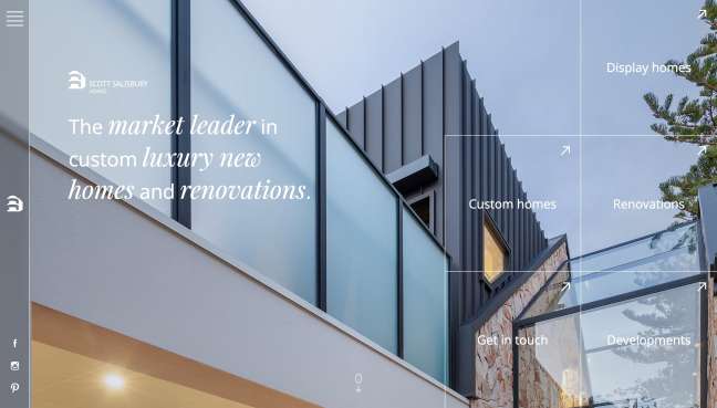
Scott Salisbury Homes is one of the world’s leaders in luxury home design and building a marketplace. What differentiates them from the competition is their friendly and helpful customer service that guides their clients through the entire process. When designing Scott Salisbury Homes' website, Digital Noir followed the same principle to a tee.
Using the tested “less is more” approach, they crafted a minimalistic layout that emphasizes simplicity and readability. Each page is thoughtfully crafted to guide visitors through services and information, maintaining a professional and approachable tone.
The whole website is built around brand messages, including negative space, simplistic yet pleasing typography, and subtle transition and hover effects to develop a visual style that embodies the experience of Scott Salisbury homes in digital form.
Digital Noir implemented high-quality photos showcasing SW's properties and services to create a dynamic backdrop and add depth and authenticity. The imagery enhances the aesthetic and reinforces SW’s dedication to quality and excellence in the real estate sector.
Although the website uses a hamburger menu, it plays with conventions by placing it on the upper left side while simultaneously letting visitors jump straight into desired categories as grid puzzle pieces on the right.
12. Leroy Merlin Inspirational Mag by Le Studio Digital BETC
[Source: Leroy Merlin Inspirational Mag]
Standout features:
- Interactive 3D diorama carousel
- A well-constructed color palette
- Engaging copy
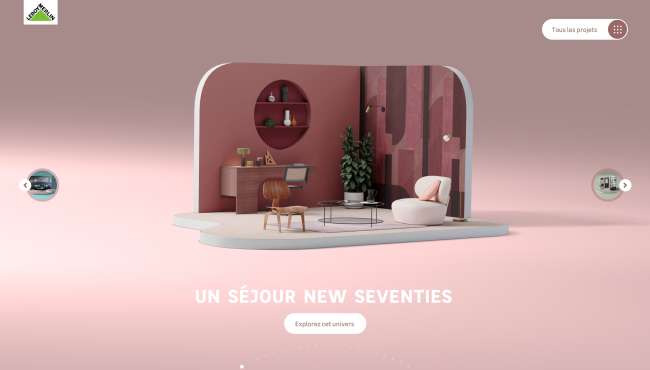
A digital project of the French home improvement retailer leader, Leroy Merlin, Inspirational Mag is an engaging space offering a superbly immersive experience.
The highly interactive page designed by Le Studio Digital BETC starts the user journey with an inspirational 3D diorama slideshow that acts as the main menu, offering a variety of chic interior designs.
The main appeal of Leroy Merlin Inspirational Mag doesn’t depend on its magazine-like layout but on the initial unconventional presentation, further bolstered by downright and passionate copy that seamlessly resonates with readers.
Besides its forthright messaging and engaging product descriptions, the website demonstrates a masterclass in color grading. Each design skillfully plays with the chosen hue and era inspiration, with just a pinch of artistic proficiency to make it all come together — both in interior and web design.
13. Covivio by Be API
Standout Features:
- Classy serif typography
- Gorgeous room pictures
- White background
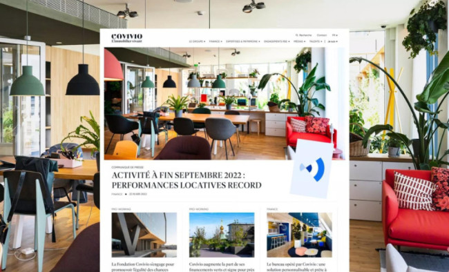
Covivio's redesigned real estate website, a collaborative effort between Be API and the Covivio team, is proof of modern elegance and intuitive user experience. The standout features include classy serif typography, gorgeous photographs, and a clean white background that allows the visuals and content to shine.
Large images showcase Covivio's impressive real estate portfolio, establishing its credibility in the industry. The website's graphic modernization incorporates the latest trends in web design, while the intuitive back-office streamlines content management for the Covivio team.
The agency used classy serif typography to add a touch of refinement and sophistication to the textual elements. The serif fonts enhance readability while evoking tradition and trustworthiness, which is crucial for conveying the company's prestige and reliability.
Lastly, a clean white background serves as a perfect canvas for the website's visuals and content, creating a minimalist and modern aesthetic. By keeping the background simple and unobtrusive, Be API ensures that the focus remains on stunning visuals and well-crafted content, enhancing the site's elegance and functionality.
14. Orange Design Studio by Fishtank Agency
[Source: Orange Design Studio]
Standout features:
- Engaging cursor effects
- Practical, sticky hamburger menu
- Good balance between text and visuals
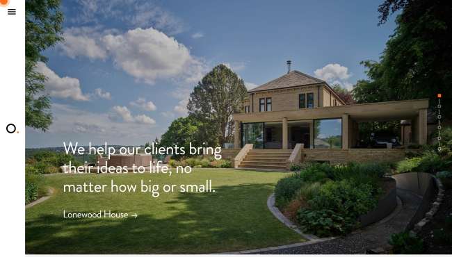
Orange Design Studio is a Yorkshire-based, visionary architectural design studio that aims to turn clients’ ideas into well-crafted buildings and spaces. Their website, courtesy of Fishtank design agency, corresponds to the brand’s intentions and reflects the philosophy of “engaging with clients to make ideas tangible.”
Elegant, simple, and user-friendly are the key attributes that describe the brand’s new website, helping them boost engagement. Studying architectural best practices and industry requirements, Fishtank crafted a website that educates Orange Design Studio’s prospective clients and inspires them to take on new design projects.
The website opts for a stylish, orange dot cursor effect, knowing that even minor interactions can change the overall user experience. This subtle detail exudes playfulness and creativity, reflecting the studio’s innovative approach to architectural design.
The hamburger menu is “sticky,” as UX best practices dictate. Clicking on it opens an on-brand window and links pointing to the main website pages, arranged sequentially following a natural user journey.
To effectively communicate Orange Design Studio’s expertise and vision, the agency aims for a harmonious balance between text and visuals. High-quality images of architectural projects are complemented by concise, informative text, providing visitors with a comprehensive understanding of the studio’s offerings.
15. Karreerne by Voksevaerk
-desktop-content.jpg)
Standout features:
- “Arbitrary” positioning
- Stripy patterns and typography
- Informative homepage
Voksevaerk did a terrific job conveying the nature of the Karreerne through its informative and fun real estate website design, which leaves no stone unturned for interested parties.
The homepage’s clear and concise layout effortlessly guides users through the available information, ensuring that they quickly grasp the value and appeal of the properties. This carefully curated introduction sets the stage for a deeper exploration of what Karreerne offers.
The entire website is full of playful golden-white stripes that indicate the building blocks of these modern housing and their top quality, all originally and attractively. A similar variation of these stripes found its way into the typography, with most headlines written in custom, double-lined gold characters that complement the website’s walls.
The web design leverages the positive space by combining colored content blocks describing the pictures. Rather than seeming messy, this “chaotic order” secures your focus and remains intact, providing a unique virtual journey resembling your first drive around the Karres neighborhood.
16. Hous Luxe Woningen by Kay Jilesen

Standout Features:
- Clean and minimalist layout
- Captivating, high-quality imagery
- Scannable property information
Kay Jilesen's marvelous work on Hous Luxe Woningen's real estate website features a clean, minimalist layout that reflects the brand's sophisticated values and target audience.
The use of negative space and simple design elements add to the site's stripped-back aesthetic, making it visually satisfying and scannable. And most importantly, it's super easy to navigate!
Additionally, the high-quality imagery throughout the site creates a cohesive and professional look that conveys the brand's luxury positioning. The website's gallery of images and artists' perspectives provide users with a detailed look at the houses. This creates a desire to explore the properties further — one of the critical goals of real estate branding.
The straightforward typography and messaging make the content readable. The consistent typeface paired with a white and gold theme adds a touch of refinement to the site. Together, all the design elements provide users with a great browsing experience.
So, if we're talking about the best real estate website designs in the high-end territory, this website is the one to beat!
17. Traçat: Arquitecture 360 by Jose Sentis

Standout Features:
- User-friendly single-page design
- 360-degree property gallery
- Dark theme with a touch of color
The Traçat: Arquitecture 360 website design by Jose Sentis, lets users "watch" beautiful architecture in a modern environment. Its simple yet super creative single-page layout truly deserves a spot among the best real estate website designs.
The conveyor-style 3D image gallery is one unique feature. It allows users to see architectural works from different angles at their own pace. Plus, it rotates 360 degrees!
When a user clicks on an image, it opens up a more extensive gallery of visuals from that specific project. Sideward scrolling is another design trick that creates extra movement within the browsing experience.
The dark-themed UI is the best choice for this web design. It's easy on the eyes and adds another layer of sleekness and professionalism to the layout.
18. Sherman Messing Group by 24 East Media

Standout Features:
- Sticky menu navigation
- High-resolution images
- Straightforward property details
Sherman Messing Group's website design by 24 East Media introduces innovative ways of presenting properties. The website features a well-organized and intuitive sticky menu navigation, allowing users to easily navigate various site sections. The design's clean and structured system makes for a seamless user experience.
The agency's strategy is to focus on the client's offerings. They added high-resolution images for a visually appealing look, complementing the site's easy-on-the-eyes color palette. Moreover, the properties' high-quality images offer an immersive experience for new and existing clients.
Lastly, the property listings are well-organized and straightforward. The design strategically presents essential information in each listing, location, price, and area, making it easier for users to browse the selection. All CTA buttons offer easy access while encouraging user engagement.
What Makes a Top-Notch Real Estate Website Design?
A top-notch real estate website design ensures an exceptional user experience while effectively showcasing properties. Here are five essential features that elevate real estate websites:
User-Friendly Navigation
Easy-to-use navigation is crucial in a real estate website. It allows users to filter properties by location, price, size, and type, ensuring they can quickly find what they're looking for. A streamlined navigation system, including a prominent search bar and clear category labels, can significantly enhance user satisfaction and encourage prolonged engagement.
High-Quality Property Listings
Property listings with high-quality images and detailed descriptions are key to attracting potential buyers. A top-notch real estate site includes well-lit, high-resolution images of each property and relevant details such as square footage, number of rooms, and amenities. Interactive features like 3D tours or videos further enhance the listing’s appeal and make properties feel more tangible to users.
Mobile Responsiveness
In today’s digital-first world, ensuring that a real estate website is fully optimized for mobile devices is non-negotiable. A responsive design adapts seamlessly across different screen sizes, providing a consistent and user-friendly experience whether browsing from a smartphone, tablet, or desktop. Mobile responsiveness also improves loading speeds, which is crucial for retaining visitors.
Fast Load Times
A fast-loading website is essential to keep visitors engaged. Real estate websites tend to feature large images, maps, and interactive tools, which can slow down performance if not optimized. Implementing techniques like image compression, content delivery networks (CDNs), and proper code structure ensures that a real estate website remains quick and efficient, even with rich media content.
Clear Call-to-Actions (CTAs)
Effective call-to-action buttons, such as “Schedule a Tour,” “Request More Information,” or “Get Pre-Approved,” guide visitors toward the next steps in their decision-making process. These CTAs should be visually prominent, placed strategically on the page, and lead to clear actions that move potential clients through the sales funnel.
Best Real Estate Website Designs: The Takeaways
As more homebuyers and investors turn to online platforms for property searches, a real estate website design that combines functionality with aesthetic appeal becomes a critical asset for real estate businesses. The ability to navigate properties with ease, view high-quality images, and access detailed information makes all the difference in user experience.
In this digital age, designers specializing in creating seamless, visually striking real estate websites are in high demand. Their expertise in blending design elements with cutting-edge technology ensures that these sites capture attention and provide an intuitive, engaging experience that drives conversions and fosters client loyalty.
![18 Best Real Estate Website Designs [2026 Updated]](https://media.designrush.com/articles/1008852/conversions/best-medical-website-designs-details.jpg)
