Successful apps don't become successful because they get every design decision right.
Some of the most recognizable brands in the world have faced backlash after redesigns, feature rollouts, and UX changes that made familiar experiences feel confusing, overwhelming, or harder to trust.
Design failures aren't fun for the teams behind them, but they can be incredibly valuable for everyone in the long run. The examples ahead reveal what happens when good intentions collide with real user behavior and what designers can learn from the fallout.
Bad Mobile App Design Examples: Key Findings
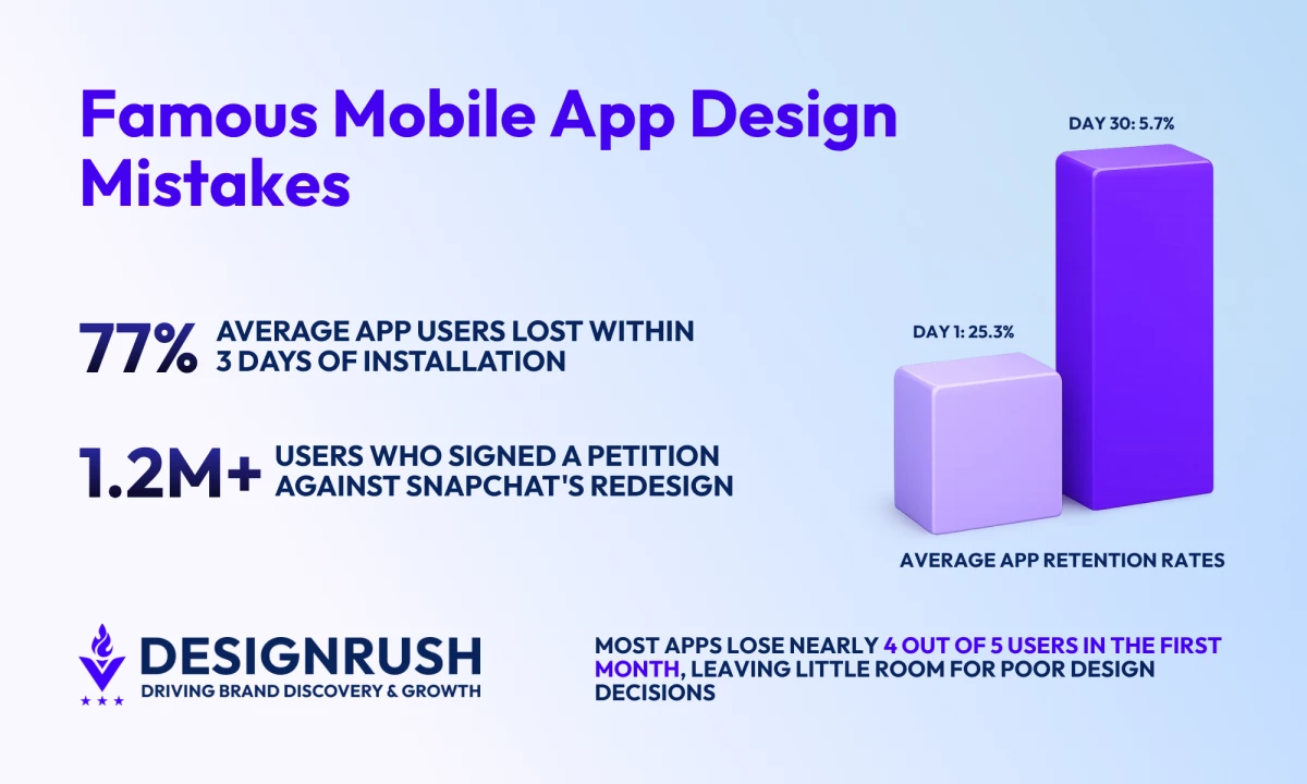
- Average app retention drops from 25.3% on Day 1 to 5.7% by Day 30, leaving little room for confusing redesigns.
- Snapchat disrupted established habits, Duolingo reduced learner flexibility, and Tinder layered monetization into the core experience.
- Decision fatigue increases when too many features, offers, or choices compete for attention.
What Counts as a Mobile App Design Fail?
Mobile app design mistakes typically occur when interface or interaction choices make an experience harder to navigate or use effectively.
Users may encounter confusing onboarding flows, inconsistent navigation, slow performance, inaccessible interfaces, or deceptive patterns that make simple tasks more difficult than necessary.
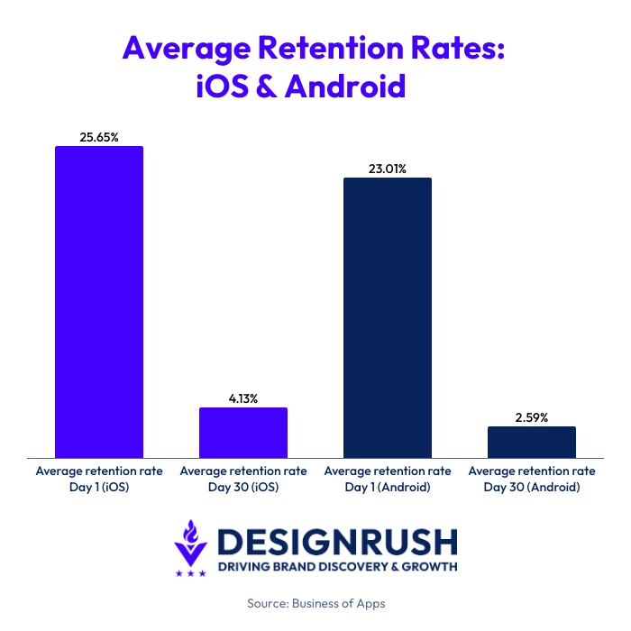
Each of these issues makes a difference, and mobile users rarely stick around to see whether things improve. According to Business of Apps, average retention rates fall from 25.3% on Day 1 to just 5.7% by Day 30.
To put those stakes into perspective, you should know the average app loses 77% of its daily active users within the first three days after installation.
A DAU/MAU ratio of around 20% is considered healthy, while anything above 25% is exceptional, highlighting just how difficult it is to build habits and encourage repeat usage.
So, most apps lose the majority of their users within the first month and have limited opportunities to recover from a poor experience.
The seven examples in this article didn't fail for the same reasons, but they demonstrate that good UX is about creating experiences people can understand, trust, and return to.
Mobile App Design Fails at a Glance
Before diving into each example, here's a quick overview of what went wrong, the business consequences, and the lesson product teams can take away from it.
| App | What Went Wrong | Business Impact | Key Lesson |
| Snapchat | Disrupted established user habits with a major redesign | 1.2M+ petition signatures, user backlash, stock decline | Familiarity is part of usability |
| Chased TikTok's design patterns | Public backlash and partial rollback | Product identity matters | |
| Amazon | Allowed features, recommendations, and promotions to compete for attention | Increased cognitive load and decision fatigue | More choice isn't always better |
| Tinder | Expanded monetization throughout the experience | Revenue growth as well as user frustration | Premium should feel optional |
| Duolingo | Replaced flexibility with a structured learning path | Great metrics but significant user backlash | Optimization shouldn't eliminate user control |
Snapchat: Who Moved My Cheese?
Fail: Breaking established user habits with a redesign nobody asked for.
Few app redesigns have generated as much public backlash as Snapchat's 2018 update.
The switch-up was intended to make the platform easier to navigate by separating content from friends and content from publishers, creators, and brands. Instead, it became a lesson in what happens when a product changes faster than its users are willing to adapt.
What Happened?
In early 2018, Snapchat rolled out a redesign that reorganized how users accessed Stories, conversations, and Discover content. Friends' Stories were separated from publisher content, and several familiar navigation structures changed as a result.
For Snapchat, the update represented a cleaner way to organize content. For many users, it felt like opening an app they no longer knew how to use.
sooo does anyone else not open Snapchat anymore? Or is it just me... ugh this is so sad.
— Kylie Jenner (@KylieJenner) February 21, 2018
The reaction was instant. A Change.org petition calling for Snapchat to reverse the redesign eventually attracted more than 1.2 million signatures, with users complaining that common actions had become more difficult and that familiar features were suddenly harder to find.
Business Impact
This update quickly turned out to be more than a UX debate.
The Change.org petition became one of the most visible examples of users organizing against a product update.
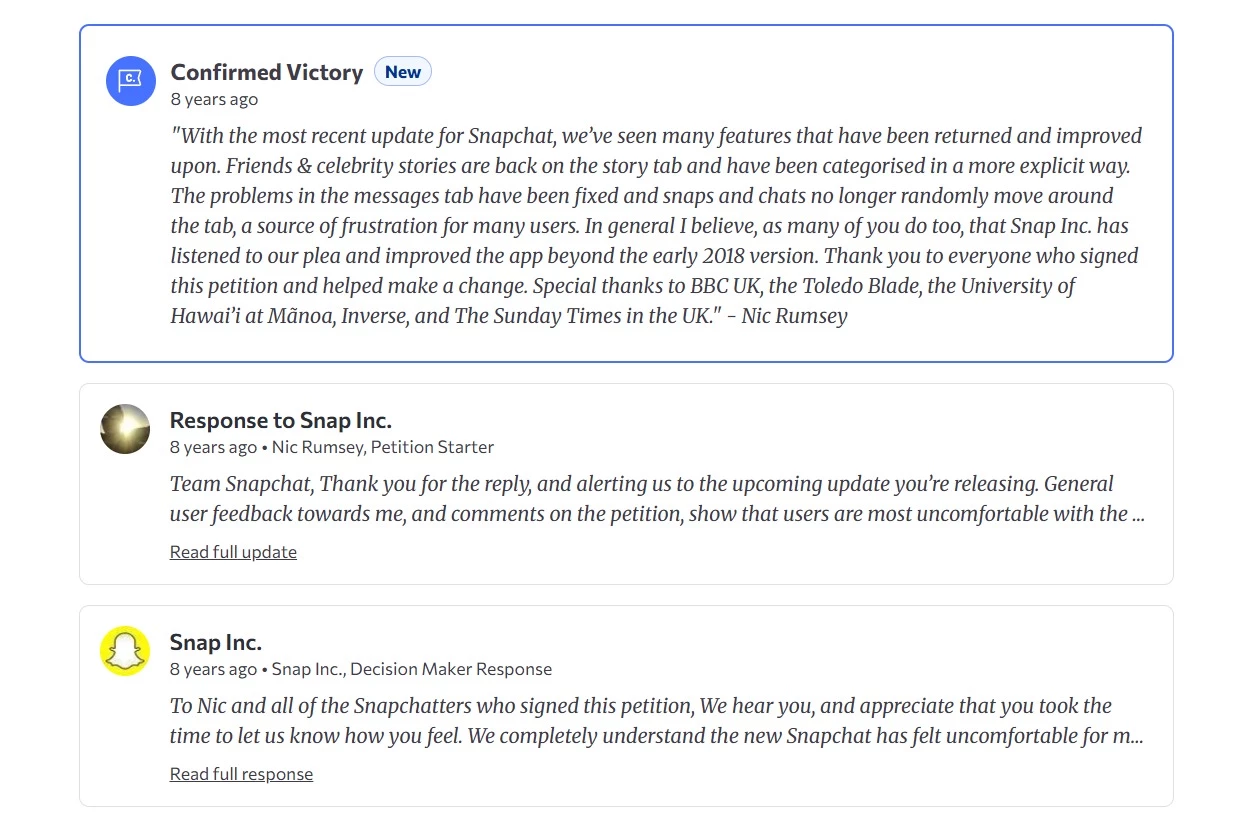
Snapchat publicly responded to the criticism, acknowledging that the redesign had felt uncomfortable for many users and promising to keep improving the experience.
The backlash also reached investors. Following disappointing quarterly results in May 2018, when Snap added just 4 million new users, slightly more than half the number analysts had forecast, analysts cited the redesign as one factor behind weaker-than-expected user growth and engagement.
Snap's shares fell 22% in early trading after the earnings announcement, and executives continued defending the redesign despite mounting criticism.
Snapchat eventually modified the design and restored clearer distinctions between friends' content and publisher content, effectively revisiting parts of the original update.
How To Avoid the Same Mistake
Major redesigns don't fail because users dislike change. Millions of users had developed routines around where content appeared, how Stories worked, and how they moved through the app. The redesign disrupted those routines all at once.
To reduce that risk:
- Test significant navigation changes with existing users before broad rollout.
- Introduce major updates gradually rather than all at once
- Use onboarding cues to explain what's changing and why
- Preserve familiar interaction patterns wherever possible
- Monitor feedback from users to understand the impact of workflow disruptions
Instagram: Everyone Wants To Be TikTok
Fail: Prioritizing trends over user needs.
By 2022, TikTok's explosive growth had every social platform rethinking its strategy, and Instagram was no exception.
The company began pushing short-form video more aggressively and tested a full-screen feed that looked strikingly similar to TikTok's interface.
📣 Testing Feed Changes 📣
— Adam (@mosseri) May 3, 2022
We’re testing a new, immersive viewing experience in the main Home feed.
If you’re in the test, check it out and let me know what you think. 👇🏼 pic.twitter.com/dmM5RzpicQ
The move was intended to help users discover more content and compete more effectively in an increasingly video-first market.
But it ended up raising an uncomfortable question - if users wanted TikTok, why wouldn't they just use TikTok?
What Happened?
Instagram's redesign placed greater emphasis on recommended content and full-screen videos, reducing the visibility of the photos and posts many users associated with the platform.
👀https://t.co/PE3oNberp4pic.twitter.com/z6LWdMpcAE
— Instagram (@instagram) June 16, 2022
The update quickly drew criticism from creators, everyday users, and even celebrities, saying, "make Instagram Instagram again" and stop trying to imitate TikTok.
Instagram CEO Adam Mosseri responded publicly, acknowledging user concerns and announcing that the platform would scale back parts of the redesign while continuing to invest in video.
Business Impact
The backlash dominated social media discussions around Instagram for weeks.
The reversal was a rare public acknowledgment that a major product update had missed the mark.
More importantly, the episode highlighted a risk facing many digital products, which is that chasing a competitor's success can weaken the qualities that made users choose your product in the first place.
How To Avoid the Same Mistake
Before redesigning around a competitor's success:
- Identify what existing users value most about your product
- Validate major interface changes before broad rollout
- Treat trends as inputs and not necessarily roadmaps
- Measure success through user satisfaction
Amazon: The Times Square Problem
Fail: Overwhelming users with too much information at once.
Amazon isn't famous for a redesign disaster. Instead, it illustrates a different challenge that many successful products eventually face. Every new feature solves a problem, but very few features ever leave.
An Amazon shopper can choose from millions of products. Helping people navigate that volume of choice is one of the company's greatest strengths.
It's also one of its biggest UX challenges.
Open the Amazon app, and you'll likely encounter sponsored products, limited-time deals, personalized recommendations, frequently bought together suggestions, product comparisons, customer reviews, coupons, bundles, and alternative products before you've even made a purchase decision.
Each element is designed to help users discover something relevant. All this can create an experience that feels more like Times Square than a store aisle.
What Happened?
If we look at the Amazon app from the UX perspective, we can’t help but notice crowded product pages, multiple competing calls to action, and the sheer amount of information users must process.
A product page might include dozens of separate content blocks before a customer reaches the bottom of the screen.
For experienced Amazon shoppers, this complexity is often manageable, or they’re just used to it. For newer users, it can be overwhelming.
Business Impact
Amazon's experience highlights a challenge many digital products face as they grow. More features, recommendations, and offers can increase choice but also increase cognitive load.
A widely cited study by researchers at Columbia and Stanford found that shoppers presented with 24 varieties of jam were significantly less likely to make a purchase than shoppers presented with six, suggesting that too much choice can sometimes discourage action rather than encourage it.
How To Avoid the Same Mistake
More information isn't always more helpful. To reduce decision fatigue:
- Make the primary action clear before introducing additional options
- Avoid forcing recommendations, promotions, and alerts to compete for the same attention
- Reveal information gradually instead of presenting everything at once
- Organize content around the user's goal, not internal business priorities
- Audit screens regularly and remove elements that create distractions
Tinder: The Freemium Obstacle Course
Fail: Letting monetization interfere with the core user experience.
Freemium products live on a delicate balance. Users need enough value to stay engaged, but companies also need a reason for people to pay.
Tinder's challenge has been figuring out where to draw that line.
Over the years, the app expanded beyond its simple swipe-match-chat formula with paid features such as Tinder Plus, Gold, Platinum, Boosts, Super Likes, Top Picks, and Priority Likes.
Each addition created new revenue opportunities, but it also added more interruptions between users and the reason they opened the app in the first place.
What Happened?
When Tinder launched, its appeal was simplicity. You open the app, swipe, match, and start a conversation.
As competition increased and growth slowed, the platform introduced additional premium features and subscription tiers designed to encourage upgrades.
Users could pay to see who liked them, increase profile visibility, send priority interactions, or unlock additional discovery features.
Individually, these additions were relatively small, but collectively, they changed how users experienced the product. What had once felt like a straightforward dating app began to function as a funnel leading toward a paid subscription.
Business Impact
Tinder's monetization strategy was undeniably successful. The app generated $1.94 billion in revenue in 2024 and ended the year with 9.6 million subscribers.
At the same time, complaints about paywalls, premium features, and swipe fatigue became a recurring theme among users. That's what makes Tinder an interesting design case study, as a feature can be commercially successful while still creating friction in the user experience.
The lesson here is to ensure that premium features feel like enhancements rather than requirements.
How To Avoid the Same Mistake
Monetization should support the user experience without competing with it.
To strike the right balance:
- Protect the core action that makes the product valuable
- Use premium features to enhance the experience rather than restrict it
- Avoid interrupting users with upgrade prompts during key tasks
- Make the benefits of paid features clear and transparent
- Monitor whether monetization changes are affecting satisfaction and retention
Duolingo: Teacher Knows Best
Fail: Designing for ideal users instead of real ones.
Good design guides users toward success, and great design recognizes that not everyone takes the same path to get there.
Duolingo's redesign turned into a reminder that users don't always want the most structured or optimal experience. Sometimes they simply want the freedom to learn in their own way.
What Happened?
Duolingo replaced its long-standing skill tree with a new learning path that guides users through lessons in a specific sequence.
The company argued that the update was based on learning science and would help users progress more effectively.
Instead of choosing lessons freely, learners would follow a structured route that gradually introduced new concepts and reinforced older ones.
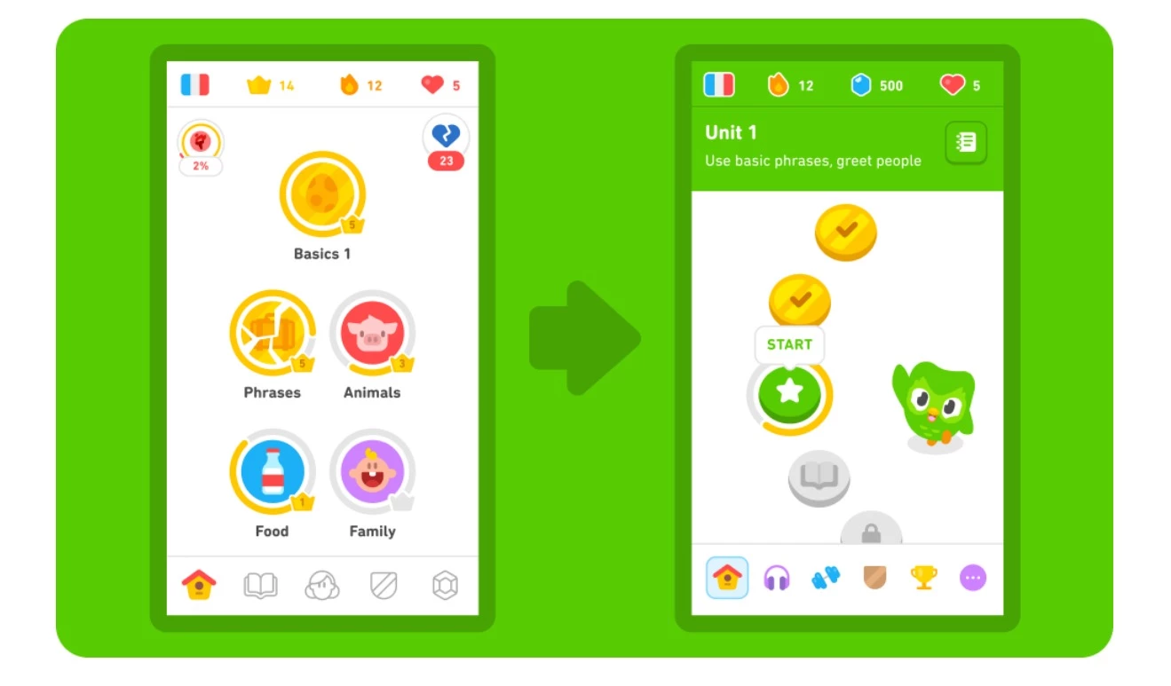
Many users, however, felt they had lost control over how they used the app.
The previous system allowed learners to revisit specific topics, skip ahead, focus on weaker areas, or move through lessons at their own pace. The new path reduced that flexibility in favor of a more standardized experience.
Reddit threads, app reviews, and social media discussions were packed with complaints from longtime users who felt the redesign prioritized an ideal learning journey over how people actually learned.
Business Impact
Unlike Snapchat or Instagram, Duolingo didn't reverse course after the users voiced their dissatisfaction.
It continued developing the new learning path and cited internal research indicating that the redesign improved learning outcomes and user progress.
That didn't stop the backlash. Users created a petition calling for the return of the old learning tree, while discussions criticizing the loss of learner choice continued across Reddit and Duolingo's own forums.
What makes the redesign particularly interesting is that both sides had a reasonable argument. Duolingo could point to educational research and engagement data. Users could point to a loss of flexibility and autonomy.
Fortunately or unfortunately, a design decision can improve performance metrics yet still create annoyance among loyal users.
How To Avoid the Same Mistake
To reduce the risk of disappointing your users, try to:
- Study how people actually use your product, not just how you expect them to use it
- Preserve flexibility wherever possible
- Be cautious when removing popular workflows
- Give users options during major transitions
- Measure satisfaction as well as performance metrics
Is Your App Making These Design Mistakes?
For each question, give yourself 1 point for every YES answer.
Onboarding & First Impressions
☐ Does your app require account creation before users experience value?
☐ Are users asked for permissions immediately after opening the app?
Navigation & Usability
☐ Does navigation frequently require more than three taps?
☐ Do users have to learn new workflows after major updates?
☐ Does any screen contain multiple competing calls to action?
Accessibility & Performance
☐ Does your app rely on small tap targets or low-contrast elements?
☐ Is accessibility support limited or absent?
☐ Is your average load time longer than two seconds?
Engagement & Retention
☐ Are notifications enabled by default?
☐ Can users NOT complete the app's primary task within 60 seconds?
☐ Are premium features or upgrade prompts interrupting core tasks?
☐ Does any screen make users stop and wonder what they're supposed to do next?
Your Score
0-2 points: Low UX Risk
Your app appears to prioritize clarity, usability, and user control. Continue testing regularly as new features and workflows are introduced.
3-5 points: Medium UX Risk
Small frustrations may be accumulating. Review onboarding, navigation, and engagement mechanics before they begin affecting retention.
6+ points: High UX Risk
Several design decisions may be increasing cognitive load or creating friction. A UX audit can help identify the highest-impact improvements before they begin affecting growth and retention.
Are AI Features Creating the Next Wave of App Design Fails?
Many of the mistakes we discussed are reappearing in a new form. The technology may differ, but the underlying lesson is the same: users adopt products because they solve problems.
Features that create confusion, complexity, or unnecessary friction don't become useful simply because they're powered by AI.
| Traditional Design Mistake | AI-Era Equivalent |
| Breaking familiar workflows | Replacing existing functionality with AI assistants nobody asked for |
| Feature overload | Adding AI chat, AI search, AI summaries, and AI recommendations everywhere at once |
| Poor onboarding | Requiring users to learn complex prompts before experiencing value |
| Decision fatigue | Flooding users with AI-generated suggestions and options |
| Removing user control | Automatically rewriting, generating, or changing content without clear user input |
| Chasing competitors | Adding AI features simply because competitors have them |
Do We Learn on Other Apps’ Mistakes or Do We Have To Make Our Own?
It's easy to look at Snapchat, Instagram, Tinder, Duolingo, or Amazon and wonder how nobody saw the problem coming.
The reality is that most questionable design decisions don't look questionable at the time.
Problems usually appear later, when real users start interacting with the product in ways the team didn't anticipate.
The good news is that you don't have to learn every lesson firsthand. Studying how other apps succeeded, stumbled, adapted, and occasionally reversed course can help teams spot potential issues before they affect retention, engagement, or revenue.
If you’re building or redesigning a mobile product, partnering with an experienced mobile app design agency can provide an outside perspective and uncover usability issues that internal teams may overlook after months or years of working on the same product.

Our team ranks agencies worldwide to help you find a qualified partner. Visit our Agency Directory for the top app design & development companies, as well as:
- Top App Developers in San Francisco
- Top Enterprise Mobile App Development Companies
- Top Android App Development Companies
- Top Cross-Platform App Development Companies
- Top AI App Development Companies
FAQs: Mobile App Design Mistakes
1. Why do mobile app designs fail?
Mobile app designs usually fail when interface decisions create friction instead of reducing it. Common causes include confusing navigation, cluttered screens, disruptive redesigns, poor performance, and accessibility issues.
In many cases, the problem isn't the feature itself but how it changes the way users interact with the product. Even small frustrations can have an outsized impact because mobile users rarely spend much time learning how an app works.
2. What is the most common mobile app design mistake?
One of the most common mobile app design mistakes is making core tasks harder than necessary.
This can happen through lengthy onboarding flows, excessive navigation steps, unnecessary account creation requirements, or interfaces crowded with competing elements.
When users have to work to accomplish simple goals, engagement and retention often suffer. Good design removes obstacles rather than introducing new ones.
3. How do UX issues affect app retention?
UX issues affect retention by increasing the effort required to use an app successfully. Slow load times, confusing workflows, poor navigation, and unclear interfaces may frustrate users before they develop lasting habits.
Since most apps have only a limited window to demonstrate value, even minor usability problems can contribute to abandonment. Improving the user experience often has a direct impact on retention and engagement metrics.
4. Should mobile apps redesign their interfaces regularly?
Not necessarily. Redesigns are most effective when they solve a specific usability problem or support a meaningful product change. Frequent redesigns can disrupt established user habits and create confusion, particularly when common actions suddenly work differently.
Ahead of making significant changes, teams should validate whether the redesign improves the experience for existing and new users.
5. Can AI features negatively impact usability?
Yes. AI features can create usability problems when they add complexity, interrupt familiar workflows, or make user actions less predictable.
For example, automatically generated suggestions, AI-powered interfaces, or excessive automation can become distracting if they aren't aligned with user needs.
The most effective AI features support existing tasks and give users control over how and when they use them.
6. How can you tell if an app redesign is successful?
A successful redesign makes the app easier to use without forcing users to relearn familiar behaviors. Improvements in retention, engagement, task completion rates, and user satisfaction are often better indicators of success than visual changes alone.
User feedback can also reveal whether the redesign solved existing problems or introduced new ones.
If people can achieve their goals more quickly and with less frustration, the redesign is likely moving in the right direction.
7. What's the difference between a UX problem and a UI problem?
A UI problem affects the visual presentation of an app, such as unclear buttons, poor contrast, or inconsistent layouts.
A UX problem affects the overall experience of using the product, including navigation, workflows, performance, and ease of completing tasks. While UI and UX are closely related, an app can look polished and still be difficult to use.
Effective products require both strong visual design and a smooth user experience.