


- Agency: Rondesignlab
- Client: Airofit
- Category: App Design — Health & Wellness
- Location: Krakow, Poland
- Project Brief: Design a mobile app that connects users with a smart breathing device and delivers personalized respiratory training insights.
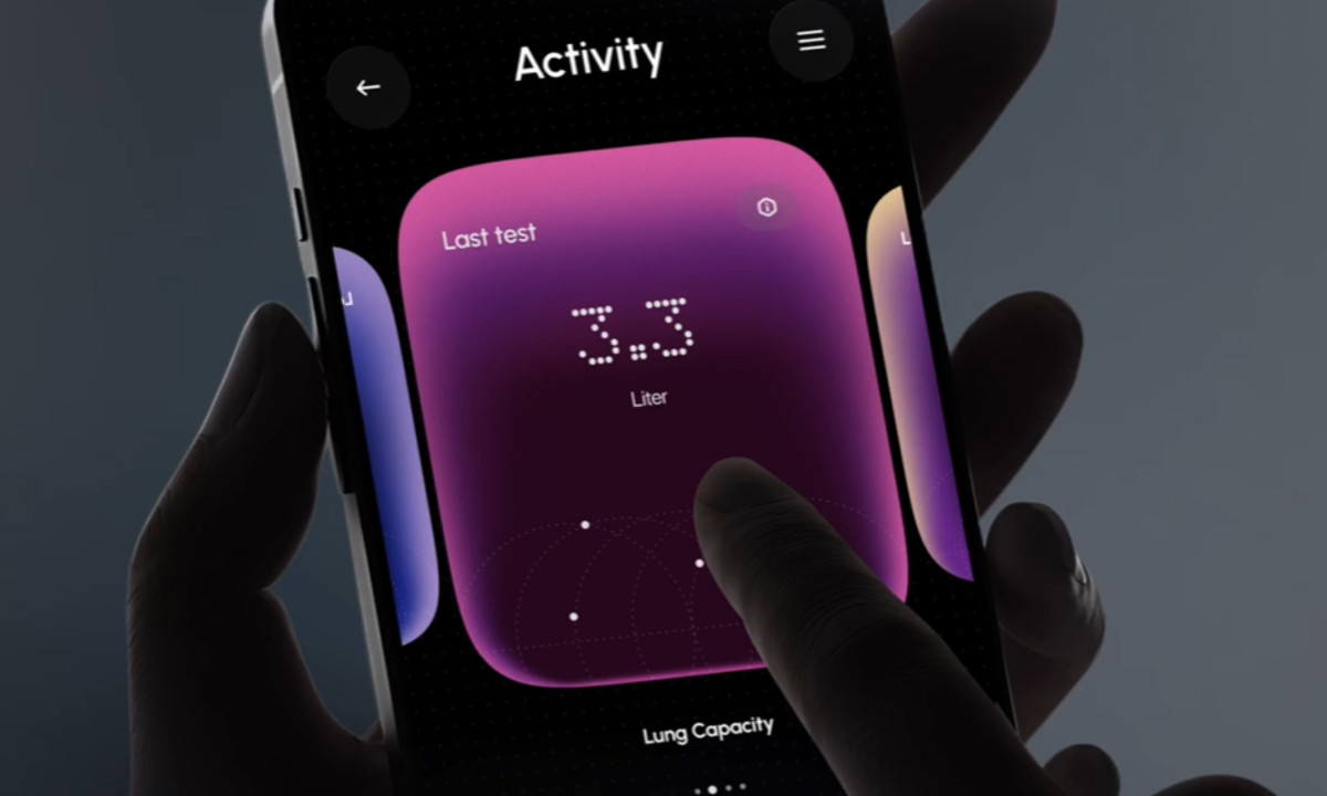
A health and wellness app earns its design when the data it displays feels like information rather than noise. Airofit does that by building every screen around a single metric, letting lung capacity, breath volume and daily streak each occupy their own visual space rather than competing for attention.
Juror Andrea Owsinek-Brucker described what set it apart from the field: "This app takes training and feedback on performance to a new level — from the look and feel, colors 'cherry apple,' to directives on action steps like 'empty your lungs.'"
Moiz S. Varind kept it tight: "Good new design sense." Lucia Barbaresso grounded it in usability: "We fully understand the technological aspect of the application and its ease of use."
The dark mode is doing more than looking good at night. The neon-tipped visualizations glow against the black background in a way that makes the data feel live, which is exactly the right feeling when a device is measuring your breathing in real time.
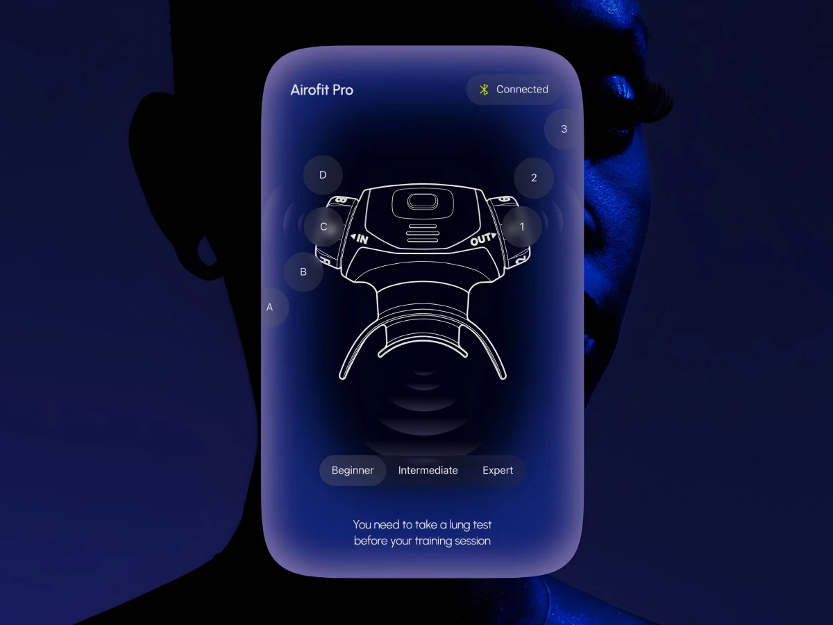
The device pairing screen is where the UI/UX logic is clearest. A technical line drawing of the Airofit Pro sits at the center with labeled interaction points and a Beginner/Intermediate/Expert selector below, making a setup screen feel like a cockpit rather than a form.
The dotted numeral display shows up on the lung capacity readout, the breath volume card and the daily streak counter. It is a small typographic choice that ends up doing a lot, giving the whole app a signature that feels like it was designed for this product specifically rather than pulled from a template.