Evernote's Mobile App Design Brings Simple Task Management To Smartphones
Managing an ever-evolving list of tasks, events, lists and notes can be difficult -- but Evernote makes complicated life a little more manageable.
Instead of recording a voice memo in one app, storing important screenshots and images in another, and relying on additional applications to remind you of your imperative to-do's, Evernote streamlines it all into one intuitive location.
Evernote was founded in 2008 and saw a fast trajectory, snagging about 11 million users by summer 2011. The app continued to evolve, and is available on Android, iOS, Microsoft Windows and macOS operating systems, enabling a cross-platform system that further simplifies daily tasks.
Evernote's Journey Introduces The App Design To Users
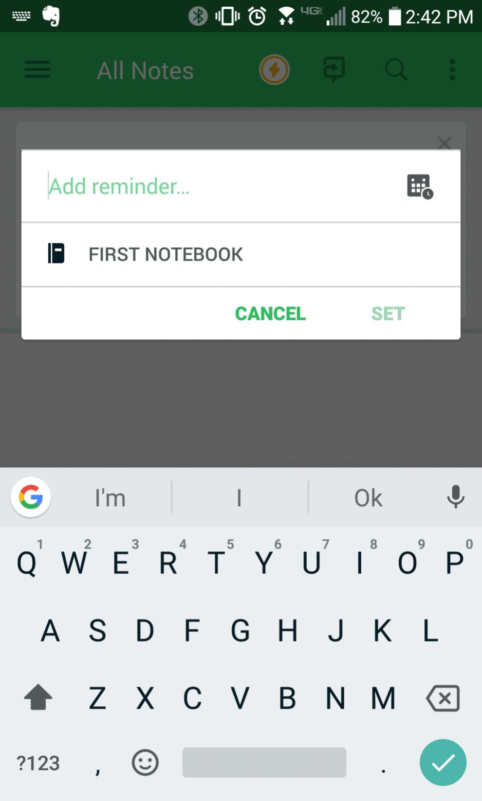
Upon downloading and opening the app, users are prompted to sign up via email of Gmail account. They are then met with a simple step-by-step onboarding process.
This process is short and sweet but is ultimately helpful as it enables users to get a quick overview of all major features that Evernote offers and how to access them.
The onboarding process consists mainly of clean popups that describe the actions a user can take, as opposed to navigating them to a different page within the app. This ensures that the onboarding is more successful in teaching users about the app design.
From the very beginning of the user's experience on the app, it is clear that Evernote is dedicated to easy navigation and clean design. This simplicity mirrors the mission of the application, which is to simplify complicated tasks.

Bright Colors And Clear Calls To Action Reinforce Branding And Navigation
Bold color accents in a pleasant kelly green hue add to the bright brand identity. The color green is associated with energy, renewal, safety and finances -- all of which work in conjunction with strong organizational tasks. The use of this color throughout both the brand AND the app subtly demonstrate how using the program can refresh someone's daily life, enabling them to conquer any and all tasks with confidence and strength.
Large, clear calls to action compliment the big colorful accents. Minimal icons ensure that the clean design stays friendly yet authoritative and on-brand. The copy used throughout the app is scholarly, educational, but ultimately clear and simple. There isn't more text than the user needs, which makes what Evernote does present even more important.
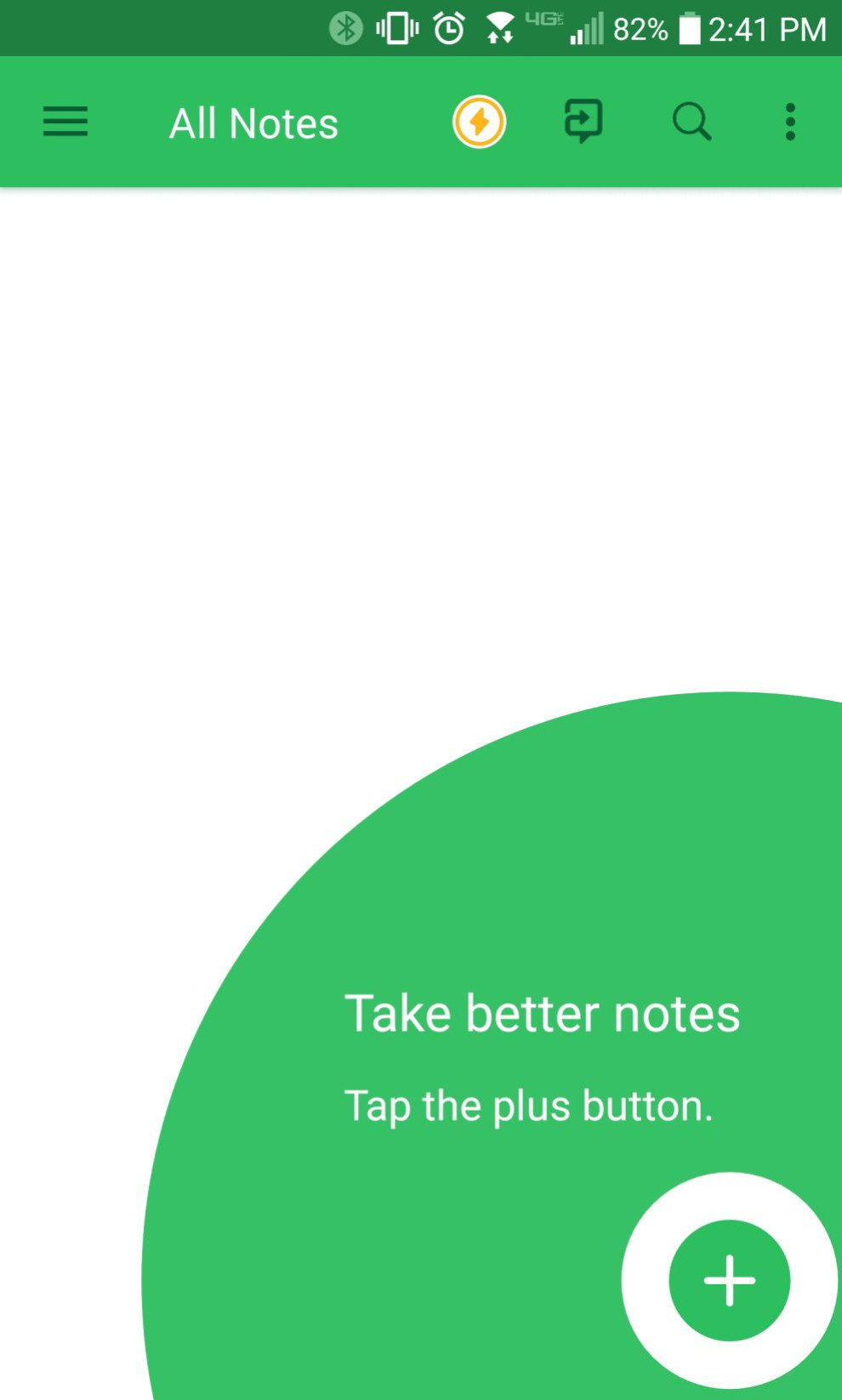
Evernote's App Landing Page Features Easy To Use Menu
As soon as users exit the simple onboarding process, they find themselves on the typical landing page that they will see each time they open the mobile app.
The general landing page of the app prominently features the main actions that a user can complete when in the application. Simple sans serif typography plainly lists the task, which is accompanied by a playful icon, conveying information both visually and written. The background remains faded, allowing the user to focus solely on the CTAs.
Evernote's App Stays Organized With Plenty Of White Space
Every page of the app design is easy to comprehend and digest, thanks mainly to the copious amounts of negative space employed throughout the interface. This breathable design is complemented by the strategic layout of the app.
The consumer journey is straightforward, with clean page transitions and no-frills pop-up screens. Each action is clearly highlighted, and users are encouraged to complete one action before they move on to the next.
The overall design of Evernote's mobile app makes it clear that the company practices what they preach -- organization around every corner.

App Design Offers Integrations And Paid Upgrades
Although Evernote's free features are extremely helpful to users, the company offers several tiers of paid subscriptions to further increase organization.
These tiers give users various access to more storage, offline access, and tons of integrations. For example, users can utilize Evernote in professional presentations, use the app to store scanned business cards, search for and unearth related content, annotate PDFs and even sync their information across many platforms and mediums. These features take Evernote from an everyday organizational app to a powerful professional tool that becomes helpful in and out of the workplace.
All in all, Evernote is an extremely intuitive and organized app that accomplishes its mission -- to enable users to manage tasks seamlessly and with ease.
The consistent branding, clever animations, and quick copy communicate information and the company ideals plainly, while the minimal design, simple layout and bold calls to action ensure that user experience and straightforward navigation are a priority.