_b778cb01254c-desktop.jpg)
Team Behind the Design
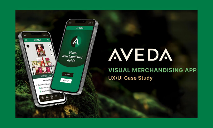
App Design Analysis
_134195bf526c-desktop.jpg)
When I review android and iOS app designs, I often look at onboarding flow, interaction clarity, visual hierarchy, and overall user experience.
MSTA Studio’s work for MH Furniture succeeds in creating a shopping app that feels as welcoming as the spaces it helps users furnish.
_486404c81153-desktop.jpg)
- Visual Aesthetic: I think the terracotta and green tones are a strong choice that establishes a feeling of warmth, while the minimalist layout evokes a sense of calm.
- Navigation & UX: The bottom bar and clear calls-to-action streamline the discovery process. Every user journey feels effortless.
- Emotional Design: Large imagery and subtle animations are used throughout the app. These elements give the interface a feeling of humanity. They turn a simple shopping task into an enjoyable experience.
- Accessibility: Strong color contrast and spacious touch targets make the app inclusive. It feels thoughtful and is built for real-world use.
What Brands & Agencies Can Learn from MH Furniture
This project offers a strong blueprint for any brand aiming to create a more human-centered shopping app.
1. Use an Earthy Palette to Build Trust
Warm, natural tones like terracotta and green can make an app feel more grounded. This approach can be more effective at building trust than bright, corporate colors. It creates a calm and welcoming digital environment.
2. Keep Navigation Simple and Persistent
A clear, persistent bottom navigation bar is one of the most effective ways to ensure users can orient themselves and move through an app without friction.
3. Design for Inclusivity from the Start
Accessibility is not an afterthought. Designing with strong color contrast and large touch targets from the beginning makes your app usable for a wider audience.
About DesignRush Featured Designs
At DesignRush, we review hundreds of agency projects each month. These featured works stand out for their creativity, accessibility, and user-centered strategy.
The most exceptional projects advance to be recognized as Monthly Design Awards winners, celebrating excellence in digital design and UX innovation.
See more standout projects across categories:
- Best App Designs
- Best Website Designs
- Best Logo Designs
- Best Print Designs
- Best Packaging Designs
- Best Video Designs
For a full list of design agencqies and related services, see our Agency Directory.