
Health insurance can be difficult to handle, and most insurance companies are known for not being easy to work with. Nib Health Insurance wanted to change the way people see their health insurance company, and their clean, well-designed mobile app does just that.
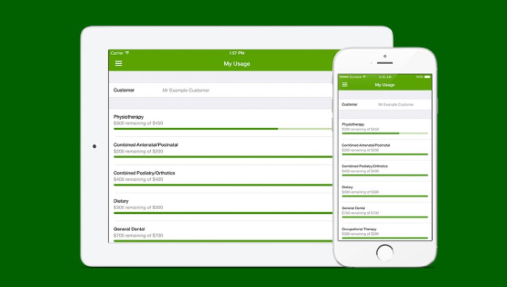
Using the app, customers can quickly access their information. A bright green shade adds some colorful flair to an otherwise clean, professional-looking app. Nib Health Insurance was sure to develop their app to be intuitive for users. A simple menu leads to various screens that clearly display information in a minimal amount of text and colorful bars.

When users open the menu, it dominates the screen. This is great for browsing through the option tabs. The user can clearly see their options, and they can click a large link instead of hunting through a tiny drop-down menu. This was a very smart design choice, especially since many health insurance customers may not be familiar with technology. The app needs to be clean and modern, but still understandable for all customers.

The app is very powerful, and it allows users to submit photos of receipts. Again, large icons and minimal text are used to help users quickly and easily move through the receipt-scanning process.
Nib Health Insurance has created an app that makes health insurance seem modern and fresh. They want to offer a clean experience with their program, so customers can do their business and move on. Unlike a social media app or game, Nib wants their customers to spend as little time as possible inside the app. Their very smart design accomplishes this perfectly.
Nib Health Insurance is a clean app design in the legal & insurance and medical & pharmacy industries.


