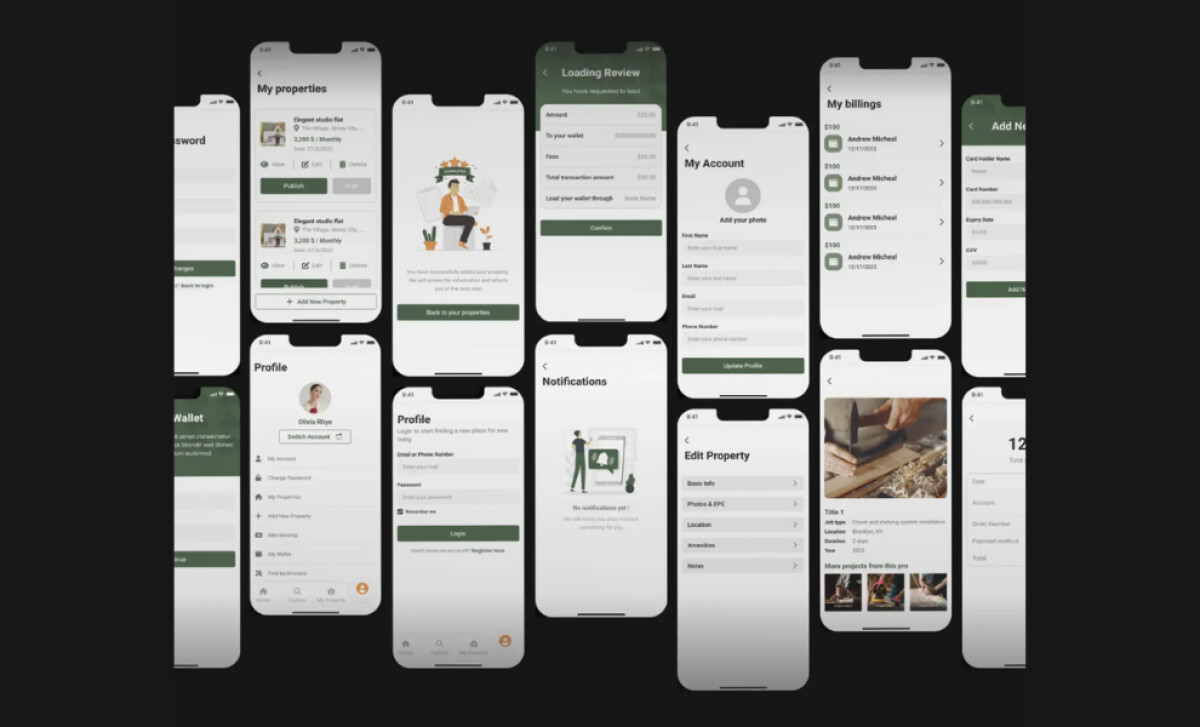
Standout Features:
- Cohesive olive-green color system
- Modular, card-based information layout
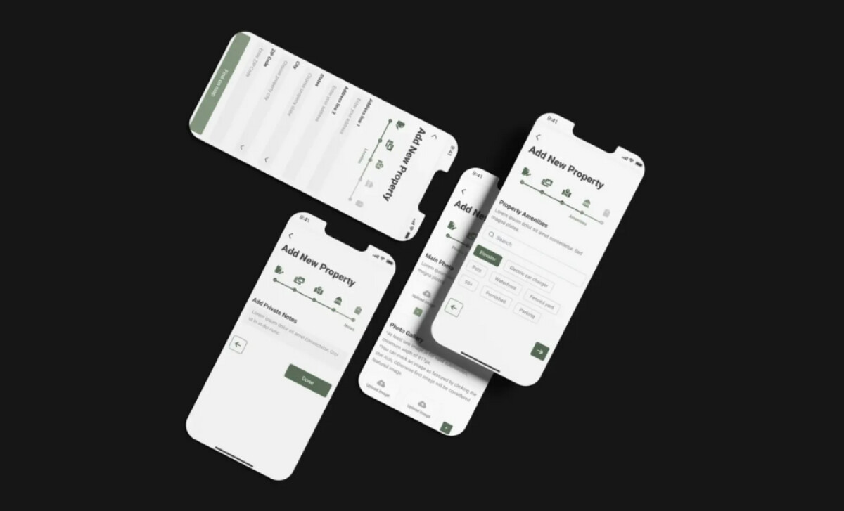
- Streamlined multi-step upload flow
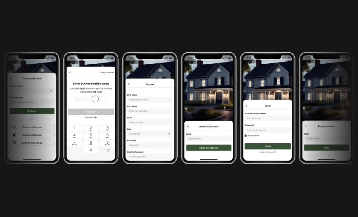
What does a great property rental app look like? This one for Ooh Rent feels clean, calm, and trustworthy. The design supports the platform’s core purpose without any unnecessary clutter.
Since 58% of smartphone users feel more favorable toward companies with well-designed apps. This makes property management feel less like a chore and more like a smooth process.
The restrained application of the olive green shows great brand discipline. It creates a calm aesthetic that reduces cognitive load.
This makes the app easier to use for first-time tenants and busy landlords alike, ensuring a smooth experience.
Ooh Rent uses a card-based layout across the Android and iOS app. You can see this clearly in the "My Properties" and "Billing" sections.
These cards neatly organize information like property details or transaction history into visually digestible units.
We like how the icon-guided progress bar anchors you throughout the journey. It gives you a clear sense of where you are and what’s next.
This reduces friction and makes a complex task feel much simpler and more achievable.
Innovation Scope’s work for Ooh Rent is a masterclass in focused app design.
It’s a great reminder that for a service-based platform, a smooth and reliable user experience is the most important feature you can offer to your customers.
When your app is the core of your service, you need to make sure the user experience is smooth, reliable, and completely frustration-free.
That's why brands turn to expert partners, and our team has ranked the best agencies worldwide to make finding them simple.
Visit our Agency Directory for the Top Mobile App Development Companies, as well as:
Our design experts also recognize the most innovative design projects across the globe. Visit our Awards section to see the best & latest in app design.