Team Behind the Design
Agency: Map to Moon
Client: Re & Use
Category: App Design (Android & iOS)
Location: Arinsal, Andorra
Project Brief: Design a mobile app that enhances recycling and community sharing with intuitive navigation and sustainable engagement.
App Design Analysis
Related Articles
When I review Android and iOS app designs, I often look at onboarding, interaction flow, visual hierarchy, and overall performance.
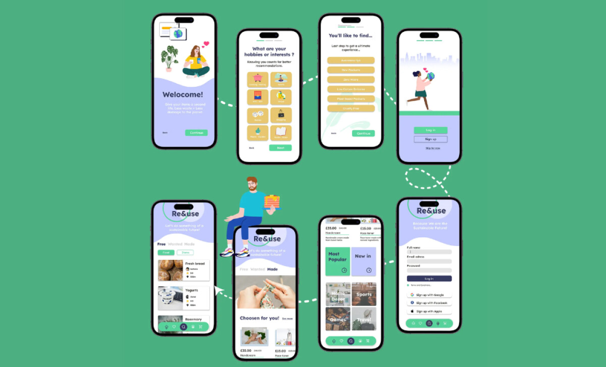
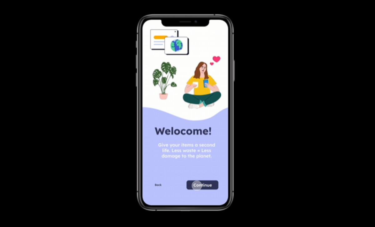
- Onboarding Experience: I like how the Re & Use app starts with a clean, friendly welcome and preference selection. This makes the user feel guided and reduces friction.
- Interaction Flow: The navigation is smooth, with well-placed buttons and progress indicators. This helps users stay engaged without confusion.
- Visual Hierarchy: Pastel tones and large icons create a soft, approachable feel. Key actions like “Continue” and “Sign Up” are emphasized clearly.
- Community Emphasis: The marketplace-like layout with items, ratings, and distances strengthens the sense of trust and connection between users.
Get connected with the right web design agency for your project.
GET STARTED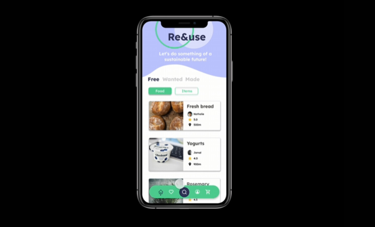
About DesignRush Featured Designs
At DesignRush, we review hundreds of agency projects each month. Among them, only a selection stand out for their creativity, usability, and execution. Featured designs like Re & Use represent some of the most compelling digital work today.
The best projects often advance to our Monthly Design Awards, gaining wider industry recognition.
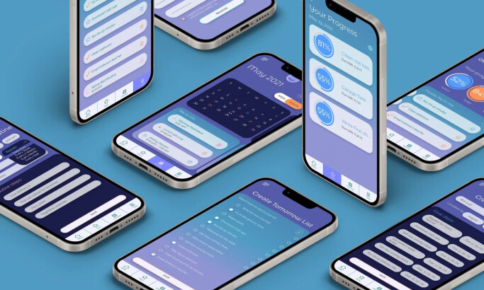
Android and iOS app designs play a critical role in user adoption, especially in industries promoting sustainability and community-driven commerce. Explore more top design projects here:
- Best App Designs
- Best Website Designs
- Best Logo Designs
- Best Print Designs
- Best Packaging Designs
- Best Video Designs
For a full list of design agencies and related services, see our Agency Directory.
Get a chance to become the next Design Awards winner.
SUBMIT YOUR DESIGN