Standout Features:
- An “intelligent” search engine
- Friendly and visual filters
- A clean but informative layout
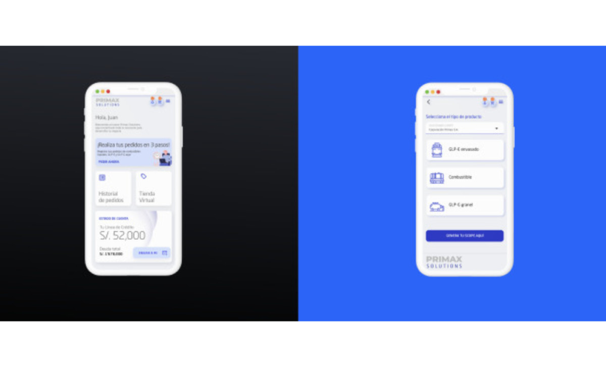
Primax's app design by Esedor has a smooth user interface. The app represents the most significant network of fuel service stations and convenience stores in Ecuador and Peru.
The color palette features mostly white circular buttons on a grey background. While some of them contain little blue illustrations, others feature visual filters. The palette inspires trust and reliability.
The app builds on friendly and visual filters across the design and helps the customers browse it seamlessly thanks to an intelligent search engine.
Overall, this app design maintains a clean layout without overlooking important information.
Get a chance to become the next Design Award winner.
SUBMIT YOUR DESIGN

-preview.jpg)