Skinfy’s Design And Color Palette Indicate The App’s Focus On Well-Being And Eco-Friendly Practices
Skinfy is an iOS mobile app by Digiruu in which users can upload and manage their skincare and cosmetic products. The app allows users to keep track of product expiration dates, alerts users when they are running low on an item and explains how to recycle items when they’re empty.
The app’s role is three-fold: to maintain the well-being and health of the user, help them save money and reduce harmful waste.
Apps belonging to the health & well-being category typically follow certain design trends and best practices that form the link between the app and its purpose.
For example, plenty of white space, a white background, clean and simple lines and a dash or two of gentle, pastel colors.
This palette hints at vigor and good physical condition, as well as a sense of order that comes from managing and arranging one’s belongings.
Skinfy’s flowing, sleek logo with splashes of purples and blues lights up the greeting screen before the app takes the user through the account creation process.
Creating an account allows the app to send personalized messages, hints, advice and tips to the user.

User Interface Makes Uploading And Sorting Of Products Fast And Easy
Mobile app designers carefully consider the placement and functionality of command buttons to create an intuitive user experience. Skinfy's UI app exemplifies this approach, with buttons strategically positioned at the bottom. Plus, the above portion changes depending on the app’s section.
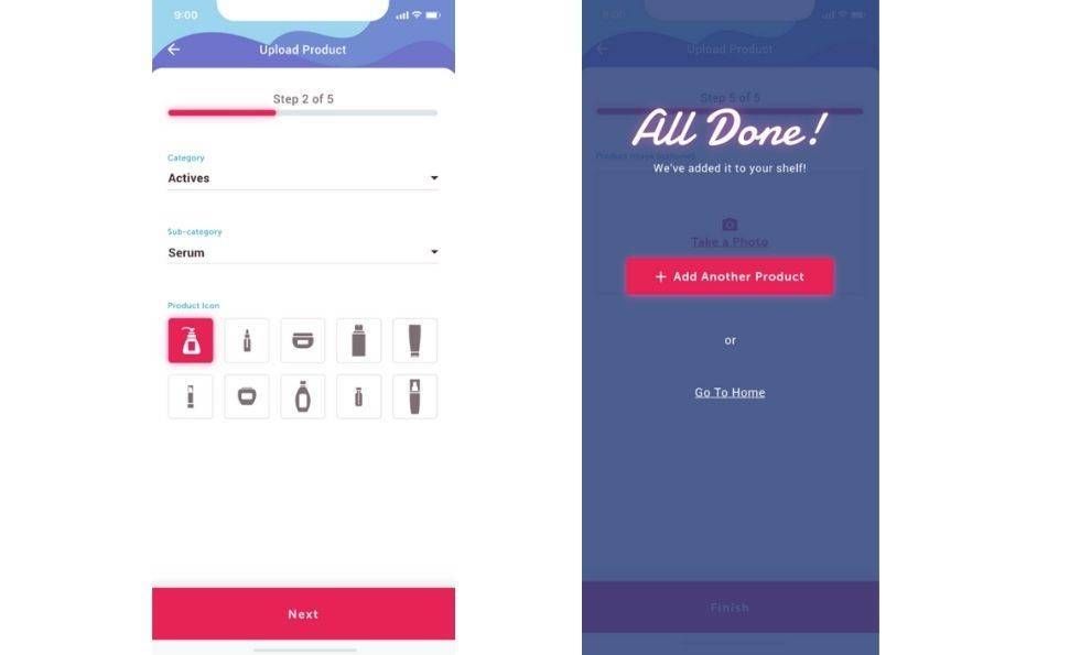
The below portion has a bright red “Add product” button that users can assign to categories such as “Face,” “Body,” “Hair” or any other custom groups.
After uploading products to their virtual shelf with a single button tap, users can arrange them according to their frequency of use or any other parameter that makes sense to them.
One of the major functionalities of Skinfy is the ability to scan the barcode of a product’s packaging to input its details, facilitating the product upload process quite a bit.
At any time, the user has a complete overview of their entire skincare and cosmetics inventory.
They can view the diversity, quantity and expiration date of all of their products in each category. Both the amount of product and its expiration date are shown with a neat visual countdown.
Skinfy’s neatly arranged library of products lets users know what products they purchase most frequently, what products they’ve used the most and which products they didn’t like.
As a final touch, the app gives out useful advice on recycling the products once they run out or have expired.

Plenty Of White Space, Contrasting Fields And Legible Typography Lend Great Readability To Skinfy’s App
Design-wise, there is a great deal of consistency throughout all of the app’s features and pages. We’ve touched upon the clean and minimal feel of it, which it owes to a smart use of white space. Experienced branding experts often use this technique to achieve a visually balanced composition that allows elements to breathe and stand out.
Skinfy’s white space separates all the design elements and content from each other to form a highly legible and readable UX. This leads to a better and quicker understanding of the on-screen copy, as users can just glance at it to get a sense of what’s important and what to look out for.
Nothing ever feels cluttered or like a distraction.
The user-centric nature of the app helps the gaze focus on a very economical amount of text and helpful visuals. The accent colors – magenta, purple and blue – are used sporadically to help users locate important sections immediately.
The simple sans-serif font is also quite legible and easy to process. The app doesn’t use any other typography other than this one, which makes for a consistent user experience.
Skinfy’s App Design Does A Great Job Of Balancing Aesthetics, Features & Functionalities
Skinfy’s iOS app is an example of great design that does not compromise functionality and user experience.
In fact, it is quite the opposite: the design, including the choice of colors and fonts, improves usability the same way it signalizes the app’s purpose and brand identity.
This skincare expiration date tracker does a great job of providing a very clear overview of the user’s personal inventory using a clean layout, minimalistic coloring and a user-friendly design.
The additional green aspect of this app lends it another unique value proposition that it uses to differentiate itself in the very competitive market – although, in fairness, inventory tracking apps aren’t that widespread yet, especially in this segment.
On the app’s About Us page, the creators state that:
“At Skinfy we understand the importance of saving the planet but know how hard it can be to do so all the time. Our mission is to support your daily skincare or beauty routines and demonstrate small steps to help properly recycle your items without over complicating it.”
The branding, development and UI/UX design work on Skinfy was done by Digiruu – a London-based team of app creators founded in 2016.
The Skinfy app is live in Apple’s App Store.